
Figures & data
Figure 1 Continued.
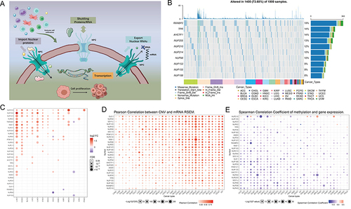
Figure 1 Expression variation of the nuclear pore complex (NPC) molecules. (A) The pattern map to show the NPC regulation mechanism of molecules between the nucleoplasm and cytoplasm and its potentially important regulatory role in the tumor immune microenvironment (TME). (B) The waterfall diagram shows the somatic mutations of the 10 NPC molecules with the highest mutation frequency using pan-cancer analysis. 73.68% is the proportion of 1900 samples with at least one mutation of the top 10 genes among 1900 samples with at least one mutation of 30 NPC genes. The percentage figure of each line on the right of the picture is the number of samples with the corresponding gene mutation divided by 1900 samples with at least one mutation among the 30 NPC molecules. (C) The color of the dots represents the degree of variance. Redder dots represent higher expression in cancer tissue. Bluer dots represent higher expression in normal tissue. The fold change equals mean (Tumor) / mean (Normal), p-value was used, t-test and p-value was adjusted by FDR. The size of the bubbles indicates the FDR. Larger bubbles represent a lower FDR. The genes with fold change (Fold change >2) and significance (FDR> 0.05) were retained to produce the figures. If there is no significant gene in one cancer type, the cancer type is omitted in the final figure. (D) The bubble chart shows the correlation between copy number variant (CNV) and mRNA expression level. Red indicates positive correlation; blue indicates negative correlation. The deeper color indicates a larger correlation index. The bubble size indicates the FDR. (E) The bubble chart shows the correlation between methylation of the 30 NPC-related molecules and mRNA expression. Red shows a positive correlation and blue shows a negative correlation. The darker color indicates a larger correlation index. Bubble size indicates the FDR. (F) Mutation characteristics of the 30 NPC-related molecules in 374 patients with hepatocellular carcinomas in the TCGA-LIHC cohort; green indicates co-mutation, brown indicates mutex-mutation. (G) Mutation frequency of 30 NPC-related molecules in 374 patients with Hepatocellular carcinoma in the TCGA-LIHC cohort. Each column represents an individual patient. The small figure above shows the tumor mutation burden (TMB), the number on the right shows the mutation frequency of each regulator. (H and I) Correlation between expression levels of 30 NPC molecules, red represents positive correlation, blue represents negative correlation, and shades of yellow indicates the P values. [Spearman method, (F) The Cancer Genome Atlas (TCGA)-LIHC, n =374; (G) International Cancer Genome Consortium (ICGC), n = 240]. (J) Least absolute shrinkage and selection operator (LASSO) model fitting. Each curve represents a gene. The profiles of coefficients were plotted versus log(λ). Vertical lines indicate the positions of seven genes with coefficients greater than 0 determined by 10-fold cross-validation. λ was determined from 10-fold cross-validation. The x-axis represents log(λ); the y-axis represents binomial deviance. Optimal values calculated from minimum criteria and one standard error of the criteria are indicated by the dotted vertical lines. (K) Univariate Forest plot showing association between 6 candidate genes expression and overall survival (OS) in TCGA-LIHC. *P <0.01, •P <0.05.
![Figure 1 Expression variation of the nuclear pore complex (NPC) molecules. (A) The pattern map to show the NPC regulation mechanism of molecules between the nucleoplasm and cytoplasm and its potentially important regulatory role in the tumor immune microenvironment (TME). (B) The waterfall diagram shows the somatic mutations of the 10 NPC molecules with the highest mutation frequency using pan-cancer analysis. 73.68% is the proportion of 1900 samples with at least one mutation of the top 10 genes among 1900 samples with at least one mutation of 30 NPC genes. The percentage figure of each line on the right of the picture is the number of samples with the corresponding gene mutation divided by 1900 samples with at least one mutation among the 30 NPC molecules. (C) The color of the dots represents the degree of variance. Redder dots represent higher expression in cancer tissue. Bluer dots represent higher expression in normal tissue. The fold change equals mean (Tumor) / mean (Normal), p-value was used, t-test and p-value was adjusted by FDR. The size of the bubbles indicates the FDR. Larger bubbles represent a lower FDR. The genes with fold change (Fold change >2) and significance (FDR> 0.05) were retained to produce the figures. If there is no significant gene in one cancer type, the cancer type is omitted in the final figure. (D) The bubble chart shows the correlation between copy number variant (CNV) and mRNA expression level. Red indicates positive correlation; blue indicates negative correlation. The deeper color indicates a larger correlation index. The bubble size indicates the FDR. (E) The bubble chart shows the correlation between methylation of the 30 NPC-related molecules and mRNA expression. Red shows a positive correlation and blue shows a negative correlation. The darker color indicates a larger correlation index. Bubble size indicates the FDR. (F) Mutation characteristics of the 30 NPC-related molecules in 374 patients with hepatocellular carcinomas in the TCGA-LIHC cohort; green indicates co-mutation, brown indicates mutex-mutation. (G) Mutation frequency of 30 NPC-related molecules in 374 patients with Hepatocellular carcinoma in the TCGA-LIHC cohort. Each column represents an individual patient. The small figure above shows the tumor mutation burden (TMB), the number on the right shows the mutation frequency of each regulator. (H and I) Correlation between expression levels of 30 NPC molecules, red represents positive correlation, blue represents negative correlation, and shades of yellow indicates the P values. [Spearman method, (F) The Cancer Genome Atlas (TCGA)-LIHC, n =374; (G) International Cancer Genome Consortium (ICGC), n = 240]. (J) Least absolute shrinkage and selection operator (LASSO) model fitting. Each curve represents a gene. The profiles of coefficients were plotted versus log(λ). Vertical lines indicate the positions of seven genes with coefficients greater than 0 determined by 10-fold cross-validation. λ was determined from 10-fold cross-validation. The x-axis represents log(λ); the y-axis represents binomial deviance. Optimal values calculated from minimum criteria and one standard error of the criteria are indicated by the dotted vertical lines. (K) Univariate Forest plot showing association between 6 candidate genes expression and overall survival (OS) in TCGA-LIHC. *P <0.01, •P <0.05.](/cms/asset/4855b169-9d79-49f8-b18b-733afb75241a/djhc_a_12158543_f0001b_c.jpg)
Figure 2 Continued.
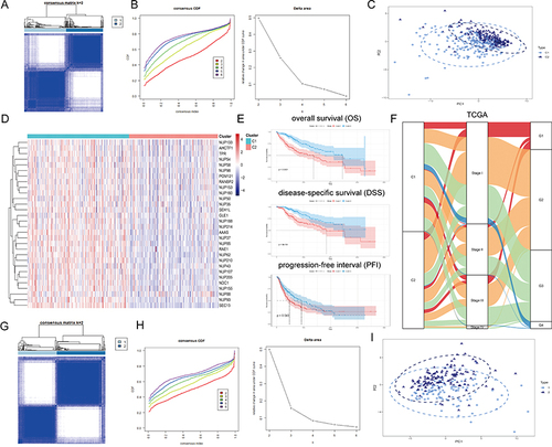
Figure 2 Unsupervised Machine Learning algorithms have been used to identify 2 molecular subtypes. (A) The consensus score matrix of all samples when k = 2. The higher the consensus score was, the more likely they were assigned to the same group based on TCGA-LIHC. (B) Left: The cumulative distribution function (CDF) curves in consensus cluster analysis. CDF curves of consensus scores by different subtype numbers (k = 2, 3, 4, 5, and 6) were displayed. Right: Relative change in area under the CDF curve for k = 2–6. (C) The Principal Component Analysis (PCA) distribution of TCGA-LIHC samples by expression profile of calcium channel molecules. Each point represents a single sample; different colors represent the C1 and C2 subtypes respectively. (D) Expression distribution of 30 NPC molecules between two subtypes based on TCGA. (E) Survival analysis including Overall Survival (OS), Disease-Specific Survival (DSS) and Progression-Free interval (PFI) based on 2 subtypes (TCGA-LIHC, Logrank test, n = 374). (F) The Sankey diagram fully demonstrated the association between Clinicopathological and subtypes attributes. (G) The consensus score matrix of all samples when k = 2. The higher the consensus score was, the more likely they were assigned to the same group based on ICGC. (H) Left: The cumulative distribution function (CDF) curves in consensus cluster analysis. CDF curves of consensus scores by different subtype numbers (k = 2, 3, 4, 5, and 6) were displayed. Right: Relative change in area under the CDF curve for k = 2–6. (I) The Principal Component Analysis (PCA) distribution of ICGC samples by expression profile of NPC-related molecules. Each point represents a single sample; different colors represent the C1 and C2 subtypes respectively. (J) Expression distribution of 30 NPC molecules between two subtypes based on ICGC. (K) Survival analysis including Overall Survival (OS) based on two subtypes (ICGC, Logrank test, n = 240). (L) The Sankey diagram fully demonstrated the association between Clinicopathological and subtypes attributes based on ICGC.
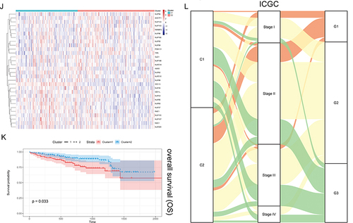
Figure 3 Variations in immune-related genes and the infiltration characteristics of TME cells in the 2 NPC phenotypes. (A) The thermogram shows variations in mRNA expression of chemokines, interferons, interleukins, and other cytokines between the 2 levels of NPCs. (B) The thermogram shows the frequency of TME infiltrating cells and immune score in 2 NPC phenotypes. (C) Representative pictures of pathological Hematoxylin-eosin (HE) staining of 2 NPCs phenotypes (Magnification, ×100, scale bars = 100 μm; Magnification, ×400, scale bars = 20 μm). (D) The violin plots specifically showed the TME related scores of different NPC patterns (Welch’s t-test). (E) The violin plots specifically showed the differences in 2 NPC phenotypes in terms of immune cell infiltration level, stromal cell content, and tumor purity (Welch’s t-test).
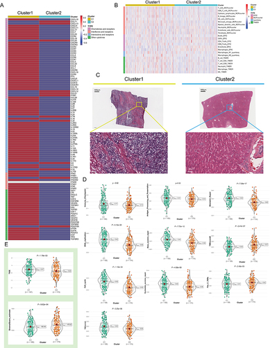
Figure 4 Analysis of NPC-related signal pathways. (A) Word cloud for the frequency of NPC-related research. (B) The heatmap shows the correlation between the expression level of the 30 NPC molecules in important cancer signaling pathways. The global percentage of cancers in which a gene has an effect on the pathway among the 32 cancers types, is shown as the percentage: (number of activated or inhibited cancer types/32 *100%). Heatmap shows NPC molecules that have a function (inhibit or activate) in at least 5 cancer types. “Pathway activate” (red) represents the percentage of cancers in which a pathway may be activated by given genes, inhibition in a similar way shown as “pathway inhibit” (blue). (C) The correlation between the 30 NPC molecules in Hepatocellular carcinoma (HCC) and important cancer signaling pathways. The solid line represents activation and the dashed line represents inhibition. (D) Expression difference analyses between the two subtypes were performed with the “limma” R package based on TCGA-LIHC, and a volcano plot was constructed. Blue, genes highly expressed in C2; Red, genes highly expressed in C1; Grey, genes with no statistical difference in expression level. (E) The mountain graph shows the differences in HCC characteristic pathway scores in the 2 NPC subtypes. (F) The co-expression network based on Multiscale Embedded Gene Co-Expression Network Analysis (MEGENA). Each node represents a module, with the larger nodes indicating a higher number of genes. The two largest gene modules are marked in Orange (C1_2) and blue (C1_9), respectively. (G and H) The MEGENA network showing the top two gene module. The darker the color and the larger the size, the more important it is in the network, the more important it is in the network, and the darker the color of the line, the greater the weight value between the nodes. (I) The signaling pathways involved in C1_2 and C1_9 were enriched using the “simplifyEnrichment” package. The bar chart on the left shows the degree of enrichment of different GO terms in different modules, the heat map in the middle shows the clustering of 287 GO terms, and the word cloud on the right summarizes the important GO terms. The redder the color, the higher the similarity between GO terms and the smaller the P-value. (J) Survival analysis of the hub genes in C1_2 (upper part) and C1_9 (lower part) in TCGA-LIHC. Red dots represent HR > 1. Blue dots represent HR < 1. Black circles indicate statistically significant (P < 0.05) and larger circles represent smaller P values. (K) The expression level of 14 modular hub genes is significantly different in 2 NPCs subtypes.
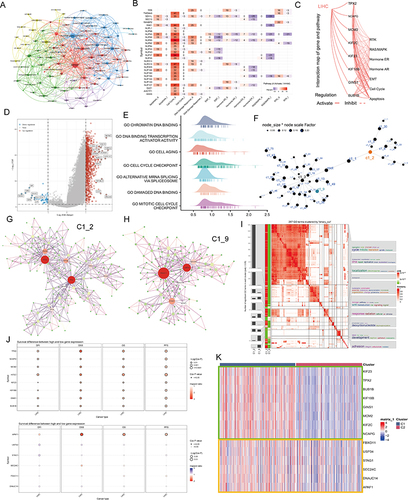
Figure 5 Single cell analysis. (A) Cells were clustered into 23 types via Uniform Manifold Approximation and Projection (UMAP) plot dimensionality reduction algorithm, each color represents a unique cluster. (B) 6 cell types were identified with its unique gene marker in UMAP dimensionality reduction analysis. (C) Bubble plot demonstrating each cell type and its gene marker. The bubble color represents the average expression and the bubble size represents the percent expression. (D) Bubble plot demonstrating expression of the hub genes in C1_2 (the upper part) and C1_9 (the lower part). The bubble color represents the average expression and the bubble size represents the percent expression. (E) Hepatocyte are distinguished from all other cells based on UMAP dimensionality reduction analysis. (F) UMAP dimensionality reduction analysis demonstrating the tissue origin of hepatocytes. Red for the adjacent liver, blue for the tumor. (G) Bubble plot demonstrating expression of the hub genes in C1_2 in 1824 hepatocytes. The bubble color represents the average expression and the bubble size represents the percent expression. (H) Heatmap demonstrating the feature genes of each cell cluster. (I) tSNE demonstrating the degree of differentiation of each hepatocyte cluster assessed by CytoTRACE. (J) Box plot showing the differentiation score of each hepatocyte cluster. (K) Up-regulated HALLMARK pathways in Cluster 1. Different gene sets are represented by lines of different colors, and up-regulated genes are located on the left approaching the origin of the coordinates, while the down-regulated genes are on the right of the x-axis. Only gene sets with NOM p < 0.01 and FDR q < 0.06 were considered significant. The top 5 gene sets are displayed in the plot. (L and M) UMAP (L) and violin (M) plots showing the expression of NPC feature in 1824 hepatocytes, respectively. For UMAP, each point corresponds to a hepatocyte and is color-coded to reflect density. (N) Box plot showing the difference in tumor stemness measured by mRNAsi between the two NPC subtypes of TCGA-LIHC. (O and P) Correlation between TPX2 (O), NPC (P) levels and mRNAsi (TCGA-LIHC, Spearman method). (Q) Monocle 3 pseudotime analysis for 1824 hepatocytes. (R) Cell cycle phase projected onto the UMAP. Approximately, 0.5p is associated with the beginning of S phase, p with the beginning of G2M phase, 1.5p with the middle of M phase, and 1.75p-0.25p with G1/G0 phase. (S) Bar chart on the left showing the relative percentage of cells in different phases across different cell clusters. The x axis represents the proportion of cells in different phases, while the y axis represents the identified six clusters. Bar chart on the right showing the relative number of cells in each cluster. (T) Circle plot showing the potential ligand-receptor pairs between cluster 1/other cluster hepatocytes and other type cells (predicted by CellphoneDB). **P < 0.01.
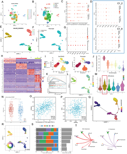
Figure 6 TPX2 can alter the proliferation behavior and stemness characteristic of tumor cells by regulating the level of NPC. (A) Multiplex immunofluorescence demonstrating the subcellular distribution of TPX2 protein in cell line sections (HPA database). (B) Correlation analysis of the TPX2 expression levels with MKI67 based on TCGA, ICGC datasets and our own samples. Matched HCC tissue sections of adjacent slides were displayed to prove the correlation of TPX2 and Ki-67 expression. The correlation analysis was based on immunohistochemical H-score (n = 40) (Magnification: ×400, scale bars = 50 μm; Spearman correlation coefficient). All the IHC scores were repeated three times using a double-blind method. Statistical analysis All experiments were repeated at least three times, independently. (C) The word cloud (left) and histogram (right) show the frequency of NPC members in PUBMED over the past five years. (D) TPX2 expression in different HCC cell lines based on the Cancer Cell Line Encyclopedia (CCLE). See also Figure S8. (E and F) Cell proliferation and Clone formation in HCC cell (HuH-7 and Li-7) transfected with the NC, sh-TPX2, oe-TPX2, oe-TPX2+si-NUP98, oe-TPX2+si-NUP153 constructs (Magnification: ×1). All experiments were repeated at least three times, independently. (G) Single staining technique by TUNEL, and DAPI staining in the Li-7 and HuH-7 cells. Representative images of TUNEL staining; red cells indicate TUNEL‐positive cells. All experiments were repeated at least three times, independently (Magnification: ×400, scale bars = 20 μm). (H and I) Sphere-forming assay of cells (magnification, × 100, scale bars = 100 μm). All experiments were repeated at least three times, independently. (J) Immunofluorescence analysis reveals colocalization of NUP98, NUP153 and TPX2 in HCC tissue. All experiments were repeated at least three times, independently (Magnification: ×400, scale bars = 20 μm). **P < 0.01, ***P < 0.001, ****P < 0.0001.
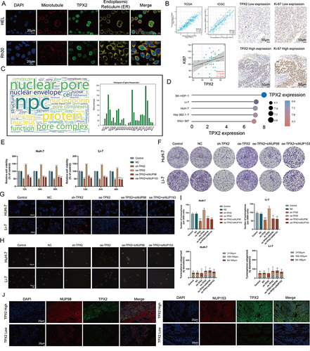
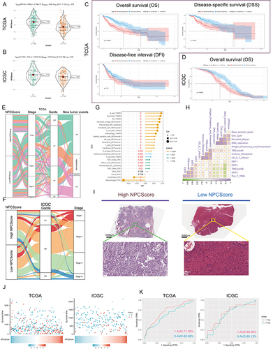
Figure 7 Clinical significance of NPCScore. (A and B) The violin plots show the NPCScore in 2 different NPC subtypes. The line in the box represents the mean value (A) based on TCGA-LIHC; (B) based on ICGC). (C and D) The Kaplan-Meier curve shows a significant difference in the survival rate between high and low NPCScore groups. (C) TCGA-LIHC, logrank test, n = 374; (D) ICGC, logrank test, n = 240). (E and F) The Sankey diagram shows the correlation between NPCScore and HCC Clinicopathological classifications (E) based on TCGA-LIHC; (F) based on ICGC). (G) The bubble chart shows the correlation between the NPCScore and the level of immune cell infiltration. The color indicates the P-value. The bubble size indicates the degree of correlation; with larger bubbles indicating a stronger correlation. (H) The chart shows the correlation between the NPCScore and TME score. Purple cube indicates a positive correlation, green cube indicates a negative correlation, and color depth and cube size represent the strength of the correlation. The darker color indicates a larger volume and a higher positive correlation. (I) Image representing the pathological HE staining variation between the high and low NPCScore groups (Magnification, ×100, scale bars = 100 μm; Magnification, ×400, scale bars = 20 μm). (J) The distribution of OS in the TCGA (left) and ICGC (right) cohort. (K) The predictive value of the NPCScore was evaluated using time-dependent Receiver operating characteristic (ROC) curve analysis within 1 and 3 years.
Data Sharing Statement
We declare that all the data in this article are authentic, valid, and available for use on reasonable request. All the data supporting this study are available from the corresponding author Prof. Yong-hua Zhang ([email protected]).