Figures & data
Table 1 The Primer Sequences for qRT-PCR Validation of Biomarkers
Figure 1 The differentially expressed propionate metabolism-related genes (DE-PMRGs) and functional enrichment analysis. (A) 3690 differentially expressed genes (DEGs) between liver Hepatocellular carcinoma (LIHC) and normal control (NC) samples. (B) The venn diagram of 132 DE-PMRGs. (C and D) The Gene Ontology (GO) functions (C) and Kyoto Encyclopedia of Genes and Genomes (KEGG) pathways (D) enriched by 132 DE-PMRGs. BP, biological progress; CC, cellular component; MF, molecular function.
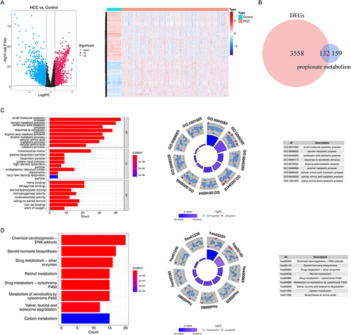
Table 2 The Coefficient of the Biomarkers
Figure 2 Construction and validation of prognostic model for LIHC. (A) The forest diagram of 44 biomarkers obtained by univariate cox analysis (p < 0.01). (B) The coefficients of biomarkers and the error plot for cross-validation in the least absolute shrinkage and selection operator (LASSO) analysis. The different colored lines in the graphic above represent different genes. (C) Kaplan-Meier plot of patients in a low- or high-risk group (p < 0.0001), and the number of patients in different risk groups. (D) Up: The risk score of each patient with LIHC. Medium: The patient survival based on the risk score. Down: The heat map of the 5 biomarkers in the high- and low-risk group. (E) Receiver operating characteristic (ROC) curves for the predictive value of the prognostic model for different years. AUC: area under the curve. (F–H) Validation of the prognostic model in GSE14520 dataset. (F) Kaplan-Meier plot of patients in a low- or high-risk group (p = 0.00065), and the number of patients in different risk groups. (G) Up: The risk score of each patient with LIHC. Medium: The patient survival based on the risk score. Down: The heat map of the 5 biomarkers in the high- and low-risk group. (H) ROC curves for the predictive value of the prognostic model for different years.
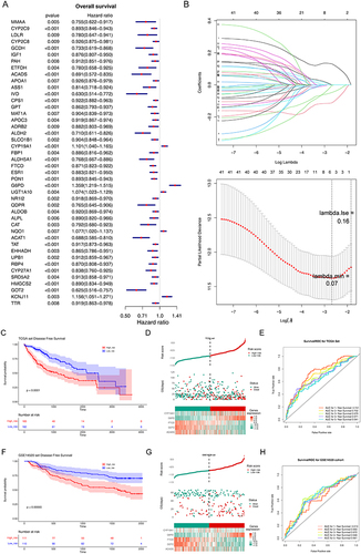
Figure 3 Independent prognostic analysis and clinical correlation analysis. (A) Comparison of risk scores among different sub-types for different clinical factors. ns, not significant; *p<0.05; ** p<0.01; ***p<0.001; ****p<0.0001. (B and C) Three independent prognostic factors obtained by univariate (B) and multivariate (C) COX regression analyses. (D) The nomogram was constructed based on three independent prognostic factors to predict the probability of 1/3/5-year survival. (E and F) The calibration curve (E) and decision curve analysis (DCA) curve (F) of the nomogram. (G) ROC curves of the nomogram and independent prognostic factors.
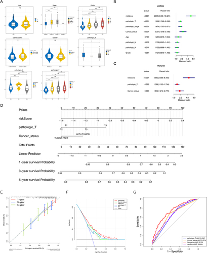
Figure 4 Gene set enrichment analysis (GSEA) of high-risk groups. (A and B) The GO terms (A) and KEGG pathways significantly enriched in the high-risk group. (C) Discrepancies of invasion score, angiogenesis score, mesenchymal transition (EMT) score, and mRNAsi score between high- and low-risk groups. *p < 0.05, **p < 0.01, ***p < 0.001; ****p<0.0001.
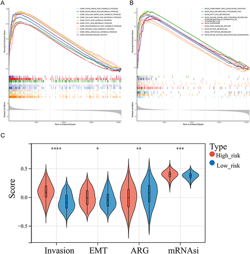
Figure 5 Analysis of immune infiltration and immunotherapy between high- and low-risk groups. (A) The proportion of 22 immune cells in LIHC samples. (B) Discrepancies of immune cells between high- and low-risk groups. ns, not significant; *p<0.05; ** p<0.01; ***p<0.001; ****p<0.0001. (C) Comparison of 47 immune checkpoints expression between high- and low-risk groups. ns, not significant; *p<0.05; ** p<0.01; ***p<0.001; ****p<0.0001. (D and E) The discrepancies of immunophenscore (IPS) (D) and tumor immune dysfunction and exclusion (TIDE) score (E) between high- and low-risk groups. ns, not significant; *p<0.05; ** p<0.01. (F) Comparison of immune score, ESTIMATE score, stromal score, and tumor purity between high- and low-risk groups. *p < 0.05, **p < 0.01.
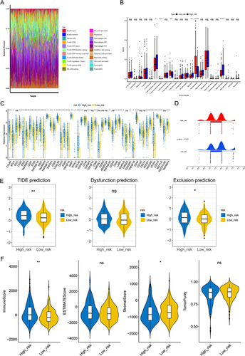
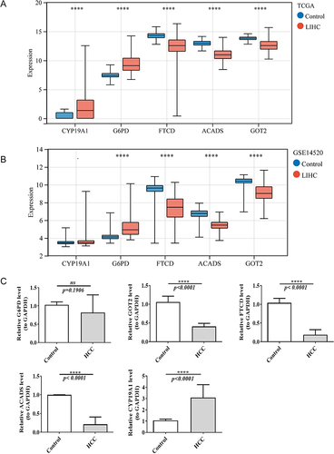
Figure 6 The expression of five biomarkers in LIHC and normal samples in TCGA dataset (A) and GSE14520 dataset (B). ****p<0.0001. (C) The mRNA expression of biomarkers in normal and HCC samples by real-time reverse transcription PCR (qRT-PCR). ns, not significant; ****p<0.0001.