Figures & data
Figure 1 Workflow of CEUS-based radiomics modeling for the T cell-inflamed GEP prediction in HCC patients. First, ROIs of CEUS images were delineated manually (the area filled in red represented the ROI). RNA-seq was performed on tumor samples and the GEP was calculated. Second, seven categories of features were extracted and LASSO and logistic regression were used to construct the model. Last, model evaluation and validation were performed.
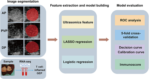
Figure 2 An example of segmentation of three-phase images from a 58-year-old man. The figures above respectively show representative images of the arterial phase (a), the portal venous phase (b), and the delayed phase (c), along with their corresponding regions of interest (ROI) (d-f). The red curve represented the tumor contour.
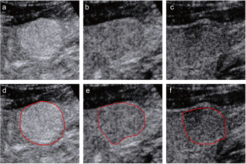
Table 1 Clinic-Pathologic Characteristics of the Patients in the Primary Cohort
Figure 3 Radiomics feature selection using LASSO regression in the primary cohort. (a) Optimal tuning parameters (λ) in the LASSO model binomial deviation diagram. (b) The coefficient profile plot of the 36 selected radiomics features of the AP model was shown. (c) Heatmap portrayed correlation coefficients matrix of 36 selected radiomics features.
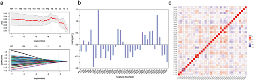
Figure 4 ROC curves of the AP model (a), PVP model (b), DP model (c) and integrated model (d) in the primary cohort. (e) Comparison of AUCs of four models using the Delong test. (f) ROC of AP model for 5-fold cross-validation. AUC, area under the receiver operating characteristic curve.
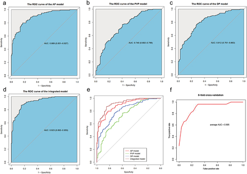
Table 2 Results of the Univariate and Multivariate Analysis in the Primary Cohort
Figure 5 The assessment of the model calibration curve and decision curve analysis (DCA) in the primary cohort. (a) Calibration curve: The ideal line was the standard curve, and the bias-corrected line was the calibrated predicted curve. The closer the calibration curve was to the ideal curve, the better the predictive ability of the model was. (b) Decision curve analysis (DCA): Net benefit of intervention according to radiomics model.
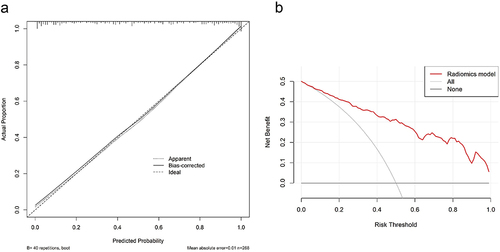
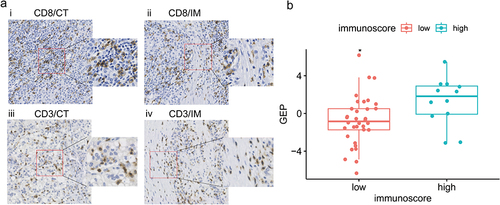
Figure 6 Analysis of correlation between the Rad-score and Immunoscore in the independent cohort. (a) Representative examples of CD8+ (i, ii) and CD3+ (iii, iv) immunostaining in tumor center (CT) and invasive margin (IM) of HCC tissue specimens with high Rad-score. Immunostained cells were brown and tumor cells were blue in color. (b) The Rad-score of the high Immunoscore group (blue) was significantly higher than that of the low Immunoscore group (red). * p < 0.05.