
Figures & data
Figure 1 Flowchart of the patient selection process.
Abbreviations: uHCC, unresectable hepatocellular carcinoma; PS, performance status.
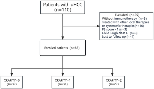
Table 1 Baseline Demographic and Clinical Characteristics of Enrolled Patients
Figure 2 (A) Kaplan–Meier curve for overall survival among the three groups. (B) Kaplan–Meier curve for progression-free survival among the three groups.
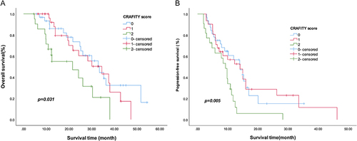
Figure 3 (A) Kaplan–Meier curve for overall survival between CRAFITY<2 group and CRAFITY 2 group. (B) Kaplan–Meier curve for progression-free survival between CRAFITY<2 group and CRAFITY 2 group.
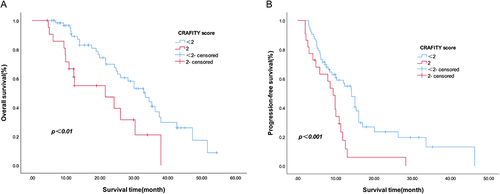
Table 2 Tumor Response for Each Group
Table 3 Treatment-Related Adverse Events
Table 4 Multivariate Analyses Factors Associated with OS and PFS