Figures & data
Table 1 Demographics and Clinical Characteristics of Participants in the Development and Validation Cohorts
Figure 1 Construction of predictive nomogram in hospitalized patients with SARS-CoV-2 infection. (A) Least absolute shrinkage and selection operator (LASSO) coefficients profiles (y-axis) of the twenty high dimensional predictors, which uses a L1 penalty to shrink some regression coefficients to exactly zero. The upper x-axis is the average numbers of predictors and the lower x-axis is the log(λ). (B) Fivefold cross-validation for tuning parameter selection in the LASSO model. The area under the receiver operating characteristic (AUC) with error bar is plotted against log(λ), where λ is the tuning parameter. The dotted vertical lines are drawn at the optimal values by minimum criteria and the one standard error of the minimum criteria (1se criteria). The upper x-axis is the average numbers of predictors and the lower x-axis is the log(λ). To avoid overfitting, 1se criteria (λ=0.031) was selected. (C) Nomogram predicted SARS-CoV-2 infection of hospitalized patients with eleven laboratory indicators, including RBC, HGB, PLT, NEUT, LYMPH, MONO, RDW, MPV, ALB, GLB and CRP. Each level of every variable was conferred a score on the scale of points. By summing up the scores of selected variables, a total score was available. The prediction possibility corresponding to this total score was used to predict SARS-CoV-2 infection of hospitalized patients.
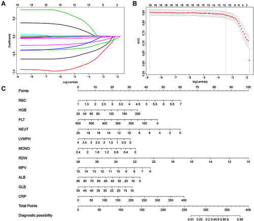
Figure 2 The precision-recall curve of four machine learning model. (A) Logistic regression. (B) Support vector machine (SVM). (C) Decision tree classification. (D) Random forest (RF).
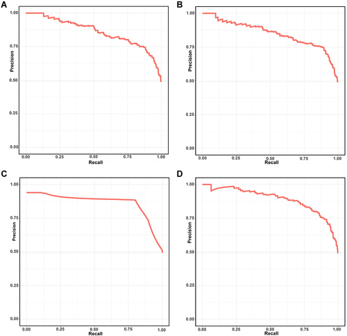
Figure 3 The ROC curve of four machine learning model. (A) Logistic regression. (B) Support vector machine (SVM). (C) Decision tree classification. (D) Random forest (RF).
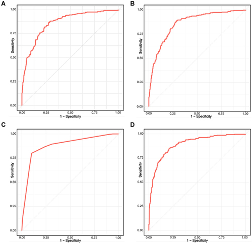
Figure 4 The calibration, DCA and CICA curves of the nomogram. (A) The calibration curve of the nomogram in the development cohort. (B) The calibration curve of the nomogram in the validation cohort. (C) The decision curve analysis (DCA) of the nomogram in the development cohort. The y-axis represents the net benefit and the x-axis represents the predicted probability of SARS-CoV-2 infection: a perfect prediction model (grey line), screen none (black line) and screen based on the nomogram (red line) (D) The clinical impact curve analysis (CICA) of the nomogram in the development cohort. The red line (number of high-risk individuals) is the number of people who are classified as positive by the model at each threshold probability, the blue line (number of high-risk individuals with event) indicates the number of true positives at each threshold probability.
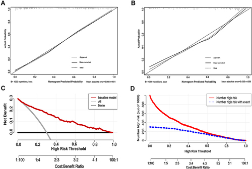
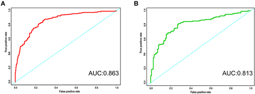
Figure 5 The ROC curve of the nomogram. (A) The ROC curve of the nomogram in the development cohort. (B) The ROC curve of the nomogram in the validation cohort.