Figures & data
Table 1 Baseline Characteristics of the Recruited Datasets
Figure 1 Flow chart.
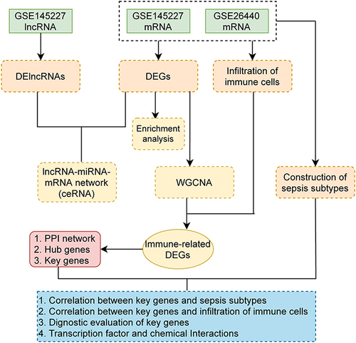
Figure 2 Differentially expressed genes (DEGs) analysis and immune-related genes. (A and B) The volcano plot of GSE145227 and GSE26440 expression matrix. (C and D) The heatmap of GSE145227 and GSE26440 expression matrix. (E) Venn diagram of DEGs in GSE145227 and GSE26440. (F) Venn diagram of immune-related genes in DEGs.
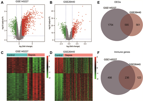
Figure 3 Kyoto Encyclopedia of Genes and Genomes (KEGG) pathway enrichment analysis of differentially expressed genes (DEGs). (A) The KEGG analysis of DEGs is displayed in the form of bubble graphs. The closer the colour is to red, the smaller the P is. The larger the bubble is, the more enriched DEGs are in the pathway. (B) The KEGG analysis of DEGs is displayed in the form of bar graphs. The closer the colour is to red, the smaller the P is. The horizontal axis indicates the number of genes enriched in the pathway. (C) Network diagram of the KEGG results.
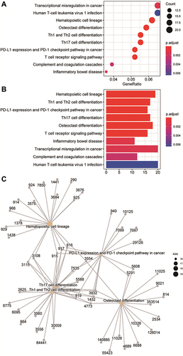
Figure 4 Gene Ontology (GO) enrichment analysis of differentially expressed genes (DEGs). (A) The enrichment results of biological process, cellular component, and molecular function in the GO analysis are shown in the form of bubble graphs. The closer the colour is to red, the smaller the P is. The larger the bubble is, the more enriched DEGs are in the pathway. (B) The biological process, cellular component, and molecular function enrichment results of the GO analysis are shown as a bar graph. The closer the colour is to red, the smaller the P is. The horizontal axis represents the number of enriched genes in the pathway.
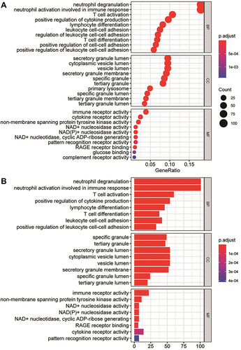
Figure 5 Immune cell infiltration analysis. (A and B) Comparison of the degree of immune cell infiltration in the GSE145227 and GSE26440 datasets between the sepsis group and the normal control group. (C and D) The correlation matrix of immune cells with significant differences. Red indicates positive correlation, blue indicates negative correlation, and a darker colour indicates a stronger correlation. The nonsignificant ones are indicated by a black “X”. *P < 0.05, **P < 0.01, ***P < 0.001, ****P < 0.0001.
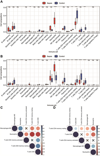
Figure 6 Construction of competing endogenous RNA (ceRNA) network and Weighted gene co-expression network analysis (WGCNA). (A) ceRNA network. Orange is the miRNA, grey is the lncRNA, red is the upregulated mRNA, and blue is the downregulated mRNA. (B) Venn diagram of the comparison between the mRNA predicted by the lncRNA and the differentially expressed genes (DEGs). A total of 10 mRNAs that competed with the lncRNA for binding to the miRNA were found. (C and E) WGCNA results of the DEGs of GSE145227 and GSE26440. The cluster analysis of genes is represented by a tree diagram, and the modules of gene classification are represented by different colours. (D and F) Correlation matrix between the module scores obtained by the WGCNA of GSE145227 and GSE26440 and the degree of differential immune cell infiltration. Red indicates a positive correlation, and green indicates a negative correlation. The darker the colour, the higher the degree of correlation. The correlation coefficient and P value are displayed in the grid in the matrix.
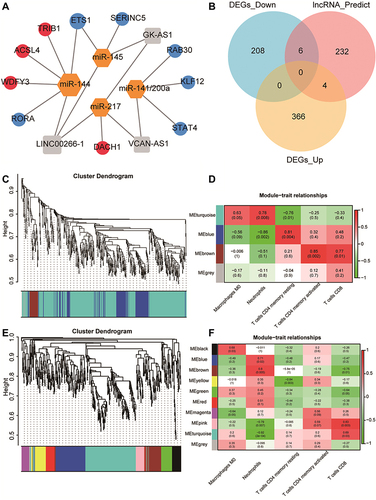
Figure 7 Results of protein-protein interaction (PPI) analysis and screening of immune-related key genes. (A and B) The PPI network diagram of GSE145227 and GSE26440. The larger the node, the larger the clustering coefficient, indicating that the gene occupies a more important spot in the network. (C and D) Diagrams of hub genes obtained from GSE145227 and GSE26440. The hub genes were the top 20 differentially expressed genes by the Matthews correlation coefficient score of the maximum correlation algorithm. The darker the colour, the greater the proportion of interactions this gene has in the network. (E) The comparison of the hub genes obtained from the two datasets yielded six key genes.
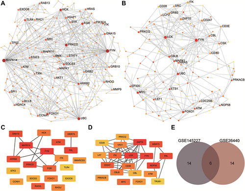
Figure 8 The ability of key genes to diagnose sepsis and the interactions between transcription factors and small-molecule compounds. (A and C) Differences in the expression levels of key genes in the GSE145227 and GSE26440 datasets between the sepsis and normal control groups. (B and D) Receiver operating characteristic curves of the ability of the key genes in the GSE145227 and GSE26440 datasets to differentiate between the sepsis and the normal control group. (E) Network diagram of the interaction between key genes and transcription factors. (F) The network diagram of the interaction between key genes and small-molecule compounds. **P < 0.01, ***P < 0.001, ****P < 0.0001.
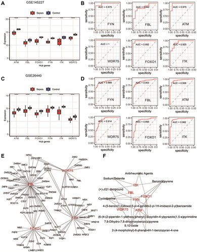
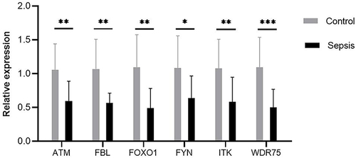
Figure 9 Expression of six key genes were compared between controls and septic children by real-time quantitative polymerase chain reaction. Differences between two groups were analyzed using the t-test or Mann–Whitney U-test. *P < 0.05, **P < 0.01, ***P < 0.001.