Figures & data
Figure 1 Expression variation of connexins. (A) pattern map shows the molecular regulatory mechanism of connexins and their potentially important regulatory role in EMT of tumor/non-tumor cells. (B) Connexins with neighboring genes showing physical interactions, co-expression, co-localization, predicted common pathways, genetic interactions, and common protein domains. (C) The correlation between the 11 connexins in CRC and important cancer associated signaling pathways. The solid line represents activation and the dashed line represents inhibition. (D) Differential expression of connexins between CRC and paired normal tissues. (E) Relationship between CNVs, DNA methylation and connexins expression. Red indicates positive correlation; blue indicates negative correlation. The deeper color indicates a larger correlation index. The bubble size indicates the FDR. (F) The correlation between CNVs, DNA methylation of the 21 connexins and CRC patients’ survival including DFI, DSS, OS, PFS. Red shows a positive correlation and blue shows a negative correlation. The darker color indicates a larger correlation index. Bubble size indicates the FDR. (G) Correlation between expression levels of connexins, red represents positive correlation, blue represents negative correlation, and shades of yellow indicates the P values. (H) Mutation frequency of 21 connexins in 620 patients with CRC in the TCGA-COADREAD cohort. Each column represents an individual CRC patient. (*P < 0.05, **P < 0.01, ***P < 0.001).
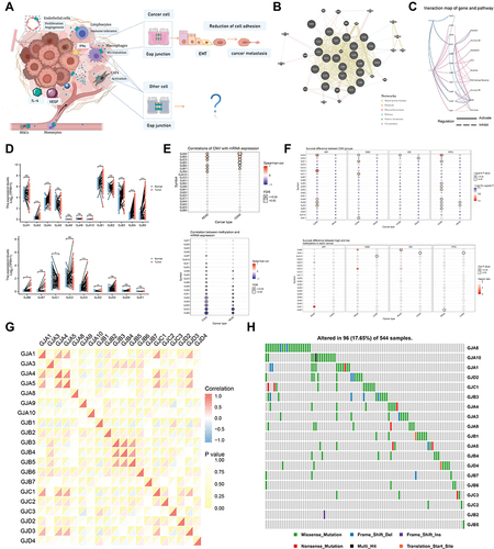
Figure 2 The landscape of connexins in CRC and the characteristics of two clusters. (A) The cumulative distribution function (CDF) curves in consensus cluster analysis. CDF curves of consensus scores by different subtype numbers (k = 2, 3, 4, 5, and 6) were displayed. Relative change in area under the CDF curve for k = 2–6 was also shown. (B) The consensus score matrix of all samples when k = 2–6. (C) The PCA distribution of TCGA-COADREAD samples by expression profile of connexins. Each point represents a single sample; different colors represent the C1 and C2 clusters respectively. (D–F) Survival analysis of (D) OS, (E) PFS, and (F) DFS based on two clusters. (G) Expression distribution of 21 connexins between two clusters, connexins with 0 expression in most samples have been removed. (H) Distribution of clinical characteristics of two subtypes, including ‘tumor-node-metastasis” (TNM) stages and pathological stage. (I) The thermogram shows variations in mRNA expression of chemokines, interleukins, alterons, and other cytokines between two clusters. (J) Representative pictures of pathological HE staining of two clusters. (K–L) The differences of (K) TME infiltrating cells and (L) common immune checkpoints between the two connexins phenotypes (Kruskal–Wallis test). (*P < 0.05, **P < 0.01, ***P < 0.001).
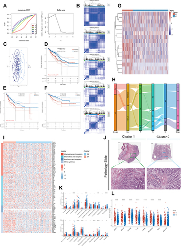
Figure 3 Analysis of connexins-related functions. (A) Mutation annotation of the top 20 frequently mutated genes in the TCGA-COADREAD cohort.(B) Comparison of the difference in mutation between C1 and C2 clusters. (C) The heatmap shows the correlation between the expression level of the 21 connexins in important cancer signaling pathways. The global percentage of cancers in which a gene has an effect on the pathway in COAD and READ, is shown as the percentage: (number of activated/inhibited cancer types/2 *100%). “Pathway activate” (red) represents the percentage of cancers in which a pathway may be activated by given genes, inhibition in a similar way shown as “pathway inhibit” (blue). (D) Volcano plot of Differentially expressed genes (DEGs) induced by alterations in connexins levels. red dots, with statistical significance; blue dots, not statistically significant; abscissa, expression differences (log2 fold change); ordinate, significance of differences (−log10 P value). (E) Network of DEGs. Darker colors and larger sizes indicate higher degrees. (F) The correlation between 10 hub genes from the network and important cancer signaling pathways. Red stands for COAD and blue stands for READ; the solid line represents activation and the dashed line represents inhibition. (G) GSEA of the status of special biological pathways in two connexins phenotypes. (H) LASSO model fitting. Each curve represents a gene. The profiles of coefficients were plotted versus log(λ). Vertical lines indicate the positions of seven genes with coefficients greater than 0 determined by 10-fold cross-validation. λ was determined from 10-fold cross-validation. The x-axis represents log(λ); the y-axis represents binomial deviance. Optimal values calculated from minimum criteria and one standard error of the criteria are indicated by the dotted vertical lines. (I) Univariate Forest plot and multivariate forest plot showing association between 4 candidate genes expression and OS, PFI, DSS in CRC. (J) Differential expression of GJA3, GJA4, and GJB6 between normal tissue and CRC tissue by using public datasets from Gene Expression Omnibus (GSE10950 and GSE44861). (K) Differential expression of GJA3, GJA4, and GJB6 between C1 and C2 clusters based on TCGA-COADREAD data. (L) Relationship between GJA3, GJA4, GJB6 levels and immune cell infiltration based on ssGSEA. The size of the bubble represents the strength of the correlation and the color of the bubble represents the P-value. (*P < 0.05, ****P < 0.0001).
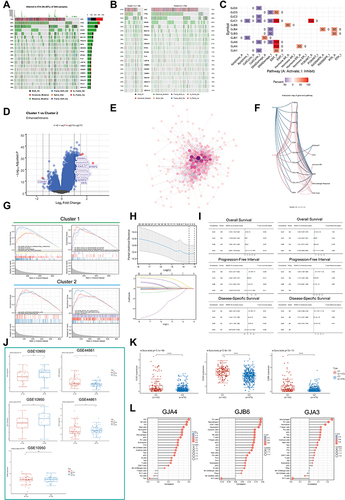
Figure 4 Clinical value of GJA4. (A) Representative immunohistochemistry images of GJA4 and GJA3 in CRC and noncancerous tissues derived from the HPA database. (B) Staining strengths were annotated as not detected, low, medium, and high. Bar plots indicate the number of samples with different staining strengths. (C and D) Correlations between GJA4 level and clinicopathological characteristics in (C) COAD and (D) READ from MEXPRESS. (E) Association of GJA4 mRNA expression with T/N/M stages and pathological stage in CRC patients. (*P < 0.05). (F) OS, DSS, and PFI about GJA4 based on TCGA-COADREAD. (G and H) Representative images of different immunohistochemical staining intensities for GJA4 based on our own samples and statistical comparison of GJA4 expression levels (H-SCORE) in (G) paracancerous and (F) CRC tissue (n = 30). (*P < 0.05, ***P < 0.001).
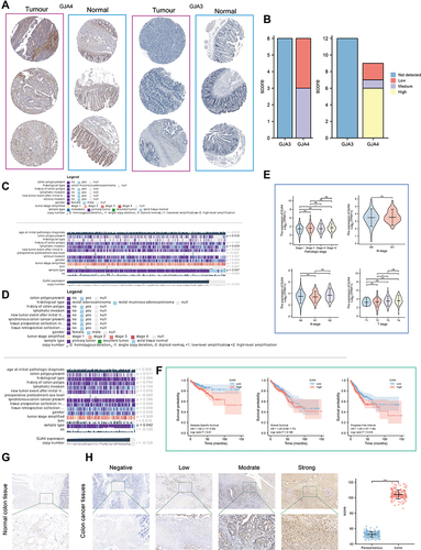
Figure 5 Single cell analysis and immunofluorescence of GJA4. (A) Distribution of GJA4 in normal intestinal epithelium at single level. (B) Single-cell analysis of GJA4 and GJA1 based on single cell RNA‐seq dataset GSE146771. Uniform Manifold Approximation and Projection (UMAP) plots showing different CRC cell types after quality control, reduction of dimensionality, and clustering; Enrichment scores of genes from the Hallmark EMT signaling gene set for each cell, from gene set variation analysis; UMAP plots showing expression of GJA4 and GJA1 clusters; The correlation between GJA1 and GJA4 was also calculated based on TCGA-COADREAD and GEPIA, respectively. (C and D) Dot plot showing the correlation between (C) GJA4, (D) GJA1 and fibroblasts based on the TIMER web tool. (E) Fibroblasts are distinguished from all other cells based on UMAP dimensionality reduction analysis. The t-distributed Stochastic Neighbour Embedding (t-SNE) is also used for dimensionality reduction of the data. (F) Heatmap demonstrating each cluster and its gene marker. (G) Dot plots demonstrate the expression distribution of GJA4 and seven fibroblast marker genes. (H and I) Double immunofluorescence staining images of GJA4 and ACTA2 in the normal and CRC tissue. The representative view of the co-staining of GJA4 and ACTA2 is shown in the enlarged images view below. Scale bars, 100 and 20 mm (enlarged images). Nuclei (DAPI) in blue.
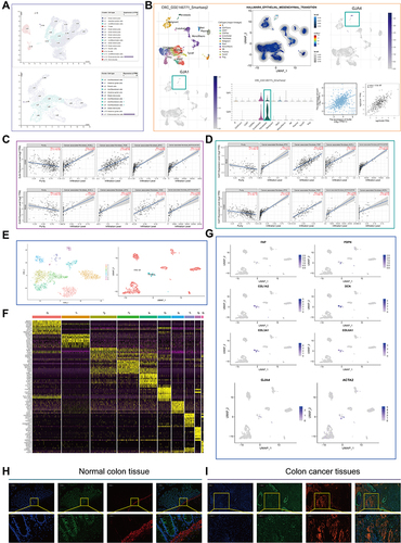
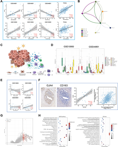
Figure 6 The role of GJA4 in the immune microenvironment. (A) The correlation between GJA4 mRNA expression with stromal/immune score and tumor purity in the GSE44861, GSE10950 and TCGA datasets. (B) Cellular communication from scTIME Portal. (C) Schematic diagram demonstrating the driving effect of fibroblasts on macrophage polarization. (D) Proportion of 22 types of Tumor-initiating cells (TICs) in the CRC tumor samples based on GSE10950 and GSE44861. (E) Correlation of the GJA4 expression levels with macrophage abundance based on GSE10950 and GSE44861. (F) Correlation between GJA4 and the M2 macrophage marker CD163 based on immunohistochemical H-score calculation. (G) Volcano map showing the genes co-expressed with GJA4. red dots, positively correlated genes; grey dots, not statistically significant; abscissa, expression differences (log2 fold change); ordinate, significance of differences (−log10 P value). (H) Functional enrichment analysis of the GJA4-related genes including GO and KEGG.