
Figures & data
Figure 1 Study design and the flow chart of patient inclusion.
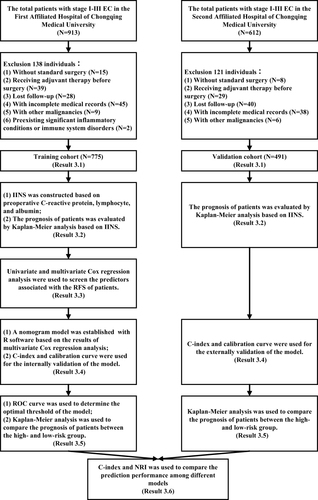
Table 1 Baseline Characteristics of the Training Cohort and the Validation Cohort
Table 2 The Distribution of Inflammation-Immunity-Nutrition Score (IINS) of Two Cohorts
Figure 2 The ROC curve of (A) CRP, (B) ALB, and (C) LYM for predicting the recurrence of EC. Description: “black dot” represents the area under the curve (AUC) at this point is the largest, which suggests that the value of this point is the optimal threshold of the indicator for predicting the recurrence of EC.
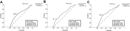
Figure 3 Kaplan–Meier survival curve of IINS in two cohorts. Description: (A) RFS curve of IINS in the training cohort; (B) OS curve of IINS in the training cohort. (C) RFS curve of IINS in the validation cohort. (D) OS curve of IINS in the validation cohort.
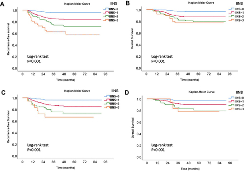
Table 3 Univariate and Multivariate Analysis of Factors Predicting EC Recurrence in the Training Cohort
Figure 4 Nomogram model for predicting the 1-year, 3-year, and 5-year RFS rates of EC patients. Description: to predict the 1-year, 3-year, and 5-year RFS rates of EC patients, locate the patient’s age on the “age” axis. Draw a straight line up to the “point” axis to determine the points for “age”. Repeat the process for each of the remaining axes, drawing a straight line each time to the “point” axis. Add the points received from each variable and locate this point on the “total point” axis. A straight line is drawn down from the “total point” axis to the “1-year RFS”, “3-year RFS”, and “5-year RFS” axis to determine the 1-year, 3-year, and 5-year RFS rates of EC patients.
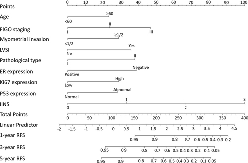
Figure 5 The calibration curve for internal and external validation of the nomogram model. Description: (A–C) the internal calibration curve of the nomogram for predicting the 1-year, 3-year, and 5-year RFS rates of EC patients, respectively; (D–F) the external calibration curve of the nomogram for predicting the 1-year, 3-year, and 5-year RFS rates of EC patients, respectively.
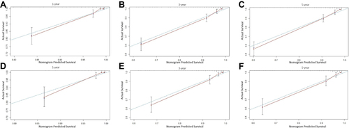
Table 4 Analysis of Survival Differences Between High- and Low-Risk Groups in Training Cohort and Validation Cohort
Figure 6 The ROC curve of the 3-year RFS rates (predicted by the nomogram model) for predicting the recurrence of EC. Description: “black dot” represents the area under the curve (AUC) at this point is the largest, which suggests that the optimal threshold of the 3-year RFS rate (risk threshold of the model) for predicting the recurrence of EC is 0.85 (area under the curve = 0.887; sensitivity, 80.2%; specificity, 83.6%).
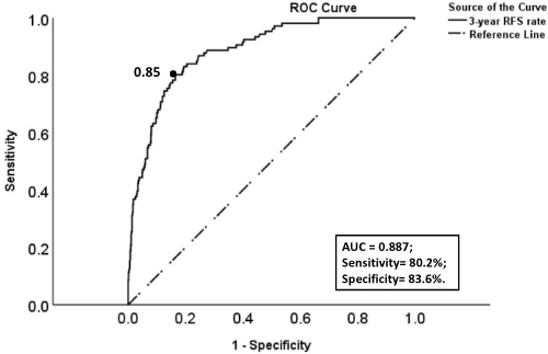
Figure 7 Kaplan–Meier survival curve of low- and high-risk groups in two cohorts. Description: (A) RFS curve of low- and high-risk groups in the training cohort; (B) OS curve of low- and high-risk groups in the training cohort. (C) RFS curve of low- and high-risk groups in the validation cohort. (D) OS curve of low- and high-risk groups in the validation cohort.
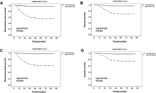
Table 5 The Predictive Performance (C-Index and NRI) of Different Models for Predicting EC Recurrence in the Training Cohort and Validation Cohort