Figures & data
Figure 1 Identification of DEGs. (A) The results of DEGs. (A1) The Volcano plot of DEGs; (A2) The Heatmap of DEGs. (B) The results of SVM-RFE analyses. (C) The results of LASSO analyses. (D) The Venn diagram of the intersections of LASSO regression analysis and SVM-RFE analyses.
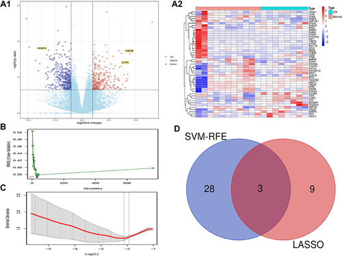
Figure 2 The expressions of hub genes in HCs and ITP groups. Yellow represents the ITP samples, blue represents the HCs samples.
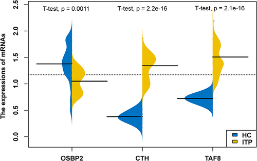
Figure 3 Functional enrichment analysis of DEGs. (A) The results of DO analysis. (B) The results of GO analysis. (C) The results of KEGG analysis.
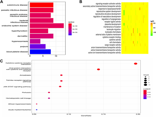
Figure 4 Immune cell infiltration analysis. (A) The results of CIBERSORT. (B) The results of ssGSEA analysis, *p<0.05, **p<0.01. (C) Correlation analysis based on the results of ssGSEA analysis. Blue represents negative correlation; red represents positive correlation.
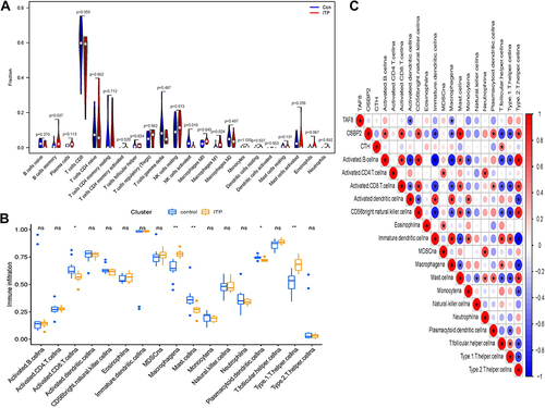
Figure 5 Correlation analysis of immune cells and hub genes. (A1) Correlation analysis of CTH and immune cells. (A2) Correlation analysis of OSBP2 and immune cells. (A3) Correlation analysis of TAF8 and immune cells. (B1) The relationship of CTH and M1 macrophages. (B2) The relationship of OSBP2 and M1 macrophages. (B3) The relationship of TAF8 and M1 macrophages.
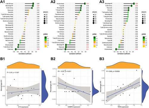
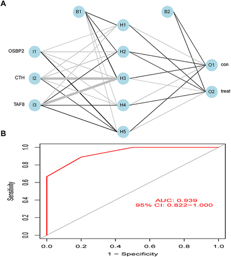
Figure 6 Diagnostic effectiveness of the biomarkers for ITP. (A) The neural network model. (B) ROC analysis was used to validate the diagnostic effectiveness of the biomarkers for ITP. The blue circles represent neurons.