Figures & data
Figure 1 Flowchart of recruiting study cohorts.
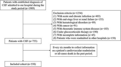
Table 1 Baseline Characteristics of Subjects
Table 2 Comparison of Baseline Characteristics of Patients in Different Outcomes
Table 3 Characteristics of Patients in the Derivation and Validation Cohorts
Table 4 Univariate and Multivariate Cox Analyses of Death or Readmission in Patients with Chronic Heart Failure
Figure 2 Integrating with systemic inflammatory indicators and traditional prognostic factors, a novel nomogram was constructed for the adverse outcome prediction in patients with CHF. The line segment corresponding to each variable is marked with a scale, representing the range of values available for that variable, while the length of the line segment reflects the size of the factor’s contribution to the ending event. “Point” indicates the individual score corresponding to each variable at different values, and “total Point” represents the sum of the individual scores of all variables taken together. Using the total score as a basis and drawing a vertical line downwards, one can know the corresponding future survival rates for that patient for 1, and 3 years.
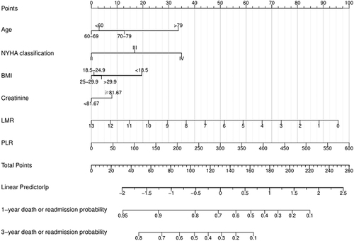
Figure 3 ROC curve analysis of the nomogram. Prediction ability in derivation cohort (A) and validation cohort (B). The horizontal X-axis is 1 - specificity, also known as the false positive rate, the closer the X-axis is to zero the higher the accuracy rate; the vertical Y-axis is called sensitivity, also known as the true positive rate (sensitivity), the larger the Y-axis the better the accuracy rate. The area under the curve is called the AUC (Area Under Curve) and is used to indicate prediction accuracy. The higher the AUC value, the larger the area under the curve, the higher the prediction accuracy.
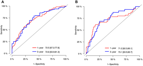
Figure 4 Calibration curve analysis of the nomogram in the derivation cohort (A) and validation cohort (B). Calibration curves are used to assess the difference between the model’s predicted survival rate and the actual one, including the standard curve (grey line) and the working curves (blue and yellow lines), the better the overlap between the working curves and the standard curve, the closer the predicted value is to the actual one.
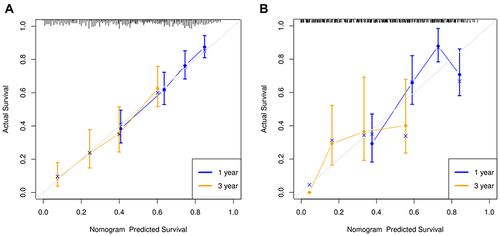
Figure 5 Decision curve analyses of the prediction models in the derivation cohort (A) and validation cohort (B). The horizontal coordinate of the graph is the threshold probability and the vertical coordinate is the net benefit rate after subtracting the disadvantages from the benefits.
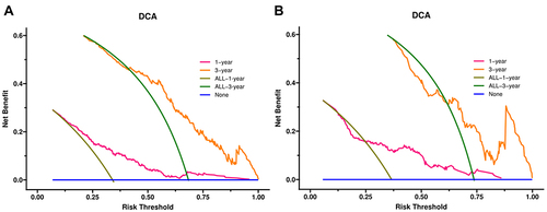
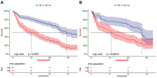
Figure 6 Kaplan-Meier curve analysis between high- and low- risk CHF patients in the derivation cohort (A) and validation cohort (B). The horizontal coordinate of the graph represents survival time, the vertical coordinate represents survival rate, the starting point is the start of follow-up, and the falling curve represents patient death. The P-value results from the Log rank test, which measures whether there is a difference in survival between the two curves.