Figures & data
Table 1 Primers Used for RT-PCR
Figure 1 Assessment of the overall effect of TBI on mice. (A) The overall experimental design and analysis process. (B) Assessment of the degree of weight change (%). (C) Evaluation of modified neurological severity scoring (mNSS). (D) Comparison of contralateral swing (%). (E) The heatmap with hierarchical cluster analysis (Euclidean distance) presents the concentration (pg/mL) of IFN-γ, TNF-α, IL-2, IL-4, IL-6, IL-10, and IL-17A in plasma and urine from Sham or TBI group mice by cytomeric bead array (CBA). (F) Evaluating the expression of biomarkers related to kidney function and injury by RT-PCR. Boxplot represents the quantified mRNA expression level (by ImageJ v1.53s), of kidney related biomarkers. Student’s t-test was used to analyze the statistical significance of differences between groups, and p < 0.05 was considered a significant difference. *p < 0.05.
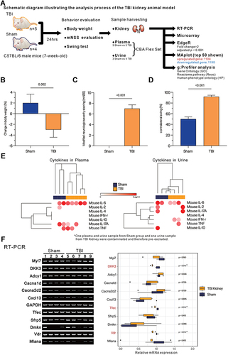
Figure 2 MA plot and Heatmap present the distribution of differentially expressed genes identified in the kidneys of TBI and Sham mice. (A) MA plot represents single gene responses, plotted as log2 mean expression (x-axis) and log2 fold change (y-axis), with the filtering criteria of fold change > 2 (FDR < 0.001), negative fold change representing down-regulated genes in TBI (Blue) and positive fold change representing up-regulated genes (Red). The top 50 genes with the smallest FDR are marked on the MAplot. (B) Differentially expressed genes are presented in the heatmap with hierarchical clustering (determined by Euclidean distance). Gene expression values are converted to Z-scores for visualization.
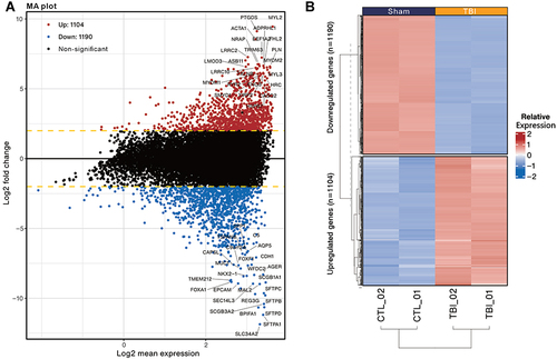
Figure 3 Functional enrichment analysis of up- and down-regulated differentially expressed genes between the kidney and Sham groups in TBI mice using g:Profiler. The analysis was performed in g:Profiler with the selection of GO:BP, GO:MF, GO:CC, Reactome (REAC) and Human Phenotype ontology (HP) databases and grouped by the color of the source database used, with the x-axis showing the negative decimal logarithmic scale values of adjusted p-value. Highlighted dots indicate the ratio of enrichment containing 10 to 80%. Highlighted dots indicate the percentage (%) of differentially expressed genes contained in individual gene sets. Gene-sets associated with kidney diseases in HP database were red-colored.
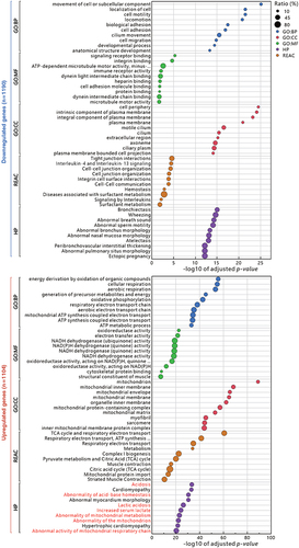
Figure 4 The top 5 Human phenotype ontology gene sets associated with differentially expressed genes are presented in ClusterProfiler Gene-Concept Network (CNET). The gene set names are presented in (A); the genes associated with each gene set are presented in (B); the overall distribution is presented in (C); and the co-expression of all genes associated with the top 5 gene sets is presented in Heat plot (D). Commonly enriched gene families are presented in red text. The fold change colour bar represents the degree of up-regulation (positive) or down-regulation (negative) of individual genes in the TBI. Size represents the number of genes contained in the gene-set.
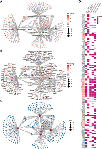
Figure 5 Enrichment map presents the distribution and enrichment of GOBP gene sets in TBI Kidney compared to Sham group. Each circle represents a gene set, and the size of the circle represents the number of genes contained in the gene-set. The color of the circle represents the GSEA score, red means the gene-set is positively enriched, blue means negative enrichment. The edges between nodes represent the similarity between gene-sets. Pre-screened clusters with more than 2 nodes are labeled with AutoAnnotate app v1.3 in Cytoscap 3.9.1, and the font size reflects the number of nodes contained in each cluster. Clusters are arranged according to the number of clustered nodes. The largest node in the figure were red-colored.
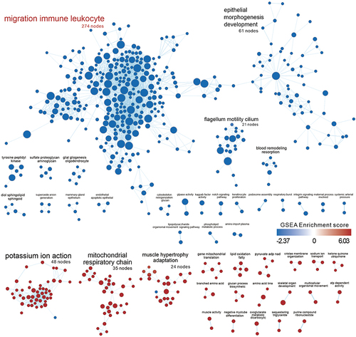
Figure 6 Similarity of comparing the up- and down-regulated gene sets in the TBI Kidney to other GEO databases as assessed by SigCom LINCS. The size of the points represents the negative decimal logarithmic scale values of adjusted p-value. Data sets are sorted by z-score (sum). Database associated with kidney diseases was marked as red text.
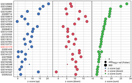
Figure 7 Comparison of the gene set commonality between TBI Kidney and ACR Kidney in GSE131179 using the CompareCluster function in Cluster profiler. The gene sets that are enriched by the two datasets are marked in red. The size of the dot represents the proportion of differential expressed genes in the gene set, and the color of the dot represents the adjusted p- value.
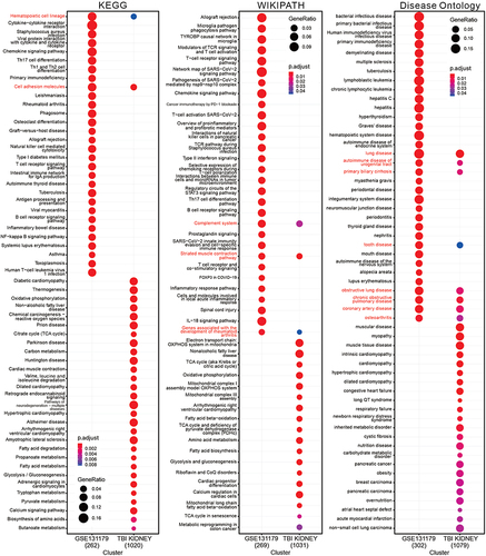
Figure 8 Simulated infiltration ratio of 22 immune cells evaluated by CIBERSORT-X. The different immune cell types were ranked in descending order according to the infiltration ratio of ACR or TBI. The Highest Density Region (HDR) boxplot was used to present the main areas of infiltration distribution. T cell CD4 memory resting or activated infiltration is marked as red text. Student’s t-test was used to analyze the significance of the differences between ACR/Control or TBI/Sham. ***P < 0.001.
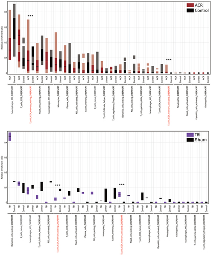
Figure 9 Distribution of 10 kidney cell biomarker gene sets in TBI/Sham or ACR/Normal presented by GSEA and Ridgeplot. GSEA presents the arrangement of each kidney-specific cell biomarker in TBI Kidney/Sham or ACR kidney/Control. False discovery rate (FDR, or q-value) less than 0.05 is marked in red. Ridge plots depict the overall distribution of genes in corresponding gene-set, with negative value representing decreased gene expression within TBI or ACR.
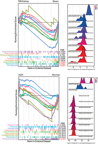
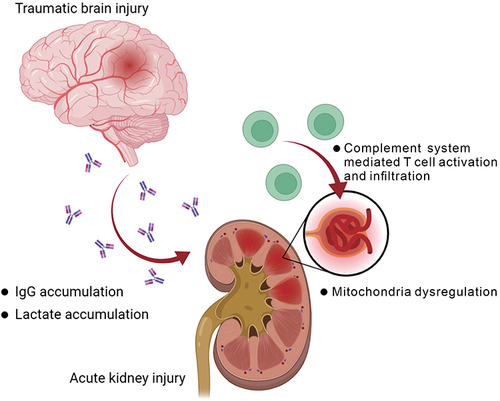
Figure 10 Summary of the postulated impact on kidney after traumatic brain injury. The graph was created with BioRender.com.