Figures & data
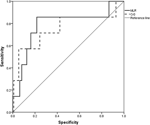
Figure 1 Flow diagram of the study population selection.
Abbreviation: PMN, primary membranous nephropathy.
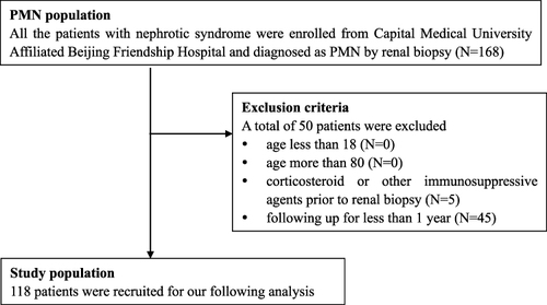
Table 1 Comparison of the Included and Excluded PMN Patients
Table 2 Comparison of Improved ALB Group and Control Group
Table 3 Comparison of CR Group and Control Group
Table 4 Characteristics of Patients with a 50% or More Cr Increase
Figure 2 Receiver operating characteristic (ROC) curves showing the sensitivity and specificity of MLR and Cr at renal biopsy for renal outcomes. MLR had the larger area under the curve (AUC=0.784) than Cr (AUC=0.754).
Abbreviations: MLR, monocyte–lymphocyte ratio; Cr0, serum creatinine at baseline.