Figures & data
Figure 1 Flowchart summarizing overall bioinformatics analyses performed in this study to explore the biological characteristics of AF.
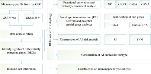
Figure 2 Analysis of DEGs in the studied dataset. (A) Distribution of expression profiles between samples before the adjustment of the two datasets. (B) Distribution of expression profiles between samples after the two datasets were combined and corrected. (C) Volcano map based on differential gene analysis, the abscissa shows log 2-fold change, the ordinate shows -log10 (P.adj), the red node represents up-regulated DEGs, the blue node represents down-regulated DEGs, and the black node represents genes with no significant expression difference. Heat map of differentially expressed genes. (D) Heat map showing differential gene expression between the atrial fibrillation (AF) and sinus rhythm (SR) groups.
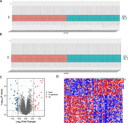
Figure 3 Differential expression of mitophagy-related genes between AF and SR groups. (A) Heat map analysis of mitophagy-related differential gene expression in the AF (atrial fibrillation) and SR (sinus rhythm) groups. (B) Correlation analysis between differentially expressed mitophagy-related genes, the upper left corner of each small square indicates the P-value, with a darker color indicating smaller P-value; the lower right corner of the small square indicates the correlation coefficient. (C) Box plot showing differential expression of mitophagy-related genes between the AF and SR groups. (*P ≤ 0.05, **P ≤ 0.01, ***P ≤ 0.001).
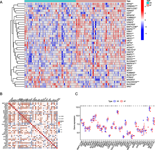
Figure 4 Immunoinfiltration analysis in SR and AF. (A) Differences in immunocell infiltration between AF (atrial fibrillation; blue) and SR (sinus rhythm; red) groups. (B) DEMRG FRIENDS analysis boxplot. Each box represents a DEMRG, the middle vertical line represents the median value of its expression, the ends of the line represent the maximum and minimum values, and the black dots represent outliers. (C) Correlation heat map of immunocells in the AF group. Red and blue represent a positive and negative correlation between immune cells, respectively. (D) The association between different expression groupings of ATG4C and immunoinfiltration. Blue and red represents the low and high expression groups of ATG4C, respectively. (E and F) Genes (BECN1, TOMM22) and immune infiltration in the high expression group. Blue and red represents the low and high expression groups, respectively. (*P ≤ 0.05, **P ≤ 0.01, ***P ≤ 0.001).
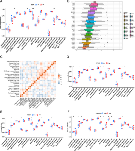
Figure 5 Immunophenotyping analysis. (A–C) AF immunophenotyping based on immune cell infiltration. (D) Volcano plot based on differential gene expression analysis between immunotypes, the abscissa shows log 2-fold change, the ordinate shows -log10 (P.adj), the red and blue nodes represent up-regulated and down-regulated DEGs, respectively, and the black node represents genes without significant differential expression. (E) Correlation heat map of immune cells with genes based on differences between immunophenotypes. Red and blue indicate that the gene is positively and negatively correlated with the corresponding infiltrating immune cell type, respectively.
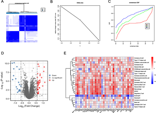
Figure 6 GO and KEGG enrichment analysis. (A) AF-related DEMRG GO enrichment analysis circle map visualization; the outer circle contains GO terms, red dots indicate up-regulated genes, blue dots indicate down-regulated genes, quadrilateral colors indicate the z-score of GO terms, blue indicates a negative z-score (these were more likely to be inhibited in the corresponding GO terms), red indicates a positive z-score, and their corresponding GO terms were more likely to be activated. (B) GO enrichment analysis network diagram of AF-related mitophagy genes, blue nodes represent entries, red nodes represent molecules, and wires represent the relationship between entries and molecules. (C) KEGG analysis of mitophagy-related genes in AF. In the quadrilaterals corresponding to differentially expressed genes on the left, blue indicates downregulation, and red indicates upregulation. (D) KEGG pathway enrichment diagram, the abscissa shows the gene proportion, the ordinate shows the pathway name, the node size represents the number of genes enriched in the pathway, and the node color represents P-value. (E–G) BP, CC, MF enrichment chord diagram, node color indicates gene expression level, red shows up-regulated genes, blue shows down-regulated genes.
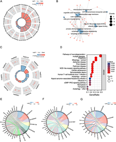
Figure 7 GSVA and GSEA results. (A) Heat maps of the main biological functions and pathways obtained via GSVA are displayed. (B–J) GSEA showed that genes upregulated in AF were mainly concentrated in NABA_CORE_MATRISOME (B), REACTOME_NEUTROPHIL_DEGRANULATION (C), REACTOME_CELL_CYCLE_MITOTIC (D), WP_PI3KAKT_SIGNALING_PATHWAY (E), WP_CHEMOKINE_SIGNALING_PATHWAY (F), REACTOME_TCR_SIGNALING (G), KEGG_ASTHMA (H), REACTOME_GPVI_MEDIATED_ACTIVATION_CASCADE (I), PID_CXCR4_PATHWAY (J). Error discovery rate (FDR) < 0.25 and p < 0.05 indicated significant enrichment.
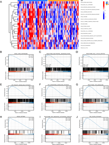
Figure 8 Protein-protein interaction network, hub-miRNA network, and hub-TF network based on mitophagy-related genes. (A) The protein-protein interaction of DEMRGs was analyzed using STRING database, and the interaction relationship is shown. The larger the circle, the greater the differential expression; Blue and red indicate down-regulated and up-regulated genes, respectively. (B) The top 15 hub genes were analyzed using the CytoHubba plugin. (C) The network of hub genes and TF transcription factors, where the hub genes are shown in red, and the yellow node indicates the TF (transcription factor). (D) The network of hub genes and miRNAs, where the red node represents the hub gene, and the blue nodes represent corresponding miRNAs.
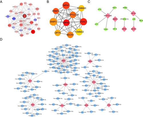
Figure 9 Comparison of model construction methods and DEG screening. (A) Histogram of RF (Random Forests) with SVM (Support Vector Machines) residuals, where green represents SVM and blue represents RF, with RF showing smaller residuals. (B) ROC curves and AUC of RF and SVM, where red represents RF and blue represents SVM. The AUC of RF and SVM are 1.00 and 0.968, respectively. (C) A random forest tree where green represents the training set, red represents the test set, and black represents all sample datasets. (D) The GINI index of DEMRGs, where the ordinate shows the gene name, and the abscissa shows the corresponding GINI index.
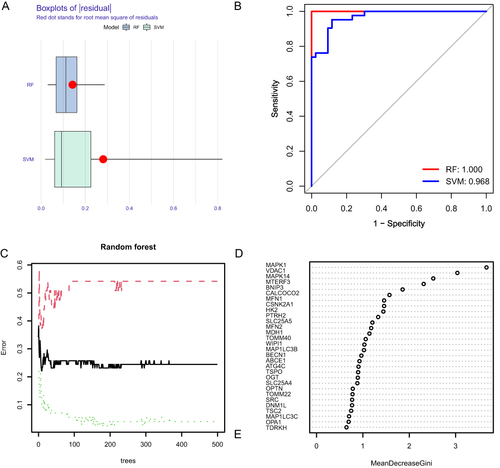
Figure 10 Construction of risk model. (A) Risk model nomogram. Each gene expression corresponds to a score, and the final total score corresponds to the AF risk. (B) Model calibration curve. The diagonal line shows the ideal curve, while the floating-point line and the solid line show the model curve before and after correction, respectively. The closer the two fit the diagonal, the better the model discrimination. (C) Clinical decision curve. Red is the decision curve after inclusion in the screening of DEMRGs, gray is the decision curve of all genes, and black is the decision curve without including any genes. After including screened DEMRGs, the model showed higher clinical relevance.
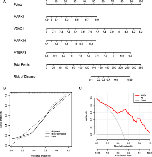
Figure 11 Determination of AF-related molecular subtypes. (A–C). Unsupervised clustering analysis of DEMRG expression in AF samples. (D) Principal component analysis among different AF types, where blue and red represent MRG cluster A and MRG cluster B, respectively. (E) Boxplot of differential DEMRG expression between different types, where blue and red represent MRG cluster A and MRG cluster B, respectively. (*P ≤ 0.05, **P ≤ 0.01, ***P ≤ 0.001). (F) Heat map showing DEMRG expression across different types. Blue and red indicate genes downregulated and upregulated in the corresponding sample, respectively. White indicates unchanged expression.
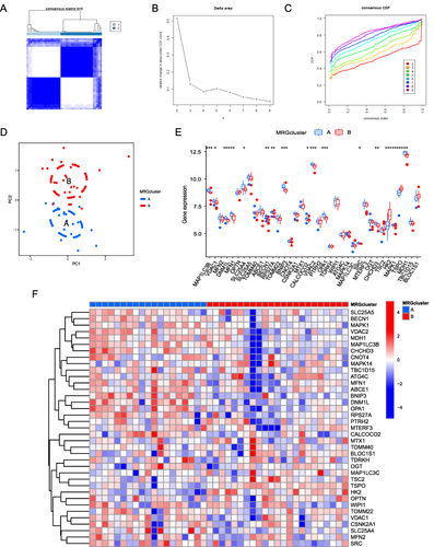
Figure 12 Differences in immunological characteristics between AF molecular subtypes. (A) Correlation heat map between immune cells and DEMRGs. Red and blue indicates that the gene is positively and negatively correlated with the corresponding infiltrating immune cell type, respectively. (B) Differential immune infiltration between different AF-related subtypes. Blue and red represent MRG cluster A and MRG cluster B, respectively. (C–G) Correlation between genes (OPA1, SLC25A4, SRC, TSPO, OGT) and immune infiltration. Blue and red represent the low and high expression group, respectively. (*P ≤ 0.05, **P ≤ 0.01, ***P ≤ 0.001).
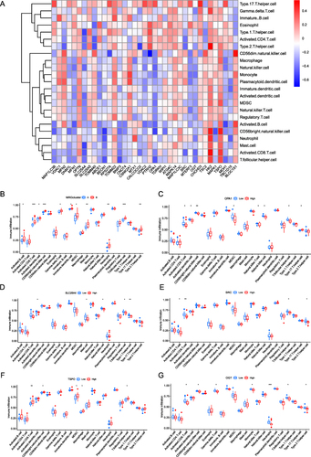
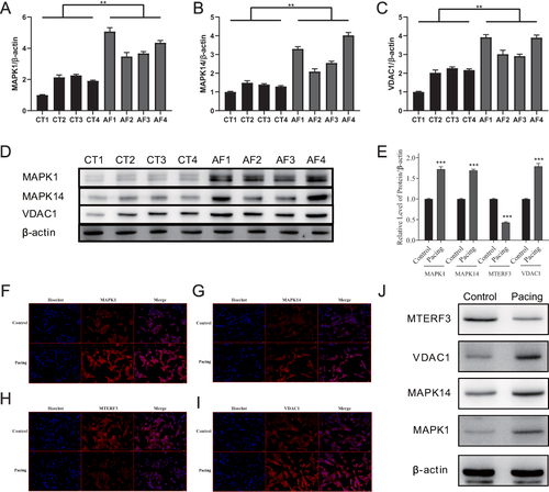
Figure 13 Expression of four key DMREGs in the atria of dogs and mouse cells. (A–C) shows the quantification of the results shown in (D), which presents MAPK1, MAPK14, and VDAC1 protein expression in canine atrial muscle tissue. (E) shows the quantification of results shown in (J), which presents MTERF3, VDAC1, MAPK14, and MAPK1 protein expression in the mouse atrial muscle HL-1 cell line. (F-I) presents the results of IF for the four key proteins in HL-1 cell lines. (**P ≤ 0.01, ***P ≤ 0.001).