
Figures & data
Figure 1 Workflow of the AH proteome profile analysis and the validation of DEPs in nAMD and PCV.
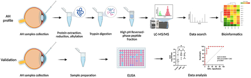
Table 1 Significantly Upregulated Proteins for Each Patient Group
Table 2 Significantly Downregulated Proteins for Each Patient Group
Table 3 Summary of Human Aqueous Humor Samples
Figure 2 Venn diagram and Volcano plots of DEPs in different comparisons. (A) Up- and downregulated DEPs in different comparisons. (B) Venn diagram identifying 631 co-expressed DEPs among Control, nAMD and PCV, 5 unique DEPs in Control, 17 unique DEPs in nAMD and 24 unique DEPs in PCV. (C–E) Volcano plots showing the distribution of differentially expressed proteins in each comparison. The horizontal axis indicates the fold change (FC), the vertical axis indicates the p value. Red dots are upregulated DEPs, blue dots are downregulated DEPs, and gray dots are proteins without significant differential expression. (|log2(FC)| > 0.58; p value < 0.05).
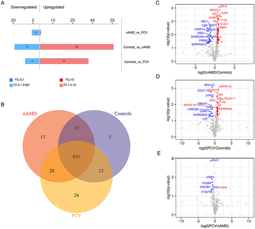
Figure 3 Heatmap and GO-term analysis of DEPs in different comparisons. Cluster analysis heatmap showing the DEPs in each comparison. Each column represents one biological replicate, each row represents a DEP. DEPs are presented in different colors in the heatmap after normalization. Red represents significantly upregulated proteins, blue represents significantly downregulated proteins, gray represents no quantitative information regarding the proteins. GO classification (Level 2) including BP, MF and CC, which differentiate in blue, red and Orange. The horizontal axis represents the number of DEPs in each functional classification. Top 20 enriched GO terms of significantly DEPs in each comparison are also shown. (A–C) Hierarchical cluster analysis and STRING GO-term enrichment of significantly DEPs between Control and nAMD groups. (D–F) Hierarchical cluster analysis and STRING GO-term enrichment of significantly DEPs between Control and PCV. (G–I) Hierarchical cluster analysis and STRING GO-term enrichment of significantly DEPs between nAMD and PCV. (|log2(FC)| > 0.58; P < 0.05).
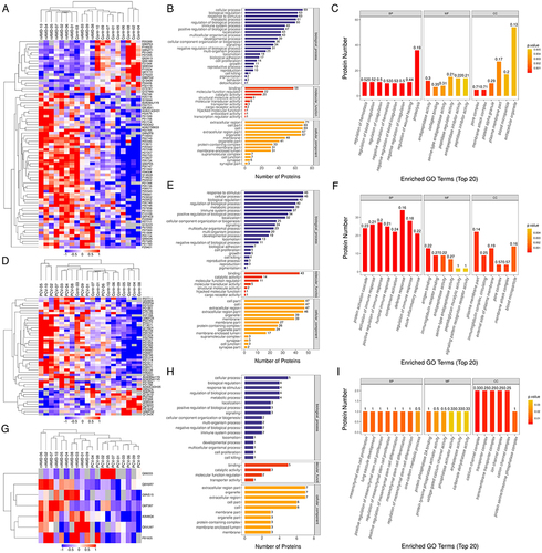
Figure 4 KEGG pathway enrichment and PPI network of DEPs in different comparisons. KEGG pathway enrichment analysis are represented with barplot and bubble plot, respectively. For upregulated DEGs, the top enriched pathways are represented in red. For downregulated DEGs, the top enriched pathways are represented in blue. In bubble plot, the horizontal axis is rich factor, the vertical axis is the name of the KEGG pathway. The bubble color scaled the enrichment score. Red represents more significant enrichment. The bubble size scaled the protein number. (A–C) KEGG pathway enrichment and PPI network displays in analysis of the up- and downregulated DEPs in Control vs nAMD group. (D–F) KEGG pathway enrichment and PPI network displays in analysis of the up- and downregulated DEPs in Control vs PCV group. (G and H) KEGG pathway enrichment finds in analysis of the up- and downregulated DEPs in nAMD vs PCV group.
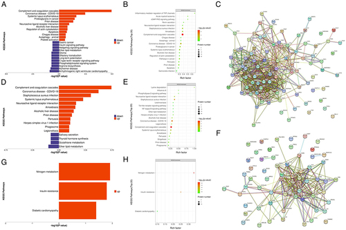
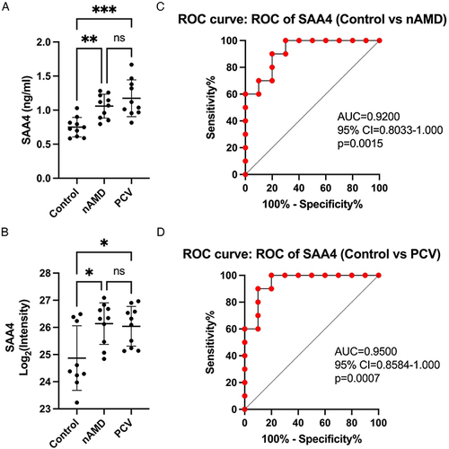
Figure 5 Validation of SAA4 and ROC analysis. (A and B) Comparison of SAA4 protein abundance measured by ELISA (A) with LC-MS/MS-based proteomics (B) measurements. (C and D) ROC curves depicting the classification power of SAA4. Data are presented as means ± SD; * indicates a p value < 0.05, **Indicates a p value < 0.01, ***Indicates a p value < 0.001, ns indicates not significant.
Data Sharing Statement
The data presented in this study are available on request from the corresponding author.