Figures & data
Table 1 The Primer Sequences of Eight Biomarkers Used in the Real-Time Quantitative PCR (RT-qPCR)
Figure 1 Identification and screening of differentially expressed immuno-inflammation-related genes (DEIIRGs). (A) Volcano plot and (B) heatmap of 134 differentially expressed genes (DEGs) between acute myocardial infarction (AMI) and control samples in GSE48060. The screening criteria were set to |Log2FC| > 0.5 and p < 0.05. (C) Venn diagram that obtained 30 DEIIRGs after overlapping 134 DEGs and 11,296 inflammation-related genes.
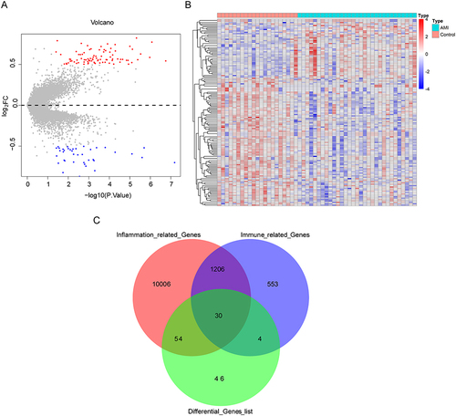
Figure 2 Functional enrichment analysis of DEIIRGs. (A) The Gene Ontology (GO) analysis for the DEIIRGs (p < 0.05 and q < 0.05). (B) The most enriched Kyoto Encyclopedia of Genes and Genomes (KEGG) terms for the DEIIRGs. (C) Bar chart and (D) circle chart for disease ontology (DO) enrichment analysis of the DEIIRGs (minGSSize = 5 and p = 0.05).
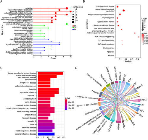
Figure 3 Screening of biomarkers and establishment of artificial neural network (ANN) in GSE48060. (A) Ten feature genes were selected by the least absolute shrinkage and selection operator (LASSO) Cox models. (B) Cross-validation for tuning parameter selection in the LASSO model. (C) 16 feature genes were detected via the support vector machine recursive feature elimination (SVM-RFE) model. (D) Feature genes rank in the SVM-RFE model. (E) Venn diagrams for eight biomarkers for AMI. (F) The ANN model was constructed based on eight biomarkers using “neuralnet”. (G) Receiver operating characteristic (ROC) curve of the ANN model.
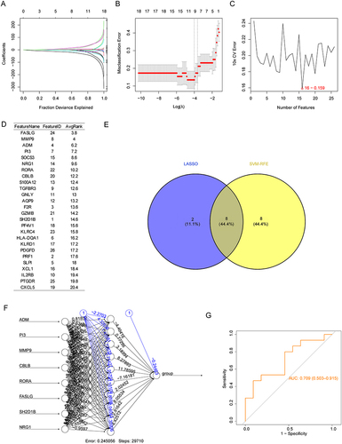
Figure 4 Assessment of the eight biomarkers in GSE48060 and GSE60993 datasets. Boxplot of the expression of eight biomarkers in AMI and control samples in (A) GSE48060 and (B) GSE60993. (C) Principal component analysis (PCA) of GSE60993 based on the expression of biomarkers. (D) ROC analysis of the gene signature based on the eight biomarkers using GSE48060 and GSE60993 databases. P < 0.05 was considered in significant difference, where p < 0.05: *, p < 0.01: **, p < 0.001: *** and p < 0.0001: ****.
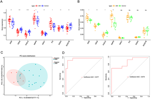
Figure 5 Construction and evaluation of the nomogram. (A) Nomogram was constructed based on the eight biomarkers. (B) Calibration curve of nomogram (C-index = 0.969278). Clinical benefits of nomogram were evaluated using decision curve analysis (DCA) (C) and clinical impact curves (D).
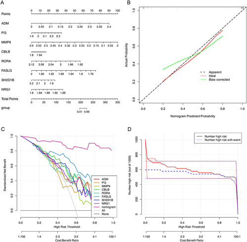
Figure 6 Ingenuity pathway analysis (IPA) of the biomarkers. (A) Bubble chart of enriched canonical pathways. (B) The significantly enriched pathway maps of the FAK Signaling pathway.
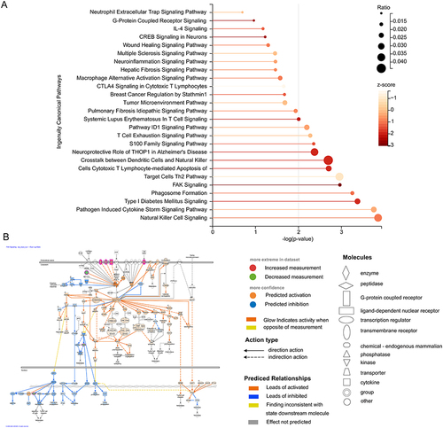
Figure 7 Immune-related analyses targeted biomarkers. (A) Histogram for the proportions of 22 immune cells in each patient from GSE48060. Red and cyan represent the AMI and control samples, respectively. The ordinate is the immune cell proportions, and the horizontal axis represents different tissue samples in GSE48060. (B) Boxplot of the proportion of immune cells in the AMI and control samples (Wilcoxon test). (C) Pearson’s correlation heatmap between eight biomarkers and 22 immune cell gene sets. * p < 0.05, ** p < 0.01.
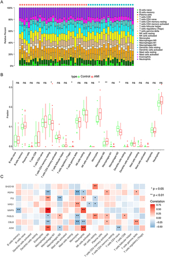
Figure 8 Construction of transcription factor (TF)–miRNA–mRNA networks. Yellow represents TF, blue represents miRNA, and red represent biomarker.
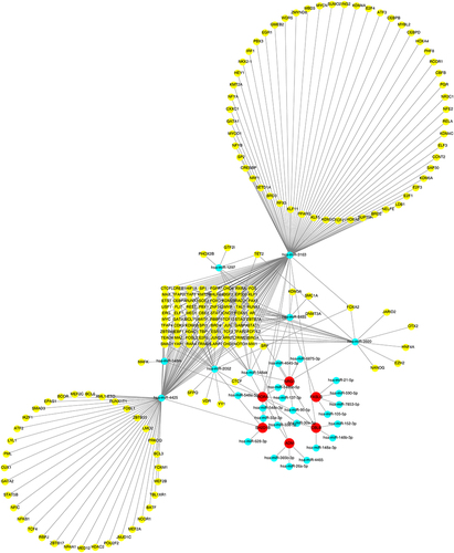
Figure 9 Establishment of the Gene–Drug regulatory networks using Gene Cards database (A) and the Drug–Gene Interaction Database (DGIdb) (B). Blue represents downregulated biomarker; red represents upregulated biomarker, and yellow and green represent drugs or compounds targeting the biomarkers.
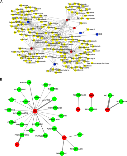
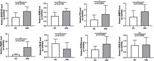
Figure 10 Verification of the eight biomarkers using real-time quantitative PCR (AMI samples = 10, control samples = 10). * p < 0.05, ** p < 0.01.