Figures & data
Figure 1 The flowchart of this study.
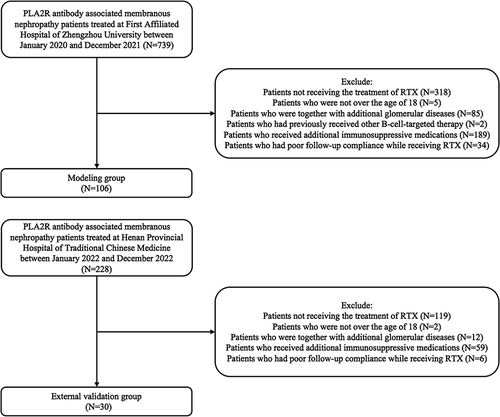
Table 1 Baseline Characteristics of PLA2R Antibody-Associated MN Patients Treated with Rituximab
Table 2 Number of PLA2R Antibody-Associated MN Patients Achieving Immunological Remission Within 6 Months After Treated with Rituximab for One Cycle
Table 3 Comparison of Clinical Characteristics Between Responders and Nonresponders
Table 4 Predictive Factors Related to Immunological Remission in 108 PLA2R Antibody-Associated MN Patients Receiving One Cycle of Rituximab Within 6 Months: Univariate Analysis
Table 5 Predictive Factors Related to Immunological Remission in 108 PLA2R Antibody-Associated MN Patients Receiving One Cycle of Rituximab Within 6 Months: Multivariate Logistic Regression Analysis (Forward, LR, α= 0.05)
Figure 2 ROC curves for PLA2R antibody, hemoglobin, and gender to predict immunological remission in patients with membranous nephropathy.
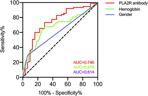
Figure 3 Kaplan–Meier curve for the the cumulative immunological remission rate of patients stratified by PLA2R antibody (A), gender (B) and hemoglobin (C) is shown for immunological remission.
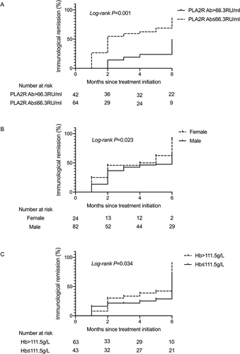
Figure 4 A novel nomogram predicting for the probability of immunological remission. To use the nomogram, the specific point for each variable of the patient lies on each variable axis. Draw a vertical line upward to determine the point at which each variable accepts. The sum of these points is located on the Total Points axis, and draw a vertical line down to horizontal axis to determine the probability of immunological remission.
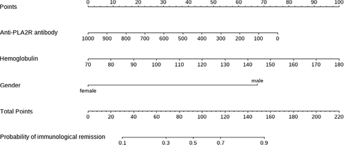
Figure 5 The ROC curve and the AUC value to evaluate the discrimination ability of the nomogram in the training and validation datasets.
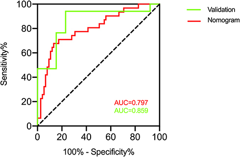
Figure 6 Calibration curves of the nomogram in the training and validation datasets. The y-axis indicates the observed cumulative incidence for immunological remission, and the x-axis is the predicted probability of immunological remission based on the predictive model. The line adjacent to the ideal line represents the predictive accuracy.
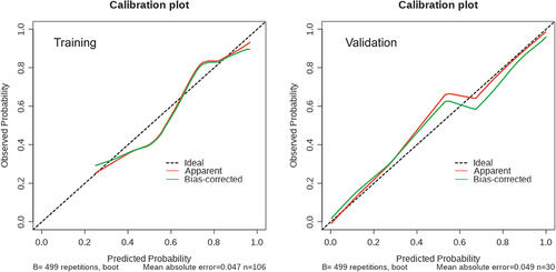
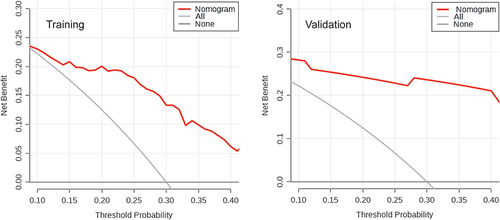
Figure 7 Decision curve analysis plot of the nomogram in the training and validation datasets. Red line represents the clinical net benefits according to the threshold probabilities; horizontal line assumes no cases will get immunological remission; grey line assumes all cases will get immunological remission.