Figures & data
Table 1 General Information
Figure 1 Observation on the efficacy of Empagliflozin. (A) Histogram comparing EF before treatment and after 2/6 months of treatment; (B) Histogram comparing IVSD before treatment and after 2/6 months of treatment; (C) Histogram comparing LVDd before treatment and after 2/6 months of treatment; (D) Histogram comparing LVDs before treatment and after 2/6 months of treatment; (E) Histogram comparing 6MWT before treatment and after 2/6 months of treatment (ns: P>0.05, *P<0.05, **P<0.01).
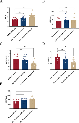
Figure 2 Distribution of gene expression values. (A) Box plot of FPKM values; (B) Violin map of FPKM values.
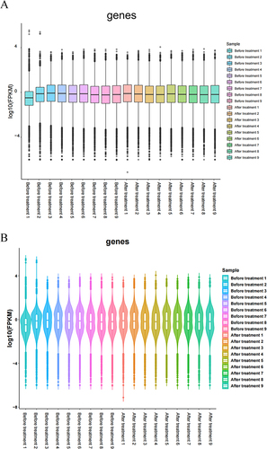
Figure 3 Analysis of the differentially expressed genes. (A) Volcano map of the Before treatment VS After treatment groups (| log2FC | > 1, P < 0.05); (B) Gene expression changes in the Before treatment VS After treatment groups; (C) Heat map of the Before treatment VS After treatment groups.
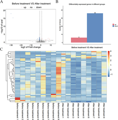
Figure 4 GO & KEGG enrichment analyses. (A) GO and KEGG enrichment analyses of the differentially expressed genes; (B) Bubble diagram showing the biological processes after GO enrichment analysis; (C) Bubble Diagram showing KEGG enrichment analysis results.
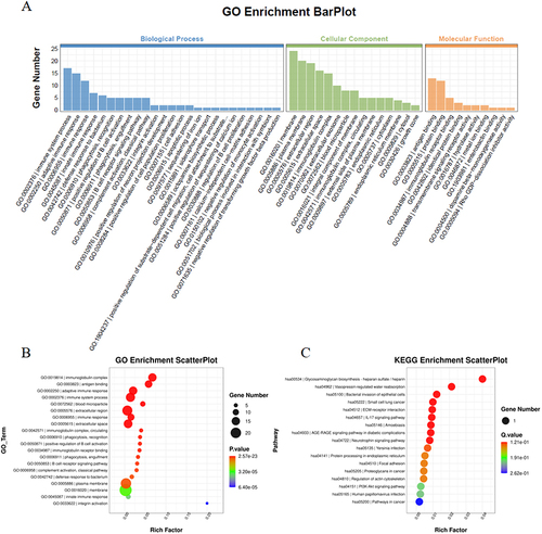
Figure 5 Immune correlation analysis. (A) Bar chart showing the immune infiltration analysis results in the Before treatment VS After treatment groups; (B) Violin chart showing the immune infiltration analysis results in the Before treatment VS After treatment groups (Cells with p < 0.05 have shown red color); (C) Heat map showing the correlation between immune cells.
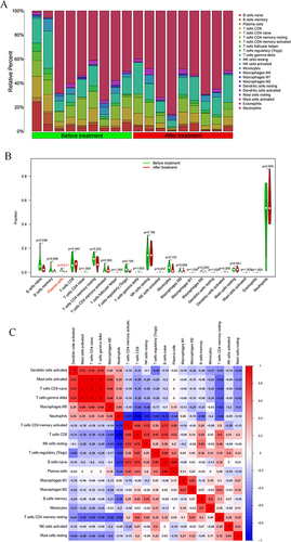
Figure 6 Machine learning. (A and B) Lasso analysis of the differentially expressed genes; (C and D) Random forest analysis of the differentially expressed genes; (E) SVM-RFE analysis of the differentially expressed genes; (F) Venn diagrams of the intersected results from lasso analysis, random forest analysis, and SVM-RFE analysis.
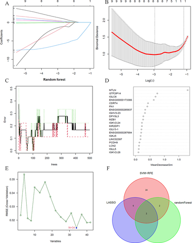
Figure 7 Verification of the hub genes. (A) GTF2IP14 expression in the Before treatment VS After treatment groups; (B) MTLN expression in the Before treatment VS After treatment groups; (C) ROC curve of GTF2IP14; (D) ROC curve of MTLN.
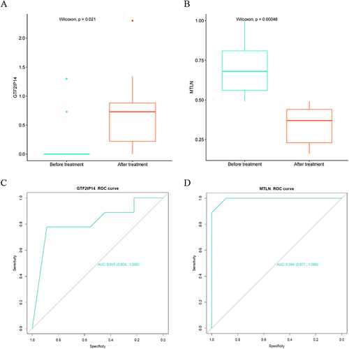
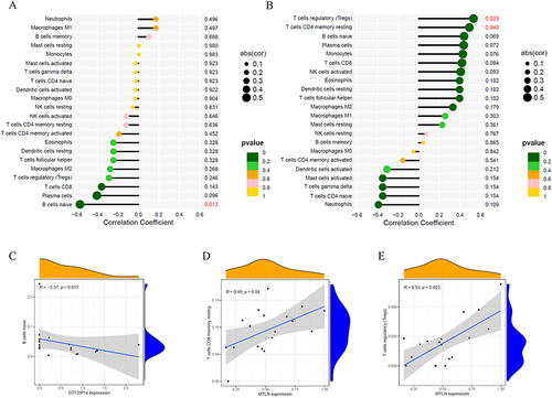
Figure 8 Correlation analysis of hub genes and immunity. (A) Lollipop map of the correlation between GTF2IP14 and immune cells (Values with p < 0.05 have been marked in red); (B) Lollipop map of the correlation between MTLN and immune cells (Values with p < 0.05 have been marked in red); (C) Scatter plot of the correlation between GTF2IP14 and naive B cells; (D) Scatter plot of the correlation between MTLN and Tregs; (E) Scatter plot of the correlation between MTLN and resting memory CD4+ T cells.