Figures & data
Figure 1 Workflow of this study.
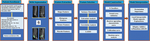
Table 1 Characteristics at Baseline Between Training Set and Testing Set
Figure 2 LASSO algorithm employed for radiomics feature selection. (A) The MSE (mean square error) path represents the performance of the least absolute shrinkage and selection operator (LASSO) model at different values of the regularization parameter (lambda) utilizing 20-fold cross-validation. The lambda value (vertical dash line) that yields the lowest MSE is selected as the optimal amount of penalization. (B) LASSO coefficient profiles of the radiomics features. The coefficient profiles demonstrate the magnitude of the regression coefficients for each feature as the lambda value increases. Features with non-zero coefficients are considered selected by the LASSO model. (C) Coefficient for the 16 selected features. This component presents the magnitude of the regression coefficients for the 16 features selected by the LASSO model. The best lambda value is 0.0387, − log (lambda) is 1.412. Lambda represents the strength of the regularization penalty applied to the regression coefficients in LASSO. Vertical dash line is the best parameters (lambda) selected by LASSO cross-validation.
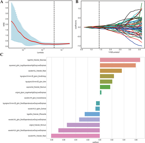
Figure 3 Correlation analysis (A) and Comparison (B) of the selected features. (A) The correlation analysis heatmap of selected radiomics features. The heatmap visualizes the correlation coefficients between the selected features. Each cell in the heatmap represents the strength and direction of the correlation, with color indicating the magnitude. This analysis helps assess the relationships and potential multicollinearity among the selected features; (B) The horizontal bar plot displays a comparison of the selected radiomics features between two groups, using their standardized values. The x-axis represents the standardized values, while the y-axis displays the names of the selected features. The plot provides a visual comparison of the magnitudes of the selected features between the two groups. This information can help identify features that show significant differences between the groups.
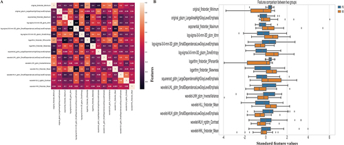
Figure 4 Comparison of nest and non-nested cross-validation. (A) Accuracy of each classifier with and without nested cross-validation. The x-axis displays the names of the classifiers, while the y-axis represents the corresponding accuracy values achieved using both nested and non-nested cross-validation; (B) Precision of each classifier with and without nested cross-validation. The x-axis indicates the names of the classifiers, and the y-axis shows the precision values obtained using both nested and non-nested cross-validation; (C) F1 score of each classifier with and without nested cross-validation. The x-axis represents the classifier names, while the y-axis depicts the F1 score values obtained using both nested and non-nested cross-validation; (D) Recall of each classifier with and without nested cross-validation. The x-axis displays the names of the classifiers, and the y-axis shows the recall values achieved using both nested and non-nested cross-validation.
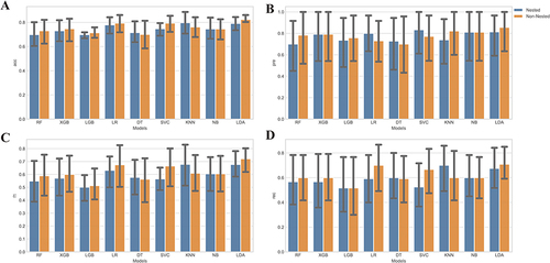
Table 2 Diagnostic Performance of Each Model in the Training and Test Sets
Figure 5 The receiver operating characteristic curves (ROC) of the training set (A) and testing set (B). The receiver operating characteristic curve illustrates the tradeoff between the model’s sensitivity and its false positive rate, considering various anticipated probabilities of future Brucella spondylitis (BS). The area under this curve indicates the model’s predictive capability for estimating the probability of BS. A value of 0.5 represents a random estimator, while a perfect model would yield a value of 1.0.
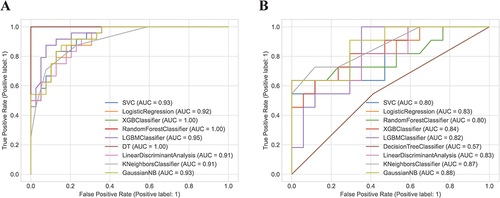
Figure 6 Shows calibration curves and decision curve analysis (DCA) for the model’s performance evaluation. (A) The calibration curve for the training set; (B) The calibration curve for the testing set; (C) DCA curve for the training set; (D) DCA curve for the testing set. Calibration curves were employed to gauge the congruity between the observed and predicted diagnostic categories. Decision curve analysis (DCA) aids in appraising the model’s performance by examining the net benefit derived from employing the model at various threshold probabilities. It evaluates the balance between the sensitivity and specificity of the model and offers valuable insights into its potential clinical applicability.
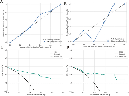
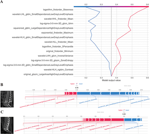
Figure 7 Model interpretation using the LIME and SHAP framework. (A) Ranking feature importance using the LIME technique; (B) Ranking feature importance using permutation feature importance (PFI); (C) Ranking the relevance of features based on SHAP values obtained from the test set. A feature is deemed more significant if its average SHAP value is higher; (D) A summary plot illustrating the decision-making process of the radiomics model and the interactions among radiomics characteristics. Positive SHAP scores indicate a higher likelihood of correctly predicting PS, while a higher risk of PS is associated with a high value. Each point on the plot represents a patient’s forecast; (E) A decision graphic demonstrating the prediction of PS using the radiomics model. The plot shows the model’s base value and the SHAP values for each feature, highlighting the impact of each feature on the overall PS forecast as you move from bottom to top. The discrete dots on the right represent different eigenvalues, with the color indicating the magnitude of the eigenvalues (red for high and blue for low). The X-axis represents the SHAP value. In binary classification, the SHAP value can be seen as the size of the probability value influencing the model’s predicted outcome. It can also be interpreted as the extent to which each feature value influences the likelihood of a patient having PS. A positive SHAP value indicates an increased probability of PS, while a negative SHAP value suggests a decreased probability of PS (implying a likelihood of BS).
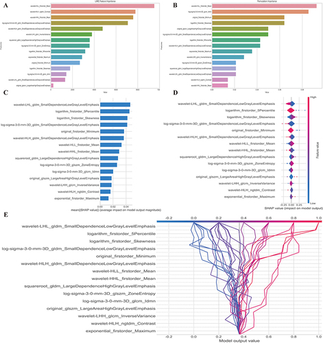
Figure 8 SHAP decision and force plots. (A) Represents the SHAP decision plot for two patients in the testing set, where one is predicted with PS, and the other is predicted with BS; (B) Indicating the SHAP force plot for the PS patient, while the figure; (C) provides the SHAP force plot for the BS patient. Both patients presented with vertebral bone destruction, with one case observed at the L4-5 level and the other at the L5-S1 level. The destruction was characterized by the presence of bone hyperplasia and sclerosis along the edges. Particularly noteworthy is the predominant localization of the observed destruction along the intervertebral disc, implying a potential interplay between disc pathology and the underlying pathogenesis of the condition. The two-single case (one patient with PS and one patient with BS) prediction method was also shown in . Also, we offer two common instances to demonstrate the model’s interpretability: respectively, PS and BS patients. Each factor’s impact on prediction is shown with an arrow. According to the blue and red arrows, PS risk was either decreased (blue) or raised (red) by the factor.