Figures & data
Figure 1 Flowchart of patient enrollment.
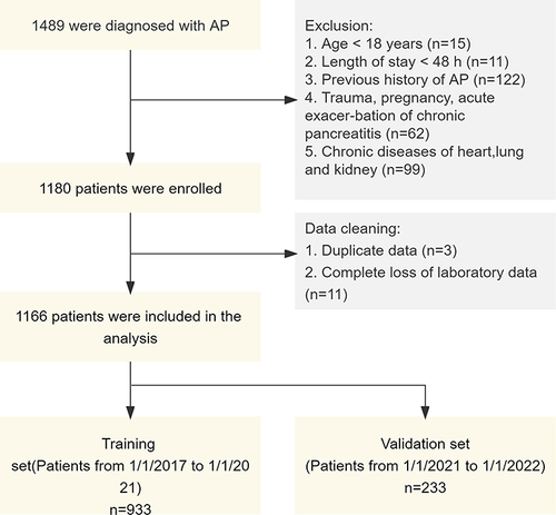
Table 1 Differences Between the Two Groups in AP Patients with or Without POF
Figure 2 Comparison of clinical outcomes based on whether there are complicated with POF. Length of stay. For non-normal distributed data, Mann–Whitney test was used. P<0.001. ****P<0.001. (B) ICU stay. (C) Bacterial Infection. (D) Death. (E) Walled-off necrosis. (F) Pancreatic fluid collections. (B and D) Fisher’s exact test. P<0.001. (C, E and F) Chi-square test. P <0.001.
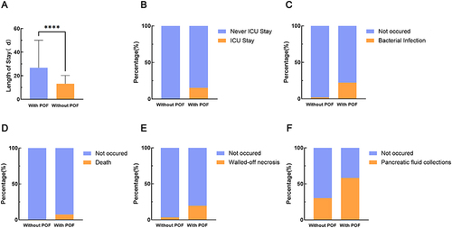
Table 2 Multivariate Logistic Regression Results
Figure 3 Selection of predictive variables using LASSO regression. (A) Characteristics of variable coefficient changes. The horizontal coordinates represent the value of the parameter log(λ), ordinate represents the coefficient of the independent variable. Finally, the coefficients of all independent variables are compressed to 0, and the later the independent variable becomes 0, the greater the contribution to the model. The dashed line on the left indicates the value of the parameter log(λ) when the model error is minimal, the dashed line on the right represents the value of the parameter log(λ) when the model error is amplified by one standard error. (B) Ten-fold cross-validation for adjusting parameters. The horizontal coordinates represent the value of the parameter log(λ), ordinate represents the mean squared error of the model.
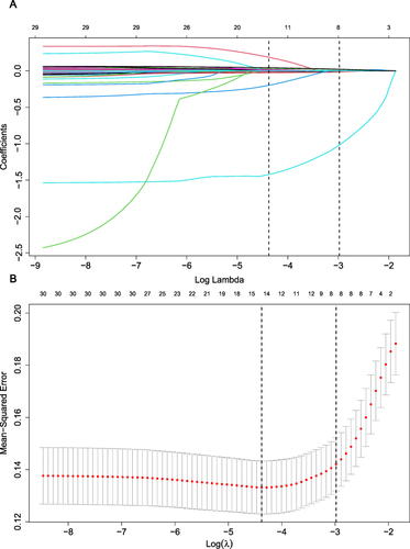
Figure 4 Nomogram for predicting whether patients with AP will develop POF. The nomogram created by univariate logistic regression (A). The nomogram created by LASSO (B).
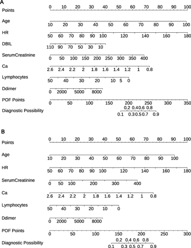
Figure 5 Nomogram performance. ROC curves of the model for predicting POF probabilities in the training cohort (A) and validation cohort (B). Calibration plots for predicting POF probabilities in the training cohort (C) and validation cohort (D). The gray slash represents the ideal reference line, and the black curve represents the predictive performance of the model. The closer the black curve is to the gray slash, the closer the predicted outcome event is to the actual event. Decision curves for the training cohort (E) and validation cohort (F). The abscissa is the threshold probability, and the ordinate is the net benefit rate, when the black dashed line is above the two solid lines, it indicates that the model provides a net benefit.
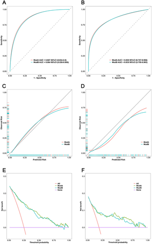
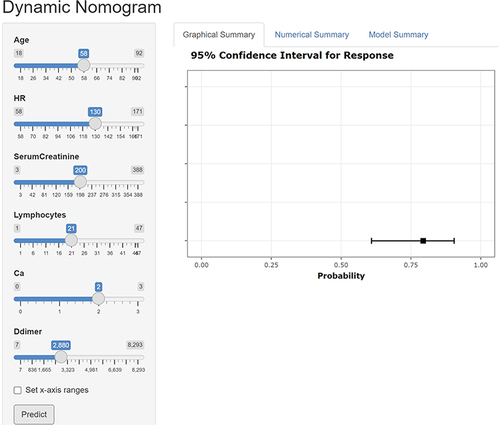
Figure 6 Dynamic web calculator to predict whether patients with AP will develop POF. The left band inputs variable values, Graphical Summary shows the probability and confidence interval of POF occurrence in the form of pictures.