Figures & data
Figure 1 (A) Schematic representation outlining the methodology employed for literature search and selection. (B) Temporal trend analysis depicting the evolution of research focused on “artificial intelligence-musculoskeletal diseases” from 2000 to 2024.
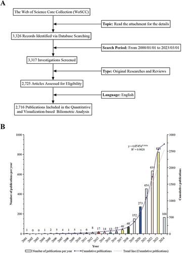
Figure 2 (A) Global distribution of research on “artificial intelligence (AI)-musculoskeletal (MSK) diseases”. Each sphere represents a country, with the thickness of connecting lines indicating the level of collaboration between nations. The size of each sphere corresponds to the number of publications from that country. (B) Chord diagrams illustrating international collaborations, where each outer curve represents a country, and the thickness of the lines denotes the strength of collaboration. (C) Research output on “AI-MSK diseases” from the top 10 countries (highlighted in red, indicating increased document production).
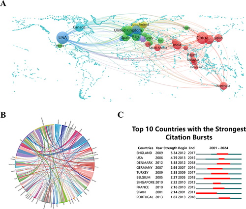
Figure 3 (A) Diagram of institutional cooperation intensity. The thickness of the connecting lines between circles denotes the strength of cooperation between institutions. Additionally, the size of each circle is proportionate to the number of documents issued by the respective institution. (B) Citation bursts at the top 10 institutions (red bars represent burst periods for institutions).
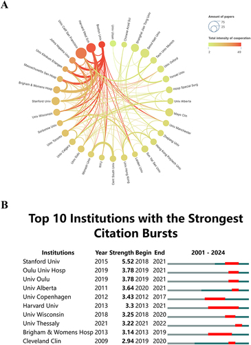
Figure 4 (A) Author co-occurrence map. Circles and text labels constitute a node, with different colors representing distinct clusters. (B) Temporal overlay of the author’s collaborative network. Each sphere symbolizes an author, and the combined size of overlapping spheres, representing the sum of their sizes along the yearly ring line, corresponds to the total number of authored articles. Purple-red indicates earlier publications by the author, yellow signifies recent publications, and overlapping colors denote multi-year publishing. Overlapping colors on the spheres create a ring-like pattern. Connections between nodes in temporal zones depict collaborative occurrences among authors. (C) Top 10 authors with the most significant citation bursts in publications related to “artificial intelligence-musculoskeletal diseases”.
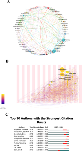
Figure 5 (A) Density visualization map of journal citations. The color intensity correlates directly with the volume of publications. (B) Journal distribution based on the average publication year (blue: earlier, yellow: later). Each circle and its label together create a node, where the circle size directly relates to the frequency of the keyword’s occurrence. The color gradient of each circle in the lower right corner denotes the average year of occurrence. (C) Top 10 journals with the most significant citation bursts. (D) A dual-map overlay of journals related to artificial intelligence in musculoskeletal diseases. Each point in the graph signifies a journal, while the curves bridging the left and right parts of the graph represent citation connections. These trajectories offer insights into interdisciplinary relationships within the field and vividly showcase the inception and progression of citations. (E) Analyses of research subject areas. Various colored spheres symbolize distinct converging fields.
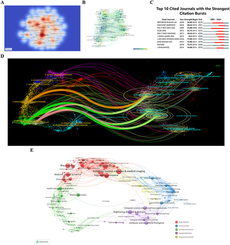
Figure 6 (A) Co-citation analysis chart for “artificial intelligence-musculoskeletal diseases”. The sizes of the overlaid circles, corresponding to the sizes of the circles on the annual rings, are proportional to the number of citations. Purple indicates earlier citation times, yellow indicates later citation times, and overlapping colors indicate citations in corresponding years. The lines connecting the circles represent the co-citation situation of the literature, and the nodes marked in magenta are critical nodes with a centrality greater than 0.1. (B) Co-cited literature network map. The sizes of the overlaid circles, corresponding to the sizes of the circles on the annual rings, are proportional to the number of citations. Purple indicates earlier citation times, yellow indicates later citation times, and overlapping colors indicate citations in corresponding years. The lines connecting the circles represent the co-citation situation of the literature, and the nodes marked in magenta are critical nodes with a centrality greater than 0.1. (C) Top 20 references with the highest citation bursts.
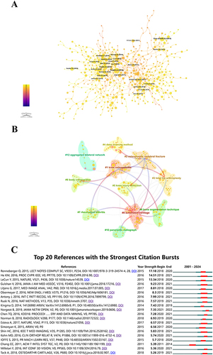
Figure 7 (A) Visualization of keyword intensity overlay over time. Each circle and its label constitute a node, where the circle size corresponds positively to the frequency of keyword occurrence. The color gradient in the lower right corner denotes the average year of occurrence, with blue representing relatively early keywords and yellow indicating recently emerged keywords that may lead to new research directions. (B) Top 10 keywords with the strongest citation bursts identified by CiteSpace. (C) Co-occurrence analysis chart of keyword frequencies. The sizes of the overlaid circles, corresponding to the sizes of the circles on the annual rings, are proportional to the number of citations. Purple indicates earlier citation times, yellow indicates later citation times, and overlapping colors indicate citations in corresponding years. The lines connecting the circles represent the co-citation situation of the literature, and the nodes marked in magenta are critical nodes with a centrality greater than 0.1. (D) Temporal trends in keyword co-occurrence. The sizes of the overlaid circles, corresponding to the sizes of the circles on the annual rings, are proportional to the frequency of keywords. The lines between keywords represent co-occurrence. Purple represents the relatively early appearance time of keywords, yellow represents the later appearance time of keywords, and overlapping colors indicate that keywords appeared in the corresponding years. Magenta nodes are nodes with relatively strong centrality, located at the central position and acting as hubs. Keywords in the same cluster are placed on the same horizontal line. The first appearance time of keywords is placed at the top of the view, with time progressing towards the right.
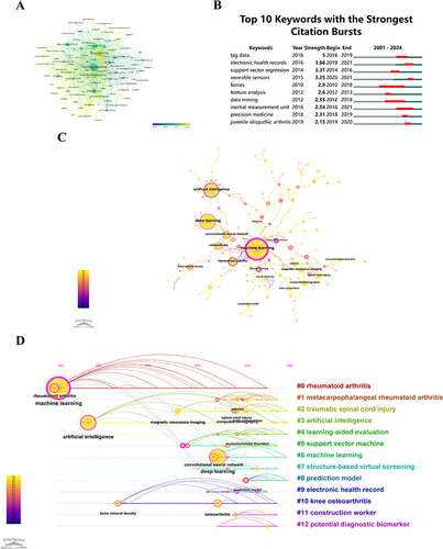
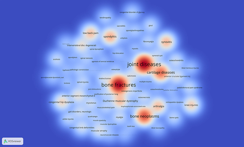
Figure 8 Density visualization map of associated diseases. The intensity of color is directly proportional to the frequency of occurrence of the represented disease.