
Figures & data
Table 1 Key inclusion and exclusion criteria
Figure 1 Study flow chart and patient profile.
Abbreviations: n, number of subjects; PEMF, pulsed electromagnetic field.
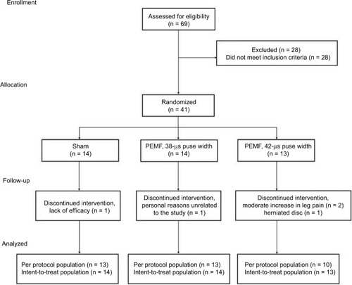
Table 2 Subject demographics and baseline characteristics
Figure 2 Mean pain scores at the end of treatment (Days 56–60) compared with baseline.
Notes: (A) Lumbar pain. (B) Radiating leg pain. Statistical analyses were conducted using one-way analysis of variance and show the within-group p-values.
Abbreviation: NPRS, numerical pain rating scale.
Abbreviation: NPRS, numerical pain rating scale.
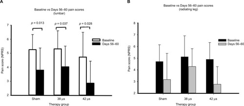
Figure 3 Mean pain scores over time.
Notes: (A) Lumbar pain. (B) Radiating Leg pain. Mean pain scores are for consecutive 5-day intervals throughout the study.
Abbreviations: NPRS, numerical pain rating scale; PEMF, pulsed electromagnetic field.
Abbreviations: NPRS, numerical pain rating scale; PEMF, pulsed electromagnetic field.
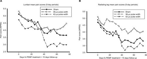
Figure 4 Mean pain scores over time normalized to baseline.
Notes: (A) Lumbar pain. (B) Radiating Leg pain. For each study group, the mean pain scores were normalized to baseline pain scores, and plotted as a percentage of baseline. Average pain scores are for consecutive 5-day intervals throughout the study. For each study group, data are expressed as a percentage of the mean baseline pain score for that study group.
Abbreviation: PEMF, pulsed electromagnetic field.
Abbreviation: PEMF, pulsed electromagnetic field.
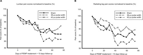
Table 3 Primary outcome measure at 60 days
Table 4 Secondary outcome measures at 60 days
Figure 5 Time to 30% reduction in pain score is the time to response. Figures show the time to 30% reduction, which was evaluated using Kaplan–Meier statistics.
Notes: (A) Lumbar pain, median time to response-Interval 5 (21–25 days) for 42 µs and Interval 9 (41–45 days) for sham (p = 0.33, log-rank test). (B) Radiating leg pain, median time to response-Interval 5 (21–25 days) for 42 µs and Interval 13 (61–65 days) for sham (p = 0.32, log-rank test).
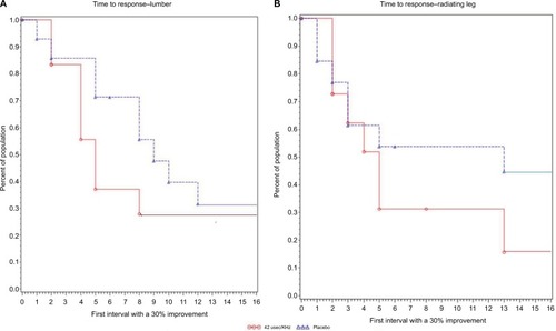
Table S1 Titles of participating sites: