Figures & data
Figure 1 The bedside monitoring unit.
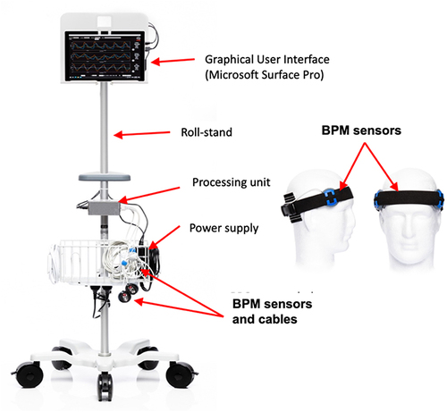
Figure 2 Architecture of the brain pulse monitoring system.
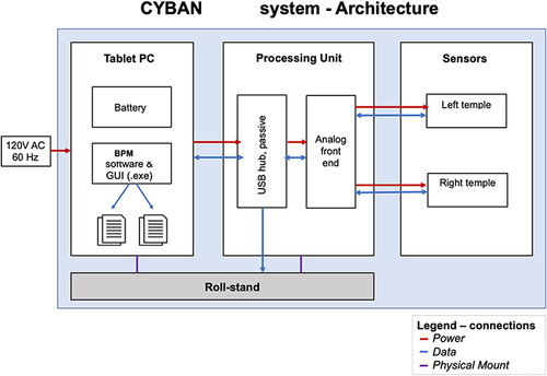
Figure 3 A brain pulse monitor was placed on each temple. A NellcorTM SPO2 A skin pulse oximeter was placed on the forehead (midline) to provide a reference conventional skin PPG waveform for comparison. The extra-ventricular drains (EVD) used to measure intracranial pressure are highlighted by the Orange arrows.
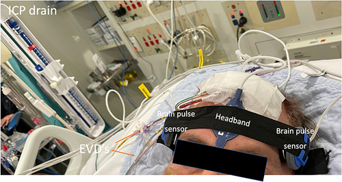
Table 1 Patient Characteristics
Figure 4 Simultaneous conventional skin and brain PPG signals (over one pulse period) compared with the invasive intracranial pressure from a patient presenting with a sub-arachnoid haemorrhage. The shape of the waveforms for both the right and left brain pulse monitor PPG signals are inverted compared with the skin PPG. The morphological features of the right and left brain waveforms were similar to the invasive ICP waveform in terms of the peaks’ temporal positions (P1, P2, P3) and the dicrotic notch (indicated by arrow). Note the raw skin PPG signal is presented without being flipped as is the convention with bedside commercial monitors.
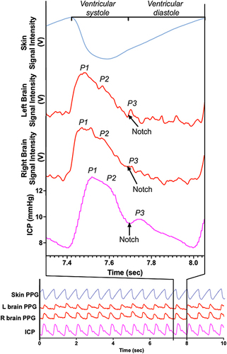
Figure 5 The evolution of the morphological waveform features of the brain pulse monitor PPG signal over a 3 day period in relation to the simultaneous invasive ICP (one pulse period) measured from an external ventricular drain positioned in the right lateral ventricle of a patient with a grade 5 sub-arachnoid haemorrhage. Day 1: Normal ICP. The relative amplitudes of the waveform peaks were P1 > P2 > P3, (indicated by the angle of the green line segment), and there is a rapid increase from the beginning of the pulse wave to the pulse peak in early systole (t1; 0.13 seconds). Day 2: Raised ICP. The P2 amplitude is now greater than P1 and P3 and there is an increased time lag (t2; 0.22 seconds) to the highest pulse peak. Day 3: Markedly raised ICP. The P2 and P3 amplitudes are very much greater than P1 and the time lag to reach the pulse peak is extended further (t3; 0.24 seconds).
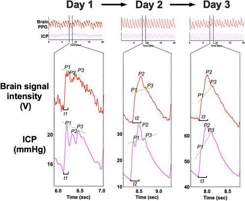
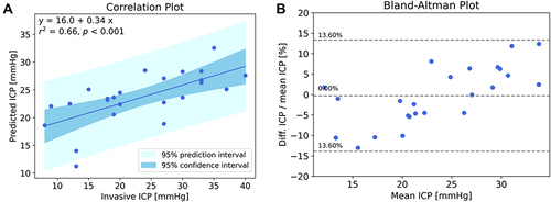
Figure 6 (A) Correlation between the brain pulse monitor predicted ICP and invasive ICP measurements. The solid line represents the best linear fit and the dark shaded area represents the 95% confidence interval of the fit, and the light shaded area represents the prediction interval of the fit; (B) Bland-Altman plot (difference as a percentage vs mean ICP), the central dashed line represents the mean bias that was less than 1%, the outer dashed lines represent the mean ± 1.96 standard deviations demonstrating that 95% of the data points were ± 13.6% of the invasive measurement. R2 = 0.66, P<0.001 (Pearson).