Figures & data
Table 1 Differences in Characteristics Between the Training Cohort and the Validation Cohort
Figure 1 Flow chart presenting the process of patient inclusion and exclusion in this study.
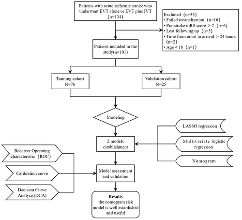
Table 2 Comparison of Characteristics Between the Futile Recanalization Group and the Favorable Recanalization Group
Figure 2 Variable selection by the LASSO binary logistic regression model. (A) coefficients profile plot was constructed against the log(lambda) sequence. Six variables with nonzero coefficients were selected by deriving the optimal lambda. (B) Following verification of the optimal parameter (lambda) in the LASSO model, we plotted the partial likelihood deviance (binomial deviance) curve versus log(lambda) and drew dotted vertical lines based on 1 standard error criteria.
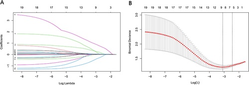
Figure 3 Variable selection by the LASSO binary logistic regression model. (A) Coefficient profile plot was constructed against the log(lambda) sequence. Seven variables with nonzero coefficients were selected by deriving the optimal lambda. (B) Following verification of the optimal parameter (lambda) in the LASSO model, we plotted the partial likelihood deviance (binomial deviance) curve versus log (lambda) and drew dotted vertical lines based on 1 standard error criteria.
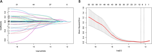
Table 3 Multicollinearity Assessment
Table 4 The Multivariable Logistic Regression Analysis
Figure 4 Development of a novel nomogram for predicting the individual risk of futile recanalization endovascular treatment via a multivariable logistic regression analysis. The predictive nomogram was developed in the training set of Model 1, with age, baseline NIHSS, ASPECTS on admission.
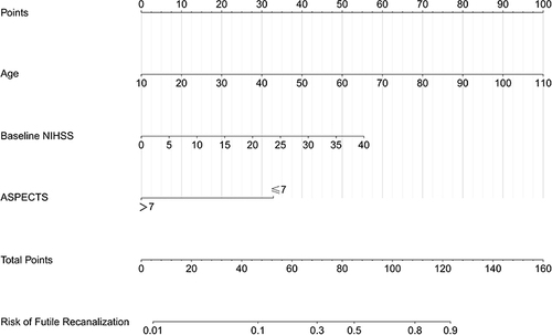
Figure 5 Development of a novel nomogram for predicting the individual risk of futile recanalization endovascular treatment via a multivariable logistic regression analysis. The predictive nomogram was developed in the training set of Model 2, with age, baseline ASPECTS, onset time, PTR and LMR.
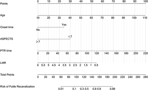
Figure 6 Receiver operating characteristic curve (ROC) validation of the Model 1 (A) and Model 2 (B) nomogram prediction.
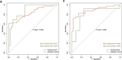
Figure 7 Calibration curves of the Model 1 nomogram prediction. The y-axis meant the actual diagnosed DR. The x-axis meant the predicted risk of DR. The diagonal dotted line meant a perfect prediction by an ideal model. The solid line represented the performance of the training set (A) and validation set (B), which indicated that a closer fit to the diagonal dotted line represented a better prediction.
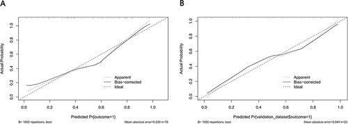
Figure 8 Calibration curves of the Model 2 nomogram prediction. The y-axis meant the actual diagnosed DR. The x-axis meant the predicted risk of DR. The diagonal dotted line meant a perfect prediction by an ideal model. The solid line represented the performance of the training set (A) and validation set (B), which indicated that a closer fit to the diagonal dotted line represented a better prediction.
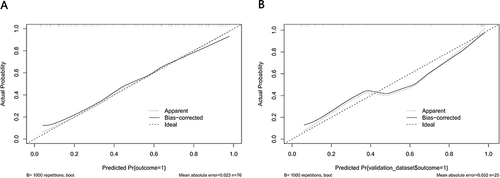
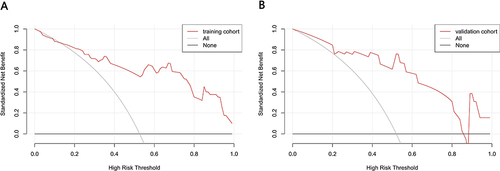
Figure 9 Decision curve analysis for the Model 1 nomogram. The y-axis measured the net benefit. The thick solid line represented the assumption that all patients had no FR. The thin solid line represented the assumption that all patients had FR. The dotted line represented the risk nomogram. (A) From the training set and (B) from the validation set.
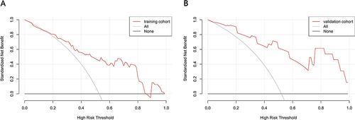
Figure 10 Decision curve analysis for the Model 2 nomogram. The y-axis measured the net benefit. The thick solid line represented the assumption that all patients had no FR. The thin solid line represented the assumption that all patients had FR. The dotted line represented the risk nomogram. (A) From the training set and (B) from the validation set.