Figures & data
Table 1 Number of Participants and the Number of Their Available Sleeping Periods in the Data
Table 2 Estimates of Sleep Parameters Obtained with Personalized and Generalized Sleep-Wake States Predictors and PSG, Averaged Over all Participants Across All Studies Combined. In Each Column, the Boldface Number Indicates the Estimated Sleep Parameter Closest to That of PSG
Table 3 Estimates of Sleep Parameters Obtained with Different Classification Thresholds via Personalized RF and XGB Sleep-Wake States Predictors, Averaged Over All Participants Across All Studies Combined. In Each Column, the Boldface Number Indicates the Estimated Sleep Parameter Closest to That of PSG
Table 4 P-Values of the T-Tests Between Estimates of Sleep Parameters Obtained with Personalized and Generalized Sleep-Wake States Predictors Compared to Those Obtained by PSG. Significance Level Is 0.05. Boldface Numbers Indicate Statistically Non-Significant Values
Figure 1 ROC curves of personalized and generalized XGB sleep-wake states predictors. The two darker ROC curves show the performance of the generalized predictor (blue) and personalized predictors (orange) averaged over all individuals across all studies. The lighter curves show performance of the generalized XGB predictor and personalized XGB predictors tested on each individual. © 2018 IEEE. Reprinted, with permission, from Khademi A, El-Manzalawy Y, Buxton OM, Honavar V. Toward personalized sleep-wake prediction from actigraphy. In 2018 IEEE EMBS International Conference on Biomedical and Health Informatics, BHI 2018 (Vol. 2018-March, pp. 414–417). Institute of Electrical and Electronics Engineers Inc. https://doi.org/10.1109/BHI.2018.8333456.Citation45
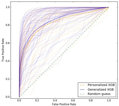
Table 5 Performance of Personalized and Generalized Sleep-Wake States Predictors Averaged Over All Participants Across All Studies Combined. In Each Column, tThe Boldface Number(s) Indicate(s) the Highest Value Obtained for the Corresponding Metric
Table 6 Performance of Personalized and Generalized Sleep-Wake States Predictors Averaged Separately Across Individuals Within Each Study. In Each Column of Each Study, the Boldface Number(s) Indicate(s) the Highest Value Obtained for the Corresponding Metric
Table 7 Performance of Personalized and Study-Specific Sleep-Wake States Predictors Averaged Separately Across Individuals Within Each Study. In Each Column of Each Study, the Boldface Number(s) Indicate(s) the Highest Value Obtained for the Corresponding Metric
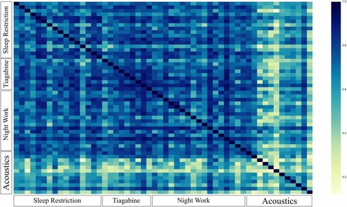
Figure 2 Heatmap of the similarity between participants obtained according to the defined similarity measure. Axes group participants based on the study they were in. Each pixel corresponds to one participant. Dark blue means maximum similarity and yellow means minimum similarity. Participants from the Acoustics study are observed to be different than each other and those from other studies potentially explaining the difference in the performance of our predictive models on them.