
Figures & data
Figure 1 Flowchart of participant selection.
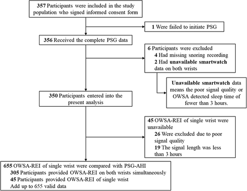
Figure 2 Diagram of the OWSA-based OSA diagnosis process.
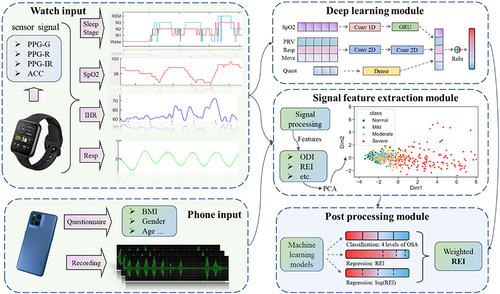
Figure 3 An example of signal trends of OWSA during two apnea episodes. The blue box indicates the first apnea, the red box indicates the second apnea. (A) and (B) show the respiratory events and sleep stages derived from PSG. The oxygen saturation curve is derived from OWSA, as shown in (C). The spectrum diagram of instantaneous heart rate is presented in (D) (apneas are characterized at ultra-low frequency). The audio energy diagram is shown in (E). Snoring was interrupted during apnea and resumed after the event. (F) shows the instantaneous heart rate derived from OWSA. The heart rate descends first and then rises during the episode of an apnea event.
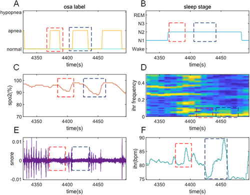
Table 1 Baseline Characteristics of Participants
Figure 4 (A) Comparison of OWSA-REI and PSG-AHI. Scatterplot and linear regression of OWSA-REI and PSG-AHI. There was a significant correlation between both meas-urements; (B) Bland-Altman Plot of OWSA-REI and PSG-AHI. The horizontal coordinate of the Bland-Altman Plot is the mean of the OWSA-REI and PSG-AHI, and the vertical coordinate is the differ- ence between them. Each dot represents a participant, the solid blue line represents the mean difference of OWSA-REI minus the mean difference of PSG-AHI, and the upper and lower red dashed lines represent the 95% confidence interval for the mean difference, which indicates very good agreement between the two detection methods when the difference lies within the 95% confidence interval.
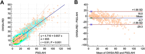
Table 2 Diagnostic Performance of the OWSA Compared to PSG
Table 3 Confusion Matrix for 4 Classes
Figure 5 ROC curves of the OWSA.
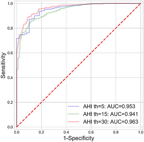
Figure 6 Comparison agreement between different wrists.(A) Bland-Altman Plot of L-REI and R-REI. The horizontal coordinate of the Bland-Altman Plot is the mean of the L-REI and R-REI, and the vertical coordinate is the differ- ence between them. Each dot represents a participant, the solid blue line represents the mean difference of L-REI minus the mean difference of R-REI, and the upper and lower red dashed lines represent the 95% confidence interval for the mean difference, which indicates very good agreement between the two detection methods when the difference lies within the 95% confidence interval; (B) Violin Plot of L-REI vs R-REI.
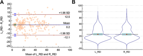
Table 4 Diagnostic Performance of the OWSA Between the Apnea-Dominated and Hypopnea-Dominated Groups
Figure 7 SHAP summary plot, ranked by mean absolute SHAP value Among the top 12 critical features, the interval of snoring was the only feature negatively correlated with SHAP values. It means that lower intervals of snoring lead to positive SHAP values and drive the model’s predictions for higher REI. The REI calculated by cross-validation of respiration and SpO2 contributed the most to the REI predicted by the model. The relationship between features and the model’s predictions is consistent with clinical experience.
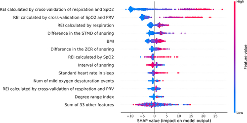
Figure 8 Dependence plots for the top six most important features, determined by mean absolute SHAP value (A) Dependence plots for REI calculated by respiration and SpO2; (B) Dependence plots for REI calculated by SpO2 and PRV; (C) Dependence plots for REI calculated by respiration; (D) Dependence plots for difference in the STMD of snoring; (E) Dependence plots for BMI; (F) Dependence plots for Difference in the ZCR of snoring. The figure illustrates the positive correlation between the six features and the SHAP value. The relation between feature values and SHAP values provides insight into how the features influence the model’s predictions. (A) depicts a more continuous and stable SHAP influence curve compared to (B). In (A), the SHAP range is narrower than in (B), suggesting that the REI calculated via respiration and SpO2 has a more significant impact on the results than the REI reckoned solely by respiration. The influence of (D–F) on the results is similar and weaker than that of A and B.
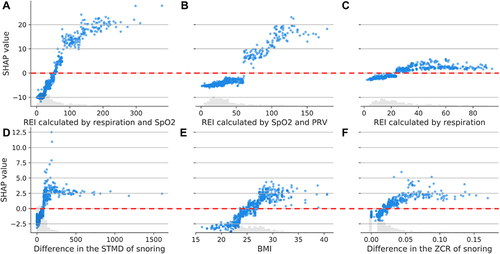
Table 5 Comparison of Diagnostic Performance of OSA with the Reference