
Figures & data
Table 1 Corresponding Literature on the Accuracy of Physiological and Biomechanical Estimates of Different Garmin® Smartwatch Models
Figure 1 Procedure on Garmin watch face: getting to the guided lactate threshold test.
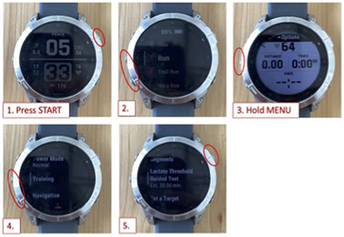
Figure 2 Study Design.
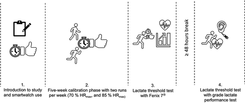
Table 2 Descriptive of Study Sample
Table 3 Descriptive Values of the Dependent Variables as Mean (Std)
Table 4 Differences Between the Measurements for All Participants
Figure 3 Differences between the LT pace output from the smartwatch and the modified Dmax method.
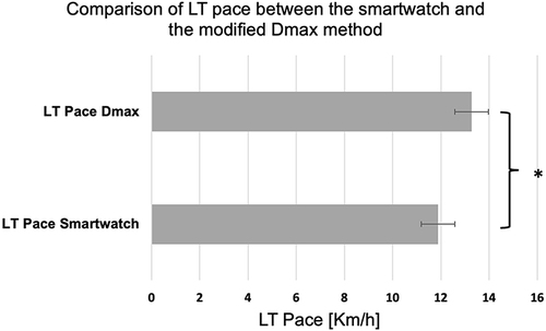
Figure 4 Differences between smartwatch LT HR output (bpm) and the modified Dmax method.
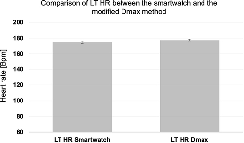
Figure 5 The distribution of all data points (pace).
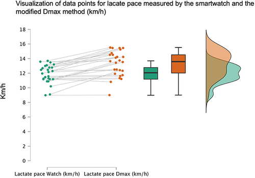
Figure 6 The distribution of all data points (HR).
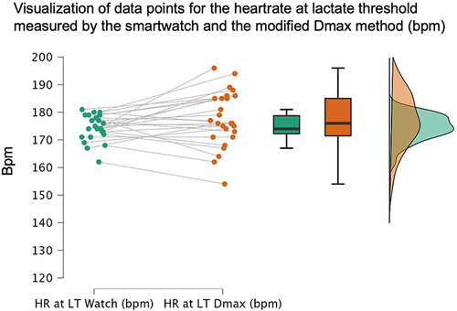
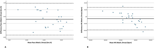
Figure 7 Bland-Altman Plot for differences in pace (A) and differences in HR (B) plotted with mean values.
Data Sharing Statement
All anonymized data are available upon request.