
Figures & data
Table 1 Demographic Data
Table 2 Average Time Gap Between HA Injections in Days
Figure 1 Graph of duration of symptom relief in days for each injection. x-axis = injection number, y-axis = days.
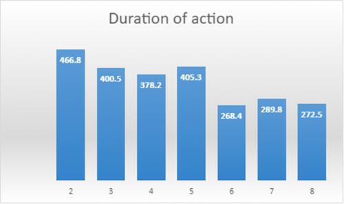
Table 3 Average Time Joints Returned for a 2nd HA Injection, in Days, Stratified by Group
Table 4 Tukey’s Comparison of Average Time Between Injections, in Days, for KL Grade
Figure 2 Flow of patients through post-treatment experience and satisfaction survey.
Abbreviation: n, number of participants.
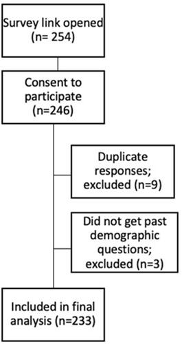
Table 5 Patient Experience and Satisfaction with HA Treatment Survey Results