Figures & data
Figure 1 Flow diagram of filtering studies.
Abbreviations: NOS, Newcastle–Ottawa scale; OS, overall survival.
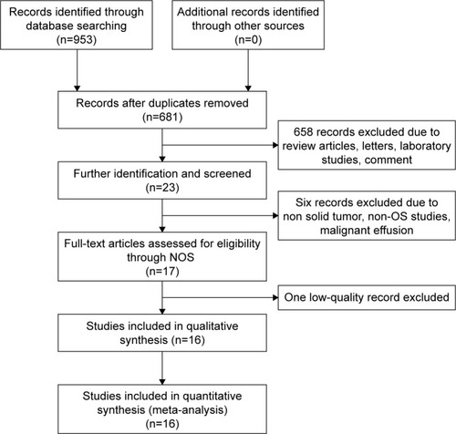
Table 1 Newcastle–Ottawa scale
Table 2 Characteristics of the included articles
Figure 2 Forest plot of the relationship between miR-100 and overall survival in solid tumor. Note: Weights are from random-effects analysis.
Abbreviations: CI, confidence interval; ES, effect size.
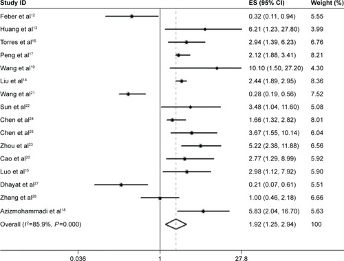
Table 3 Subgroup analysis
Figure 3 Sensitivity analysis: meta-analysis of random-effects estimates (exponential form) with studies omitted.
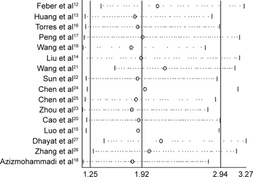
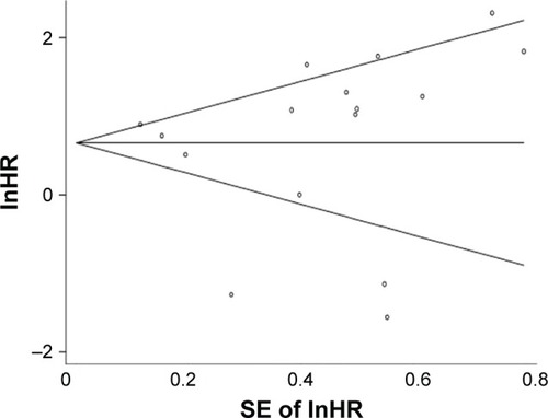
Figure 4 Publication bias: Begg’s funnel plot with pseudo 95% confidence limits.
Abbreviations: HR, hazard ratio; SE, standard error.