Figures & data
Table 1 Baseline Patient Characteristics in TCGA Cohort
Figure 1 Pearson’s correlations analysis and gene-gene and protein-protein interaction networks of ALOX genes. (A) Pearson correlation analysis of ALOX genes. Red indicates positive correlation and blue indicates a negative correlation. (B) GeneMANIA interaction networks; (C) Protein‑protein interaction networks.
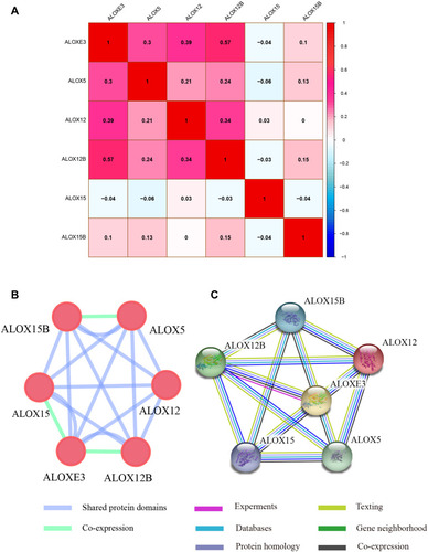
Figure 2 Gene expression distribution of ALOX genes in TCGA. *P<0.05; **P<0.01; ***P<0.0001.
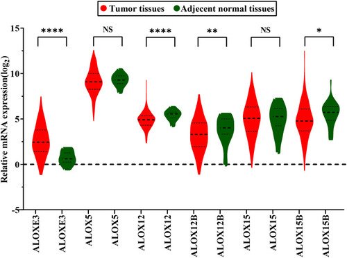
Figure 3 Expression levels of ALOX genes in tumor and normal tissues from the GEPIA website. (A), ALOXE3; (B), ALOX5; (C), ALOX12; (D), ALOX12B; (E), ALOX15; (F), ALOX15B.
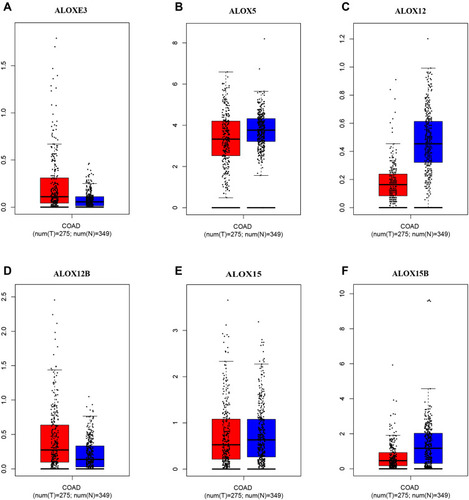
Figure 4 Expression levels of ALOX genes in tumor and normal tissues from the MERAV website. (A), ALOXE3; (B), ALOX5; (C), ALOX12; (D), ALOX12B; (E), ALOX15; (F), ALOX15B.
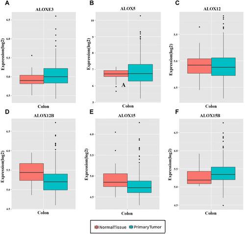
Figure 5 The diagnostic ROC curves of ALOX genes distinguish COAD tumor tissues and adjacent normal tissues in the TCGA cohort. ROC curves of ALOXE3 (A); ALOX5 (B); ALOX12 (C); ALOX12B (D); ALOX15 (E); ALOX15B (F).
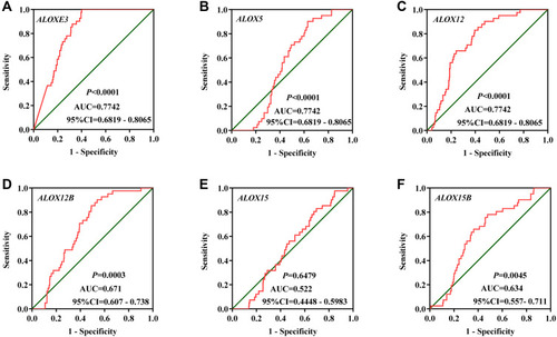
Figure 6 The verification of the relative expression of ALOXE3 and ALOX12 in COAD. (A) The relative expression of ALOXE3 between tumor tissues and adjacent normal tissues. (B) The diagnostic ROC curve of ALOXE3 in COAD. (C) The relative expression of ALOX12 between tumor tissues and adjacent normal tissues. (D) The diagnostic ROC curve of ALOX12 in COAD.
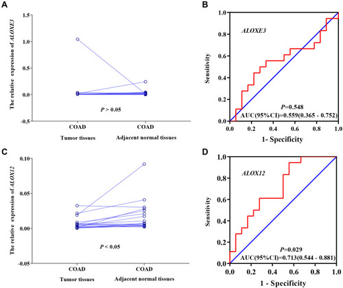
Table 2 Prognostic Values of ALOX Gene Expressions in COAD of TCGA Cohort
Figure 7 Kaplan–Meier survival curves for ALOX genes in COAD of the TCGA cohort. OS stratified by ALOXE3 (A); ALOX5 (B); ALOX12 (C); ALOX12B (D); ALOX15 (E); ALOX15B (F).
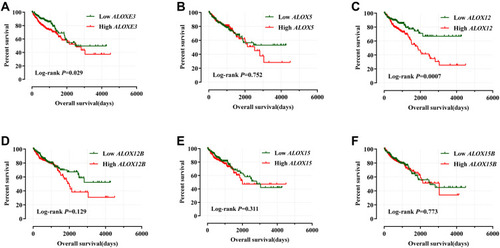
Table 3 Joint Effects Analysis of ALOXE3 and ALOX12 Expressions in COAD Patients OS
Figure 8 Joint effects analysis of ALOXE3 and ALOX12 of COAD OS in the TCGA cohort.
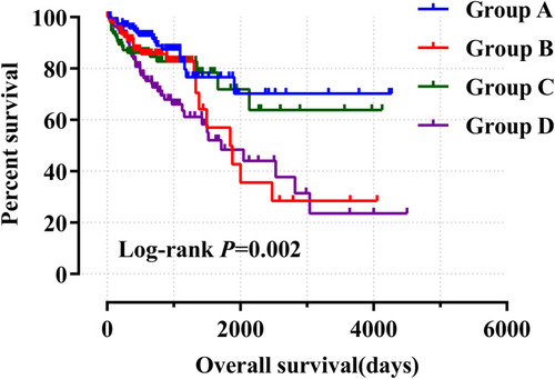
Figure 9 Risk score model and ROC curves. (A) Risk score model plot including risk score ranking, survival status, and heatmap. (B) Kaplan–Meier curves for low- and high-risk groups. (C) ROC curves for one‑, two‑, three‑, four‑ and five‑year survival rates from the risk score model.
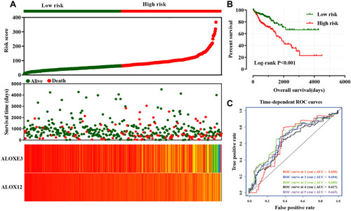
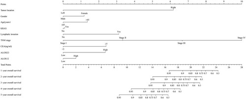
Figure 10 Nomogram for predicting the prognosis of COAD patient.