Figures & data
Table 1 Sample Information and Clinical Information
Figure 1 Differences in BRCA expression. (A) is a volcano map of differentially expressed genes. (B) is a hierarchical clustering heat map of the top 20 significant differentially expressed genes. On the x-axis, dark blue represents tumor samples, and brown represents normal samples. The y-axis represents the top 20 differentially expressed genes.
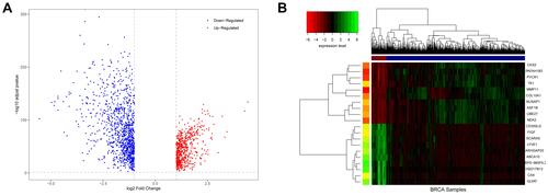
Figure 2 Choosing a suitable β value to construct a hierarchical clustering tree. (A) shows the scale-free fit index for the analysis of the soft threshold of 1‒20. (B) shows the analysis of the average connectivity of the 1‒20 soft threshold. (C) shows that genes were divided into different modules through hierarchical clustering, where different colors represent different modules.
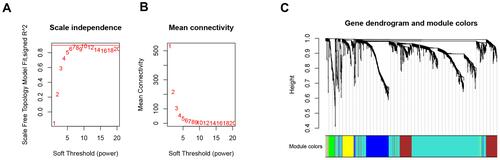
Figure 3 Screening of modules that were related to sample traits. This picture is a heat map showing the correlation between the characteristic genes of the module and immune cells.
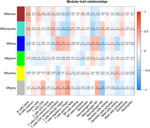
Figure 4 GO function and KEGG pathway analysis of key module genes. (A–C) are the bubble charts of the top 20 GO function items of the key module genes. (D) shows the top 20 KEGG pathway circle diagrams of key module genes.
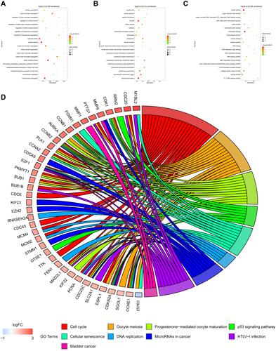
Figure 5 Identification of the hub genes. (A) is the protein–protein interaction (PPI) network from the blue modular gene. The greater the number of connected nodes, the larger the nodes. The green node represents the central node which is greater than 95 degrees. (B) is a scatter plot of blue modular genes. (C) is based on the genes whose PPI and co-expression network overlap and were selected as hub genes.
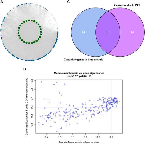
Figure 6 Validation of hub genes in TIMER database. (A) shows the relationship between the expression of the 13 hub genes and the level of memory-activated CD4 T cell infiltration. P≤0.05 was considered significant. (B) is a scatter plot of CCNA2 expression and memory-activated CD4 T cell infiltration level.
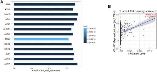
Figure 7 Validation of the hub genes in Tumor and Immune System Interaction Database. (A) and (C–F) represent heat maps of the correlation between hub genes and immune cells, chemokines, receptors, immune-inhibitory factors, and immune-stimulatory factors, respectively. (B) shows the protein–protein interaction network of the immune microenvironment. Green represents hub genes, red represents chemokines, purple represents receptors, yellow represents immune-inhibitory factors, and blue represents immune-stimulatory factors.

Figure 8 Analysis of the correlation between hub genes and clinical characteristics. (A–C) are box plots of the correlation between hub genes and estrogen receptor, age groups, and stages, respectively.
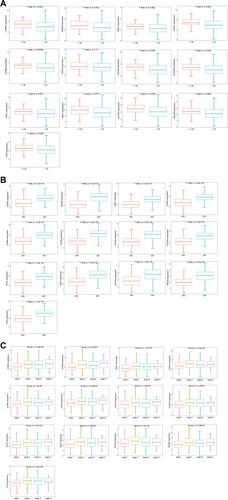
Figure 9 The expression levels of hub genes in the validation set. (A–M) are box plots of the expression levels of the hub genes in the validation set. (N) is a volcano map of differentially expressed genes.
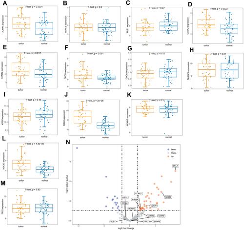
Figure 10 Kaplan–Meier survival analysis. Figure shows the overall survival analysis for BUB1 (A), CCNA2 (B), CCNB2 (C).
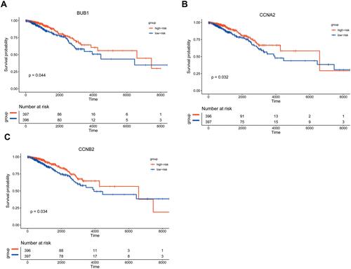
Figure 11 Single gene enrichment analysis. (A and B) are the enrichment classification diagrams of these two pathways (cell cycle and neuroactive ligand receptor interaction). (C) is a diagram of the enrichment pathway and its gene circle.
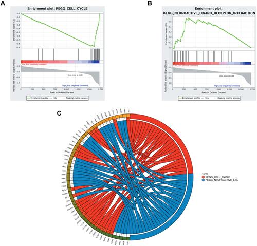
Figure 12 Expression levels of CCNA2 in tissues between non-metastatic breast cancer and metastatic breast cancer patients after surgery and immunotherapy. *p<0.05.
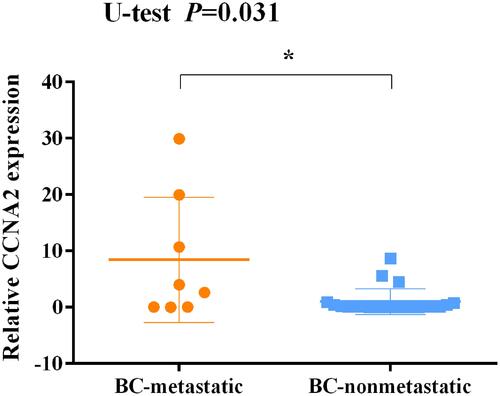
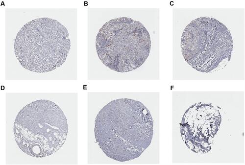
Figure 13 Immunohistochemistry analysis of CCNA2 expression in breast cancer samples. Data were obtained from the human protein atlas. (A) Protein levels of CCNA2 in tumor tissue (staining: Low; intensity: week; quantity: <25%). (B and C) Protein levels of CCNA2 in tumor tissue (staining: Medium; intensity: strong; quantity: <25%). (D–F) Protein levels of CCNA2 in normal tissue (staining: not detected; intensity: negative; quantity: none).