Figures & data
Figure 1 Gene expression patterns across datasets. (A and B) Principal component analysis (PCA) of gene expression profiles without (A) and with (B) the removal of batch effect. (C) Sample cluster dendrogram and clinical trait heat map of 15 Ctrl, 18 Eu and 28 Ec samples. The batch row corresponded to the sample series: white, GSE25628; pink, GSE23339; red, GSE7305.
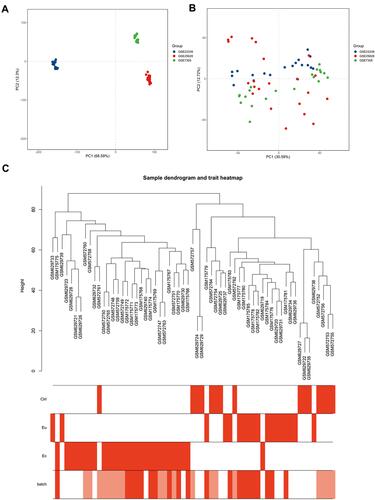
Figure 2 Division and validation of modules based on the scale-free co-expression network constructed according to a soft-thresholding power. (A) Scale-free topology fit index as a function of soft-thresholding power ranging from 1 to 20. The red line meant that the value of scale-free topology fit index was 0.85. (B) Mean connectivity as a function of soft-thresholding power ranging from 1 to 20. The soft-thresholding power of β=10 was determined as the beat fit since it had highest value of mean connectivity when the scale-free topology fit index was over 0.85. (C) Cluster dendrogram of all included genes based on the dissimilarity (1-TOM) of genes. The divided modules were labeled by different color and exhibited below the cluster dendrogram. The top row represented preliminary modules divided by dynamic tree cut and the bottom row represented the final modules division with the merge Cut Height set to 0.25. (D) Network heat map plot of 1000 randomly selected genes. The more saturated red color represented the higher co-expression interconnection of pair-wise genes. Diagonal-distributed red color indicated high intra-modular connectivity and low extra-modular connectivity. (E) Clustering dendrogram of merged module eigengene. (F) Eigengene adjacency heat map plot of merged modules. The color represented the adjacency of corresponding modules where red meant high adjacency and blue meant low adjacency.
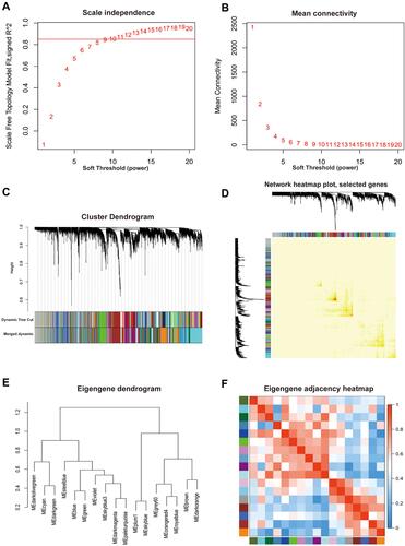
Figure 3 Identification and assessment of the EMS-related module. (A) Heat map plot of module-trait relationship. The correlation coefficients and corresponding p-value were represented in each square and the color bar was ranked by correlation coefficients. (B) Scatterplots of gene significance (GS) vs module membership (MM) in the darkmagenta module.
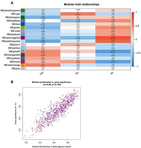
Figure 4 GO enrichment analysis of genes in the darkmagenta module. Top significantly enriched GO biological process terms, molecular function terms and cellular component terms of genes in the darkmagenta module.
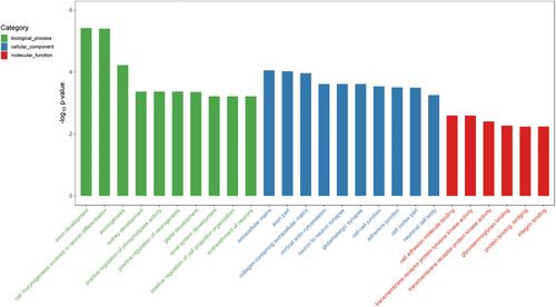
Figure 5 Sub-networks and functional clusters extracted from the weighted co-expression network of the darkmagenta module based on selected GO terms. The nodes represented genes and the edges represented the weighted correlation of genes in sub-network. (A and B) Sub-network of the GO term named “axon development” (A) and “axonogenesis” (B) extracted by Cytohubba. The depth of red-yellow represented the genes with top values of MCC and the more saturated red color represented the higher MCC value. (C and D) Functional cluster of the GO term named “axon development” (C) and “axonogenesis” (D) extracted by MCODE and the hub gene was labeled by red color.
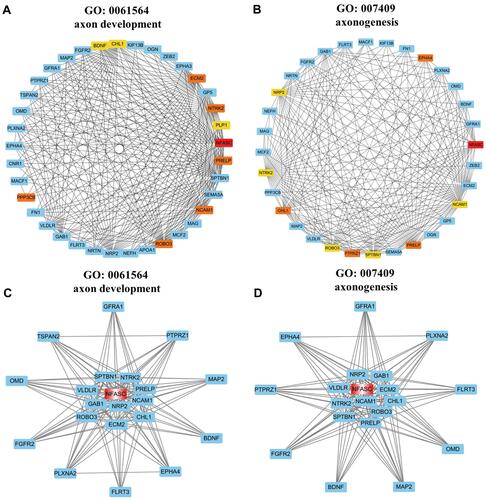
Figure 6 Validation of hub genes in the darkmagenta module. (A and B) ROC curves of NFASC (A) and CHL1 (B) for distinguishing ectopic endometrial samples from non-ectopic endometrial samples. (C and D) Relative protein expressions of NFASC (C) and CHL1 (D) in the Ctrl, Eu and Ec, as determined by IHC staining. Scale Bars = 50 μm. **p < 0.01, ***p < 0.001.
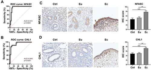
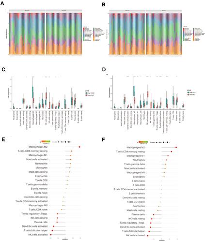
Figure 7 The relationship between hub genes and infiltrating immune cells. For each hub gene, samples were divided into two groups (high expression or low expression group) based on median gene expression. (A and B) The stacked bar chart shows the infiltration ratio of 22 types of immune cells in each sample of in the high- or low-NFASC (A) and high- or low-CHL1 (B) groups, respectively. (C) Box plot shows the infiltration difference of immune cells between the high- and low-NFASC groups. (D) Box plot shows the infiltration difference of immune cells between the high- and low-CHL1 groups. (E and F) The relationship between NFASC (E) or CHL1 (F) and immune infiltrating cells, respectively.