Figures & data
Figure 1 GCM task flow.
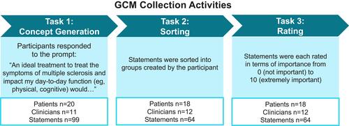
Table 1 Demographic Information for MS Patients
Table 2 Background Information for Participating MS Specialists (Clinicians)
Figure 2 GCM analytic steps.
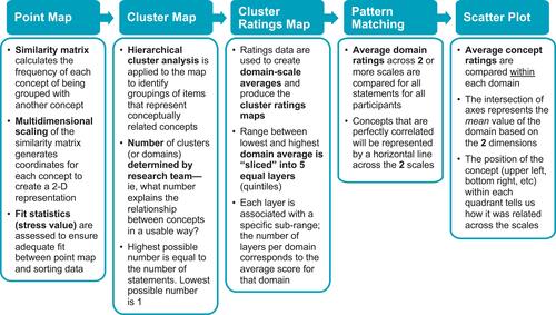
Table 3 Descriptive Statistics for GCM-Derived Domains and Corresponding Statements
Figure 3 Cluster mapping of participant sorts and ratings. (A) Point cluster map; (B) cluster-ratings map.
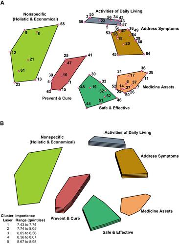
Figure 4 Pattern matching of patient and clinician importance ratings by domain.
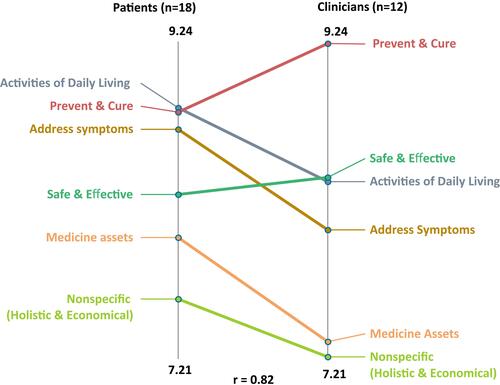
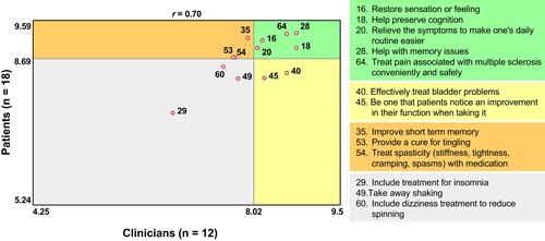
Figure 5 Address Symptoms domain scatterplot comparing patient and clinician mean ratings of importance by statement. The upper right quadrant (green) indicates statements above the mean for both patients and clinicians. The lower left quadrant (white) indicates statements below the mean for both patients and clinicians. The opposite quadrants indicate statements above the mean for patients/below the mean for clinicians (orange) and above the mean for clinicians/below the mean for patients (yellow).
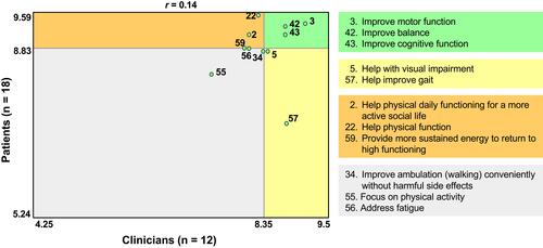
Figure 6 Activities of Daily Living domain scatterplot comparing patient and clinician mean ratings of importance by statement. The upper right quadrant (green) indicates statements above the mean for both patients and clinicians. The lower left quadrant (white) indicates statements below the mean for both patients and clinicians. The opposite quadrants indicate statements above the mean for patients/below the mean for clinicians (orange) and above the mean for clinicians/below the mean for patients (yellow).