Figures & data
Figure 1 Flow chart of the model structure.
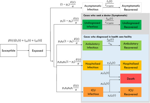
Figure 2 The epidemic curves in different scenarios (A) Hospitalized cases (B) ICU admitted cases. The colours indicate the scenarios. Black: Severe scenario, orange: moderate scenario, and green: mild scenario.
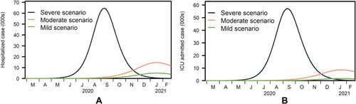
Figure 3 The cumulative N95s consumption for selected ratios of confirmed cases versus suspected cases. The simulated scenarios in plots (A–C) are severe, (D–F) moderate, and (G–I) mild. The ratios of confirmed cases versus suspected cases for: (A, D and G) is 1:0; (B, E and F) is 1:2; (C, F and I) is 1:10. The line colours describe policies of N95 usage where the red line shows single use, blue line shows extended use, and green line shows prolonged use.
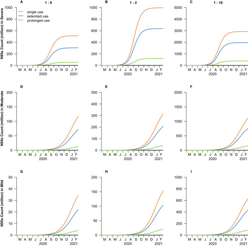
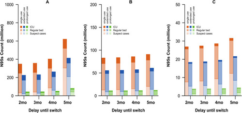
Figure 4 N95 use across time with the switch to rapid testing in different epidemic scenarios where (A) is severe, (B) is moderate and (C) is mild. The orange line series shows single use, blue the extended-use and green the prolonged-use policies. Each bar is stratified by the levels of health care setting. Darker colours describe ICU cases, medium shading the cases in regular beds and lighter shades the suspected COVID-19 cases.