Figures & data
Figure 1 Flow chart of the study.
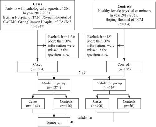
Table 1 Comparison of Basic Information Between the Two Groups
Table 2 Clinical Characteristics of the Case Group
Table 3 Comparison of Factors Relevant to Lactation Between Two Groups
Table 4 Comparison of Other Factors Between the Two Groups
Table 5 Multivariate Logistic Analysis of Risk Factors for Granulomatous Mastitis
Figure 2 The clinical prediction model (Nomogram) for predicting the risk of granulomatous mastitis (*Indicates P<0.05; ***Indicates P<0.001).
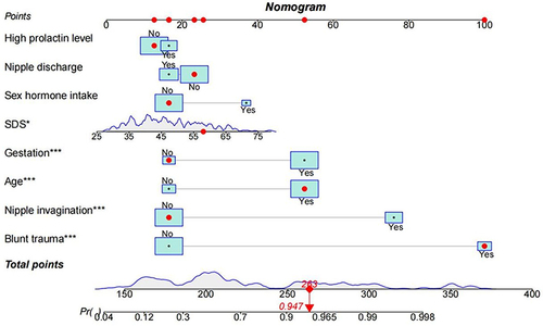
Table 6 Comparison of Important Variables Between the Modeling and Validation Groups
Figure 3 The calibration curves of the prediction model in modeling group (A) and validation group (B), indicating its uniformity.
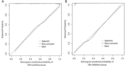
Figure 4 The receiver operating characteristic curve of the prediction model in the modeling group (A) and validation group (B), indicating its discrimination.
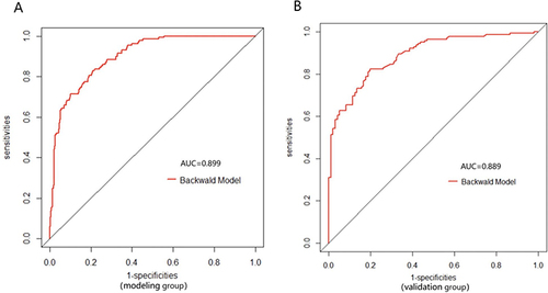
Figure 5 The decision curve analysis (DCA) of the prediction model in the modeling group (A) and validation group (B), indicating good clinical practicability of the model. The red DCA represents the established curve of the prediction model, and the blue DCA is the curve of the simple clinical model.
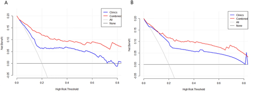
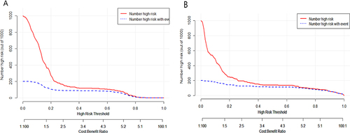
Figure 6 The clinical impact curves (CIC) of the prediction model in the modeling group (A) and validation group (B). The red curve (number of high risks) indicates the number of people classified as positive (high risk) by the Nomogram for each threshold probability. The blue curve (number of high risks with the outcome) represents the number of true positives under each threshold probability.