
Figures & data
Table 1 National Early Warning Score
Figure 1 Flowchart shows patient exclusion process.
Abbreviations: ICU, intensive care unit; NEWS, National Early Warning Score.
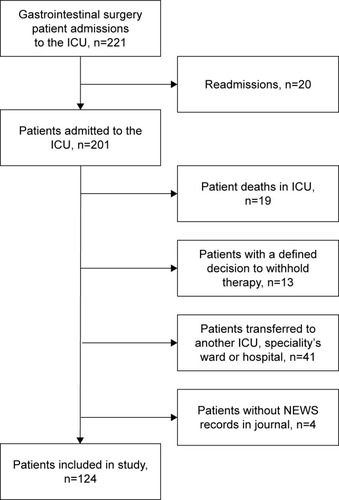
Table 2 Clinical characteristics and treatment details of 124 patients included in study
Table 3 Clinical characteristics of readmitted to ICU/HDU and non-readmitted groups
Table 4 Multivariate logistic regression model of predictors associated with clinical deterioration and readmission to the ICU/HDU
Figure 2 Sequence plot of maximum NEWS – first 30 days.
Notes: Patients not readmitted to the ICU/HDU are demonstrated in (A), and patients readmitted to the ICU/HDU are demonstrated in (B). There is one line per patient demonstrating the sequence of maximum NEWS score in each 6-hour period.
Abbreviations: HDU, high dependency unit; ICU, intensive care unit; NEWS, National Early Warning Score.
Abbreviations: HDU, high dependency unit; ICU, intensive care unit; NEWS, National Early Warning Score.
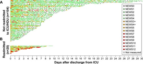
Figure 3 Locally Weighted Scatterplot Smoothing plot of the development of NEWS score for the last 180 hours before the ICU/HDU readmission or ward discharge was experienced.
Notes: (A) Patients readmitted to the ICU/HDU. (B) Patients not readmitted to the ICU/HDU.
Abbreviations: HDU, high dependency unit; ICU, intensive care unit; NEWS, National Early Warning Score.
Abbreviations: HDU, high dependency unit; ICU, intensive care unit; NEWS, National Early Warning Score.
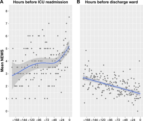
Table 5 Linear mixed effect model – change in mean NEWS score