Figures & data
Table 1 Baseline Clinical Characteristics And Clinic Profile Of Patients
Figure 1 The cumulative risk of heart failure readmission. Each curve represents the change in the corresponding cumulative incidence of different HF readmission times with the interval between two hospitalizations. The median time decreased from 784 days for the first hospitalization to 664 days for the second hospitalization, 515 days for the third hospitalization, and 388 days for the fourth hospitalization. The cumulative risk of heart failure readmission increased with the number of times of hospitalization.
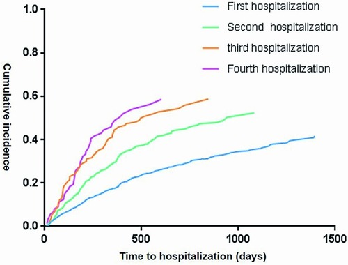
Table 2 Cox Regression Model And Conditional Frailty Model Of Risk Factors For HF Readmission
Figure 2 HRs of risk factors for heart failure readmission analyzed by conditional frailty model. Plots represent HRs of the risk factors and bars indicate 95% CI.
Abbreviations: HR, hazard ratio; PCI, percutaneous coronary intervention.
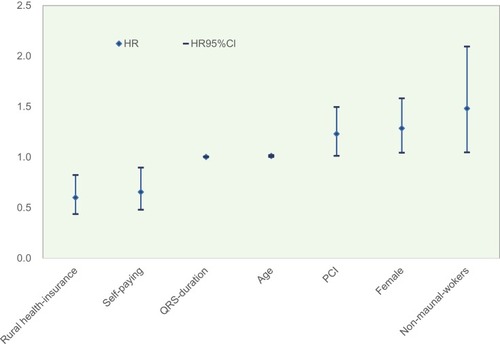
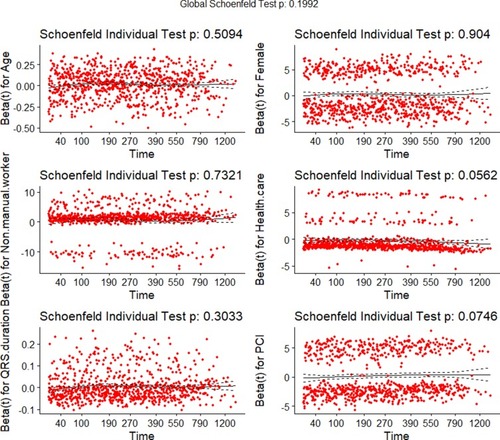
Figure 3 Schoenfeld residual diagram. The curve of each diagram represents the trend of risk factor change as time goes by. The P-values of the variables and the model as a whole were shown in the diagram. Survminer, Survival, ggplot2, and other packages of R3.5.0 and related programs were used to create the Schoenfeld residuals graph. P>0.05 indicates that the variable meets the conditional proportional hazard assumption.