Figures & data
Table 1 Characteristics of Study Patients
Table 2 Association of Lactate Series with the All-Cause Mortality
Figure 1 Kaplan–Meier survival curves of all-cause mortality according to lactate indices. Panels (A–E) Indicate Lacadm, Lac24max, Lac24min, Lac24TW and LacΔ, respectively.
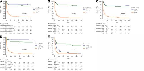
Table 3 The Area Under ROC Curve (AUC) for Lactate Indices
Figure 2 Receiver operating characteristic (ROC) analysis for lactate indices. Panel (A) is the 30-day mortality rate, and Panel (B) is the 180-day mortality rate.
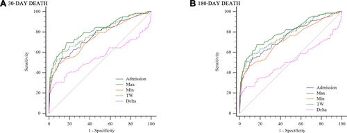
Table 4 The Area Under ROC Curve (AUC) for GRACE Score + Lactate Index
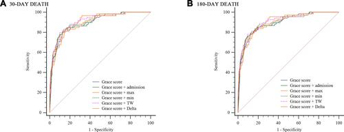
Figure 3 Receiver operating characteristic (ROC) analysis for GRACE score +lactate indices. Panel (A) is the 30-day mortality rate, and Panel (B) is the 180-day mortality rate.