Figures & data
Table 1 Patient’s characteristics
Figure 1 Example of a glycemic profile of a patient of each group.
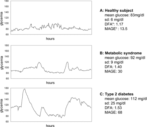
Figure 2 Differences in detrended fluctuation analysis among healthy subjects, patients with the metabolic syndrome and patients with type 2 diabetes.
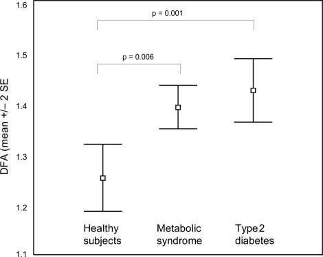
Figure 3 Correlation between detrended fluctuation analysis and mean amplitude of glycemic excursions.
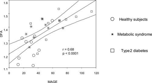
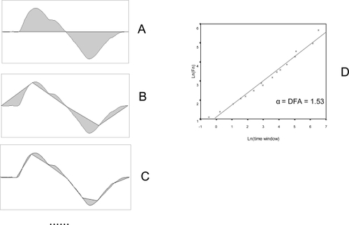
Figure 4 Detrended fluctuation analysis (1). From the original time series, an integrated curve is obtained:
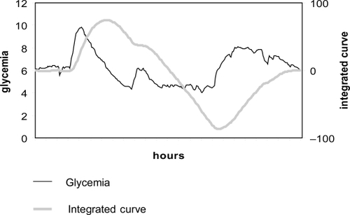
Figure 5 Detrended fluctuation analysis (DFA) (2). The integrated curve is divided into progressively smaller time segments (A, B, C, etc). A regression line is calculated for each segment, and the total difference between the integrated curve and the regression lines is calculated for each time window (F(n), gray area). The smaller the time window, the better the fit of the regression line and the lower the value of F(n). Finally, a plot is drawn (D) with log(F(n)) in the y-axis and log(time-window) in the x-axis. A good fit reveals the presence of scaling (self-similarity). DFA is the slope of the regression line. It displays the scaling exponent, and is an indicator of the degree of complexity of the curve.