Figures & data
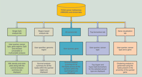
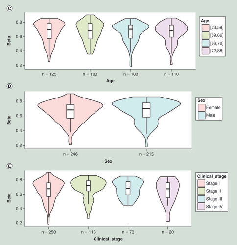
(A) Kaplan–Meier plot showing survival in higher (β > 0.59; shown in red) and lower (β < 0.59; shown in blue) methylation groups dichotomized by maxstat method. The X-axis denotes survival time in days and the Y-axis denotes the probability of patient survival. (B) Density plot, highlighting all the cut-off points evaluated in MethSurv. Different cut-off points are represented by colored texts and the number in red denote the currently used cut-off point to group the patients. (C) Violin plots showing the methylation levels among different age groups. Continuous age data are binned into quantiles for the visualization. (D) Violin plots showing the methylation levels among female and male samples. (E) Violin plots showing the methylation levels among stage I, II, III and IV LUAD samples. A boxplot within each violin plot summarizes the interquartile range and median methylation levels (show by a thick black line). The X-axis denotes the patient category, while the Y-axis denotes the methylation β-values (ranging from 0 to 1).
HR: Hazard ratio; LR: Log-likelihood ratio; LUAD: Lung adenocarcinoma; q25: Upper quantile; q75: Lower quantile.
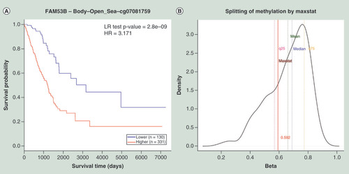
(A) Heat map depicting clustering of the CpG methylation levels within FAM53B gene calculated using the average linkage method with correlation distance. Methylation levels (1 = fully methylated; 0 = fully unmethylated) are shown as a continuous variable from a blue to red color. Rows correspond to the CpGs and the columns correspond to the patients. (B) PCA plot of LUAD patients showing the methylation levels for the gene FAM53B. The patients who are alive are shown in red and the deceased ones are shown in blue. Patient age groups are represented by different shapes. X-axis denotes PC1 (30.8% variability) and Y-axis denotes PC2 (16.5% variability), respectively. Heat map and PCA plots are generated using seamless integration with ClustVis [Citation23].
LUAD: Lung adenocarcinoma; PCA: Principal component analysis; PC1: Principal component 1; PC2: Principal component 2.
![Figure 3. Clustering analysis of the CpGs within the proximity of FAM53B in lung adenocarcinoma samples using the ‘gene visualization’ module of MethSurv. (A) Heat map depicting clustering of the CpG methylation levels within FAM53B gene calculated using the average linkage method with correlation distance. Methylation levels (1 = fully methylated; 0 = fully unmethylated) are shown as a continuous variable from a blue to red color. Rows correspond to the CpGs and the columns correspond to the patients. (B) PCA plot of LUAD patients showing the methylation levels for the gene FAM53B. The patients who are alive are shown in red and the deceased ones are shown in blue. Patient age groups are represented by different shapes. X-axis denotes PC1 (30.8% variability) and Y-axis denotes PC2 (16.5% variability), respectively. Heat map and PCA plots are generated using seamless integration with ClustVis [Citation23].LUAD: Lung adenocarcinoma; PCA: Principal component analysis; PC1: Principal component 1; PC2: Principal component 2.](/cms/asset/7b49e26c-ecc3-4a9a-a26f-e604fba7bbd2/iepi_a_12323822_f0004.jpg)
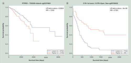
(A) KM plot for cg22374861-PTPRO using breast cancer samples dichotomized by mean methylation (cut-off = 0.17). (B) KM plot for cg08799922-C1R using acute myeloid leukemia samples dichotomized by maxstat method (cut-off = 0.35). (C) KM plot for cg18328206-RASSF5 using KIRC samples dichotomized by maxstat (cut-off = 0.07). (D) KM plot for cg06523224-BNC1 using KIRC samples dichotomized by maxstat (cut-off = 0.14). The X-axis denotes survival time in days, and the Y-axis indicates the probability of patient survival. The red and blue lines indicate higher (β > cut-off) and lower (β < cut-off) methylation patient groups, respectively, dichotomized according to best cut-off point in MethSurv.
HR: Hazard ratio; KIRC: Kidney renal clear cell carcinoma; KM: Kaplan–Meier; LR: Log-likelihood ratio; Maxstat: Maximally selected rank statistics.