Figures & data
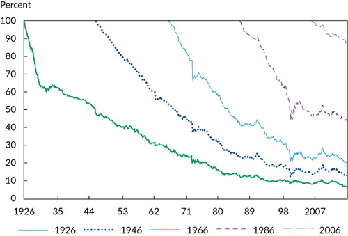
Notes: This figure considers what happens to an investor who starts off with the market portfolio but never trades after that. The solid green line represents an investor who bought the entire US stock market in 1926 and did not participate in any IPOs, SEOs, or share repurchases and did not reinvest any dividends, showing the resulting fraction of the market that is owned over time. The other lines show the fraction of the market owned by passive investors who start in 1946, 1966, 1986, and 2006, respectively.
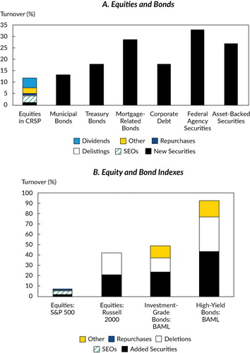
Notes: This figure shows the average yearly turnover for a “passive” investor who keeps market-cap weights in a given equity or bond investment universe. Panel A shows the turnover for all US-listed stocks in the CRSP database and for US municipal bonds, Treasury bonds, mortgage-related bonds, corporate debt, federal agency securities, and asset-backed securities. Panel B shows the turnover for equity indexes (S&P 500 and Russell 2000) and corporate bond indexes (Bank of America Merrill Lynch investment-grade and high-yield indexes).
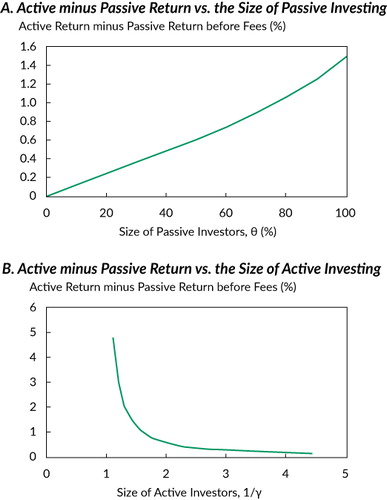
Notes: This figure plots the expected return to the active investors in
excess of the expected return of the securities included in the “market”
portfolio, , based on the numerical example discussed in the
text. Given the base-case parameters in the text, Panel A varies the fraction bought by
passive investors, θ, and Panel B varies the size of the active investors by varying
their risk tolerance, 1/γ (a higher number of active investors means a smaller
aggregate absolute risk aversion).