Figures & data
Table 1 Numbers of undergraduate students responding to the Postcard survey
Figure 1 Bar chart illustrating the most common generic forms of feedback provision named by the students in the postcard survey. Note that the total percentage in each grouping is less than 100% because responses occurring at less than 5% for both groups have been excluded
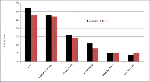
Figure 2 Bar chart illustrating the proportions of responses from each year group of biological science students identifying each form of feedback provision
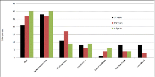
Table 2 Most common responses to the question ‘What is the most useful piece of feedback you have received?’
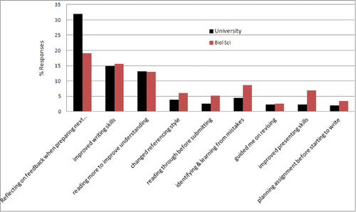
Figure 3 Bar chart illustrating the most common responses to the question ‘Name one way in which you have used feedback to improve your learning’