Figures & data
Figure 1. (A) Input–output schematic diagram of a superficial hyperthermia target volume. The patient-related factors are represented by the vertical arrow. The outputs marked * are subjective and not recorded by the data acquisition system. (B) Closed-loop control in superficial hyperthermia where the human controller interprets tissue temperatures and patient feedback and steers the water bolus temperature and applicator powers. Numbers in italic font represent the signal width and are specific to the circumstances at the Erasmus MC.
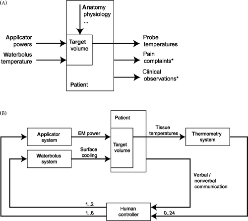
Figure 2. A 2 × 3 LCA array and water bolus (WB) placed on the chest of a patient.
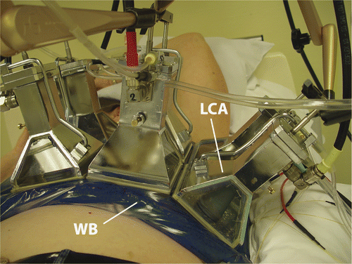
Figure 3. Screenshot of the graphical user interface for power steering. The measured forward power is indicated in large font and the power set point in small font. The reflected powers are represented graphically in a colour code (green <5%, yellow 5–10%, orange 10–15%, red >15% reflected power).
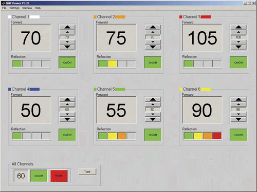
Figure 4. Screenshot of the temperature monitoring graphical user interface. (A) Temperature–time graphs for the sensors below each applicator are shown. (B) The measured temperatures are mapped onto a sketch that includes anatomical features, the location of the tumour and scar tissue, apertures of the applicators, catheter tracks and margins of the radiation field. For each measurement point the tissue type, depth, temperature and temperature difference over 20 s is also shown.
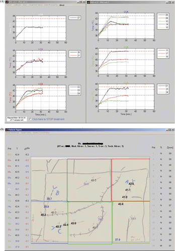
Figure 5. Example treatment evaluation sheet. Ch, channel; ss, steady-state; int., interstitial; sup., superficial; NaN, not-a-number (no data available).
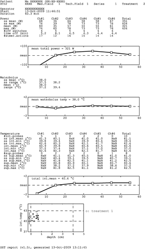
Table I. Power steering statistics based on a per applicator analysis of all treatments conducted in 2009 at Erasmus MC (196 treatments, 920 applicator·treatments).
Figure 6. Characteristic shapes of the power trend line: (A) normal, (B) peak at beginning of treatment, (C) continuous increase and (D) decrease at the end of treatment.
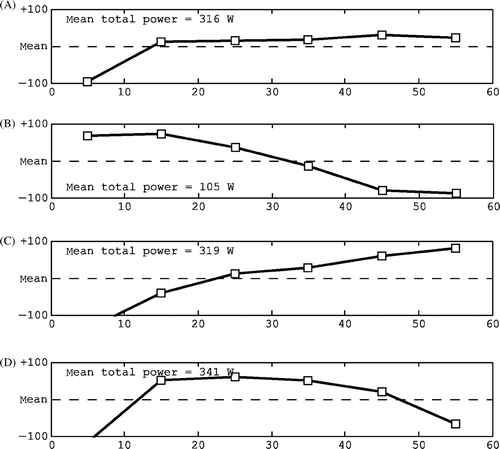
Figure 7. Characteristic shapes of the water bolus trend line: (A) stable and normal, (B) low temperature at the start, (C) wavy and (D) steering.
Figure 8. Characteristic shapes of the interstitial temperature trend line: (A) normal, stable, (B) increasing towards the end, (C) decline towards the end, (D) maximum in the early stages and (E) dip in the steady-state period.
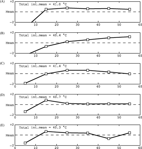
Figure 9. Examples of characteristic temperature–depth plots: (A) all temperatures therapeutic, (B) mix of therapeutic and sub-therapeutic temperatures, (C) sub-therapeutic temperatures, (D) available data only in the top layer with poor coverage at depth, (E) no interstitial data available and (F) relatively high surface and low interstitial temperatures indicating a too high water bolus temperature.
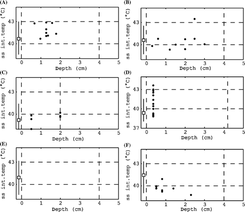
Table II. Characteristics of typical power trend line shapes, the related checks and possible actions for the next treatment.
Table III. Characteristics of typical water bolus temperature trend line shapes, the related checks and possible actions for the next treatment.
Table IV. Characteristics of typical interstitial temperature trend line shapes, the related checks and possible actions during treatment evaluation.
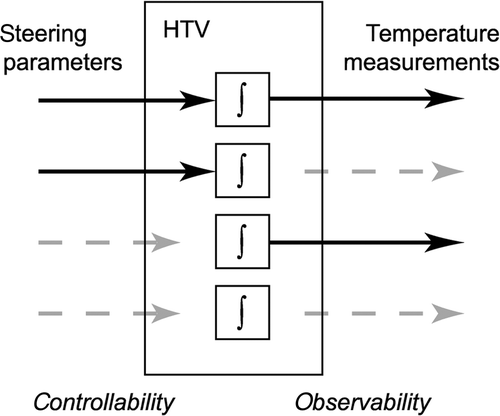
Figure 10. Schematic representation of the four main levels of controllability and observability in parts of the hyperthermia target volume (HTV). The blocks marked ∫ represent the tissue dynamics of a HTV subsection. From top to bottom: controllable and observable, controllable and poorly observable, poorly controllable and observable, poorly controllable and poorly observable.