Figures & data
Figure 1. The heating system, including (a) peristaltic pump, (b) MW generator, (c) water-cooled antenna, (d) MW radiator.
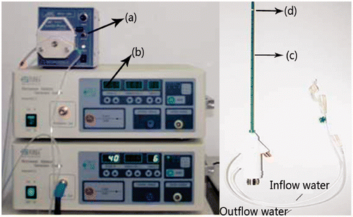
Figure 2. Schematic of the experimental systems.
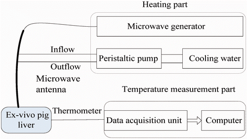
Table I. Thermal properties of ex vivo porcine livers.
Figure 3. FEM model (units in cm).
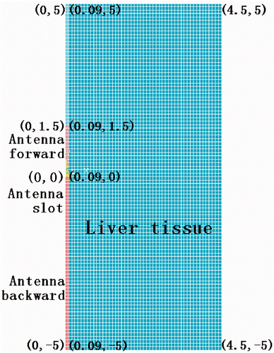
Table II. Thermal-physical parameters of MW antenna.
Figure 4. Geometry of antenna and TCs placed in the ex vivo porcine liver.
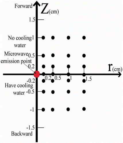
Table III. dT/dt data at each TC.
Figure 5. Measured temperature curves at the four reference points. The arrows identify the end of each time interval.
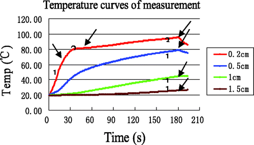
Table IV. The errors for temperature measurement data.
Figure 6. Simulation temperatures at the four reference points.
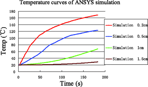
Figure 7. Comparison between simulation and experiment. Curves without markers are experimental measurements. Curves with markers are from computer simulation. The arrows identify the end of each time interval.
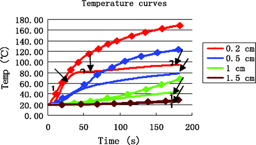
Table V. The errors between simulation and measurement.
Table VI Enthalpy values of ex vivo porcine liver.
Figure 8. Temperature simulation at the four reference points after incorporating enthalpy.
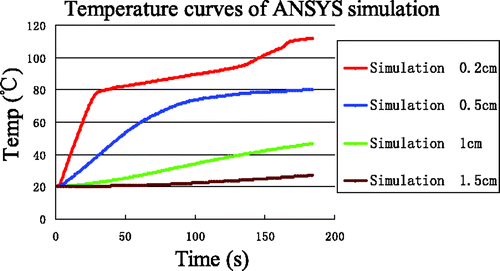
Figure 9. Comparison between simulation with enthalpy considerations and experiment. Curves without markers are measurements. Curves with markers are results from computer simulation. The arrows identify the end of each time interval.
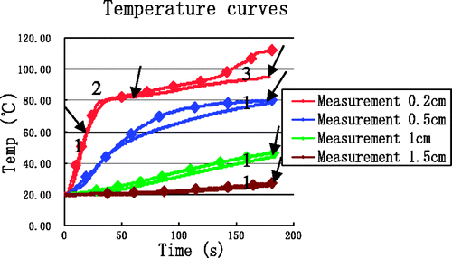
Table VII. The errors between simulation incorporating enthalpy and experimental data.
Figure 10. Average temperatures in the fourth minute of heating and cooling experiments.
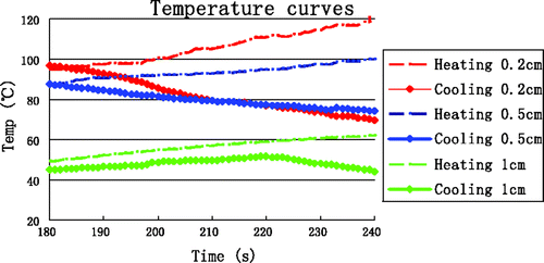
Table VIII. data from TCs near the MW antenna.
Figure 11. Simulation results of temperature field at t = 180 s.
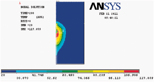
Figure 12. Temperature evolution from simulations incorporating enthalpy and high-temperature SAR.
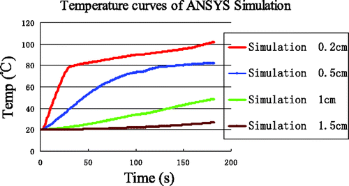
Figure 13. Comparison between simulation incorporating enthalpy and high-temperature SAR with experimental data. Curves without markers are measurements. Curves with markers are from computer simulation. The arrows identify the end of each time interval.
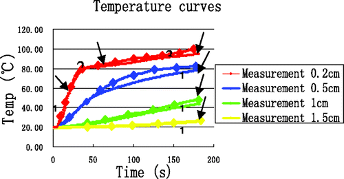
Table IX. The errors between simulations including enthalpy and high-temperature SAR and measurements.
Figure 14. Measured temperature from 14 experiments and at (0.5, 0); red curve is average.
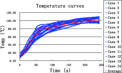
Figure 15. Comparison between simulation based on the proposed thermal model and experiment. Curves without markers are experimental results. Curves with markers are from computer simulation. The arrows identify the end of each time interval.
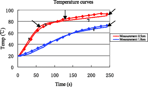
Table X. The errors between simulation and measurements.
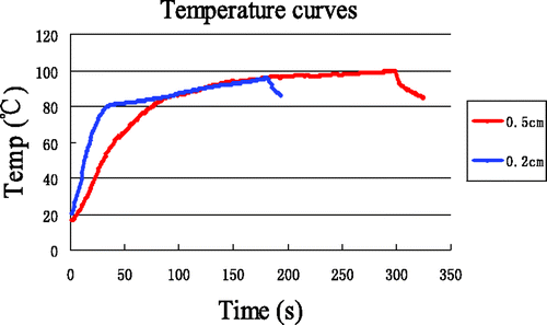
Figure 16. Temperature at (0.5, 0) with 5 min heating compared with that at (0.2, 0) with 3 min heating.