Figures & data
FIG. 1. Calibration plots for PIM. The two plots show the observed risk by expected risk in deciles of expected risk using a log scale for the two versions of PIM.
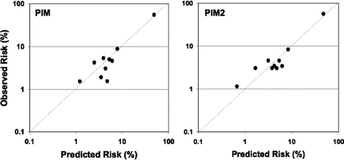
FIG. 2. England and Wales PICU head injury practice by unit. Upper panel: Practice ordered according to size from smallest to largest. Lower panel: Cumulative practice by unit presented as percentage. The dotted lines in the lower panel show the borders of each quartile. The dotted lines in the upper panel show the size of practice defined at these quartile borders.
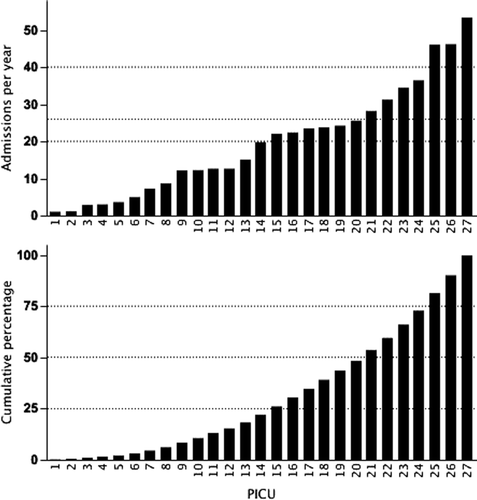
FIG. 3. Specialist paediatric neurosurgical practice by PICU. Grouping of PICUs into quartiles defined in Fig. 2 from upper-first to lowest-fourth, groups I to IV. PICU numbering is the same as in Fig. 2.
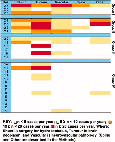
TABLE I. Summary of PICU group data by category of intensive care intervention for HI care.
FIG. 4. Funnel plots showing risk-adjusted mortality rate displayed as a scatter plot. The horizontal line shows the predicted mean 8.6%. Dotted lines show the 99.8% and 95% (2σ) limits. Points I–IV in the upper panel use the same notation as described in Fig. 3. Lower panel uses the same scheme of symbols, with each point representing PICUs within respective quartile-sectors of the health care system.
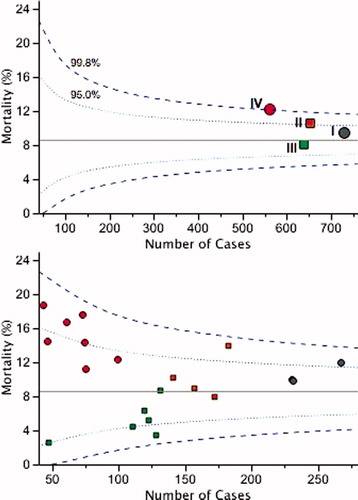
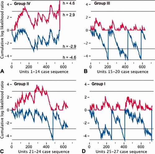
FIG. 5. Half-cumulative-sum-risk-adjusted charts in the four quartiles of PICUs over their respective case series sequence, where: A, units 1–14, lower quartile and Group IV; B, units 15–20, third quartile and Group III; C, units 21–24, second quartile and Group II; D, units 25–25, upper quartile and Group I. Upper red line in each control chart tests for doubling of odds of death (h = 4.6). Lower blue line in each control chart tests for halving of the odds of death (h = −4.6).