Figures & data
FIGURE 1. Sexually dimorphic male (a) and female (b) Uca lactea annulipes.
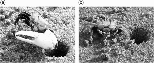
FIGURE 2. Seasonal variation in the tidal rhythm of emergence. The graph summarizes the emergence data collected in the years 1997–2001. The x-axis is divided into the 12 mo of the solar year, whereas the y-axis represents the time (in h) before and after the dead low tide (the horizontal line at zero denotes the time of low tide). The collective data of a given month are presented as a box plot. This graphical method displays the full data range of the given variable, including outliers drawn as small circles. The horizontal line in the middle of the box represents the median 50% value. The number of the different emergences (N) observed is indicated below each time interval. A lower case letter is given to groups with statistically equal medians. Squares are drawn from the average low temperature of the day, as supplied by the Climatological Division, Meteorological Department, Directorate of Civil Aviation, State of Kuwait.
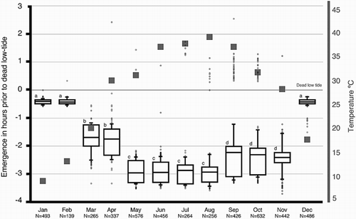
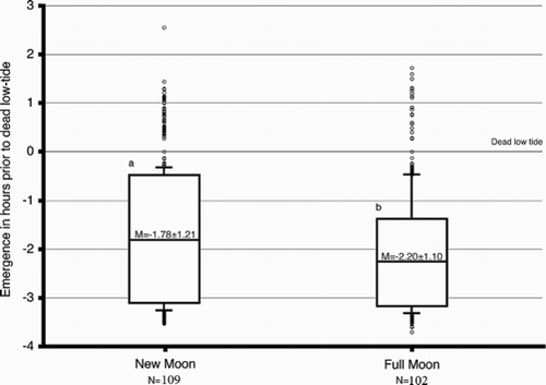
FIGURE 3. Lunar variation in the tidal rhythm of emergence. The graph summarizes emergence data as a function of the moon phase. The collective data of a given phase are presented as a box plot. This graphical method displays the full data range of the given variable including outliers drawn as small circles. The horizontal line in the middle of the box represents the median 50% value. A lower case letter is given to groups with statistically equal medians. The number of the different emergences (N) observed is indicated below each time interval. A lower case letter is given to groups with statistically equal medians.