Figures & data
Figure 1. Distribution profiles for the n = 144 pregnancies. (A) Infant birth weight. (B) Gestational age. (C) Birth weight/gestational age. Black circles: subsample for current study (n = 144). Empty circles: Entire MIREC Cohort.
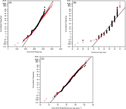
Table 1. Characteristics of the mothers and pregnancy outcomes.
Figure 2. Heatmap and hierarchical clustering of correlation analysis results for all data. Color key/histogram indicates the strength of correlation (r values). Darker (red) shade indicates positive correlation. Lighter (yellow) shade indicates negative correlation.
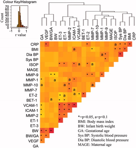
Table 2. Maternal markers affecting different birth outcomes as determined by regression model analyses.
Figure 3. Venn diagram of maternal factors dictating infant birth weight based on infant birth weight distribution data analysed by best subsets regression analyses. (A) All data. (B) <25th percentile IBW. (C) >75th percentile IBW.
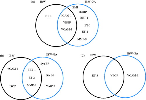
Figure 4. Association of maternal biomarker profiles and (A) infant birth weight. (B) Gestational age.
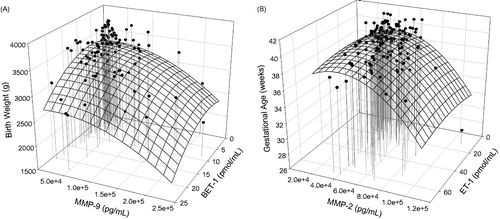
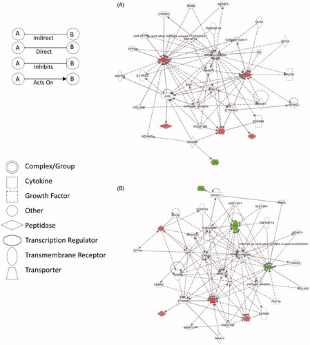
Figure 5. Primary protein networks obtained through ingenuity pathway analysis (IPA) of the fold change of plasma markers in the identified sub groups versus the control group (25th–75th percentile). (A) Network 1 depicting pathways related to cardiovascular disease (<25th percentile) and (B) Network 2 depicting pathways related to inflammatory response (>75th percentile). Red: up-regulation; Green: down-regulation.