Figures & data
Table 1. Patient demographics.
Figure 1. Disease activity at each time point (n = 83). Disease activity was measured by the MBDA score (a) and DAS28 (b). Boxes indicate interquartile range. Thick horizontal bars represent median values. Whiskers indicate most extreme points within 1.5 × IQR of the box. Gray lines represent connection between the scores of each individual subject over the three visits.
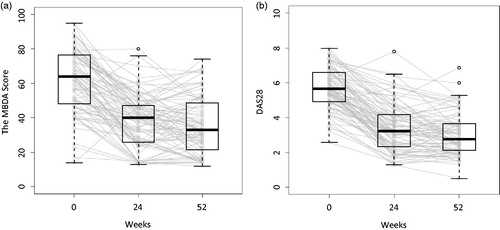
Table 2. Distribution of ΔmTSS from baseline to Week 52 following anti-TNF treatment.
Table 3. Spearman correlation between disease activity or change in disease activity and radiographic progressionTable Footnote*.
Table 4. Relative risk of radiographic progression based on disease activity at Week 24.
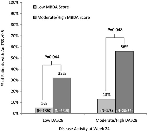
Figure 2. Moderate to high MBDA scores added value to DAS28 at Week 24 for identifying patients with ΔmTSS > 0.5.