Figures & data
Table 1. 2D structure of data set compounds with its Ki and pKi values.
Figure 1. (A) Molecular alignment of the three most active compounds. Rings 1, 2, 3 and the carbonyl oxygen (acceptor) were used as superimposition sites as well as its 3D shapes. (B) Molecular alignment of all 40 studied compounds. (C) Chemical feature sites were employed as the template for the molecular alignment (distances are shown in Å).
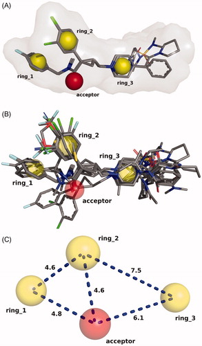
Figure 2. PCA findings for the studied data set. (A) Factor selection, (B) scores plot, and (C) loadings values.
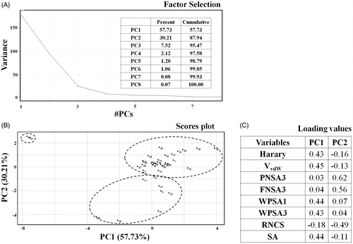
Figure 3. Distribution of test, training, and complete sets compounds according to pKi range.
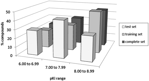
Table 2. Statistical parameters analysis of the three bests HQSAR models using fragment size default (4–7).
Table 3. Statistical data of the best CoMFA models.
Table 4. Statistical data of the best CoMSIA models.
Figure 4. Plots of predicted versus experimental pKi values HQSAR (A), CoMFA (B), and CoMSIA (C) best models.
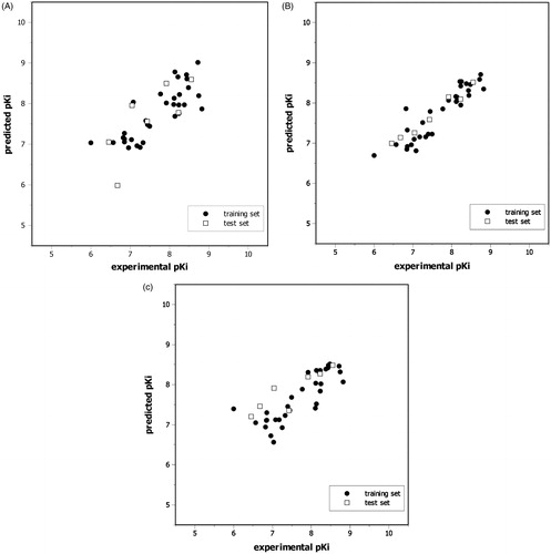
Table 5. Experimental (Exp.) and predicted (Pred.) biological activities (pKi) for the test set (Cpd).
Figure 5. HQSAR contribution maps for the most potent antagonist (A) and the least active antagonist (B). Green and yellow correspond to positive contributions to activity. Red and orange correspond to negative contributions to activity. The colored maps are available in online version.
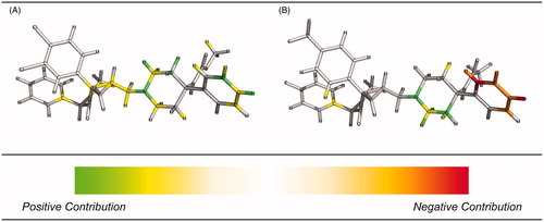
Figure 6. Energy contribution maps for the most (A) and the least active antagonists (B) generated for the best CoMFA model.
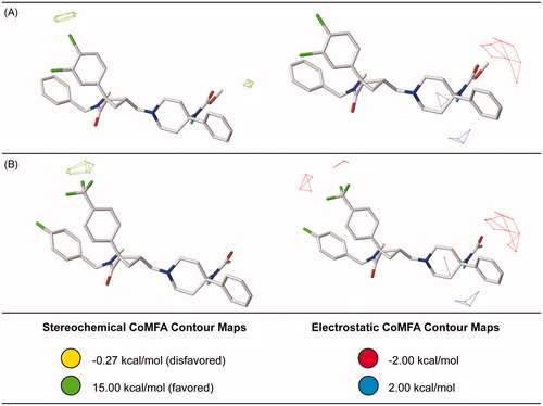
Figure 7. Steric and electrostatic contribution maps for the most (A) and the least active antagonists (B) generated for the best CoMSIA model.
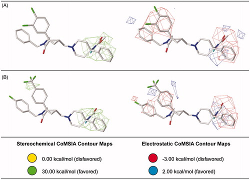
Figure 8. Hydrophobic, H-bond donor, and H-bond acceptor contribution maps for the most (A) and the least active antagonists (B) generated for the best CoMSIA model.
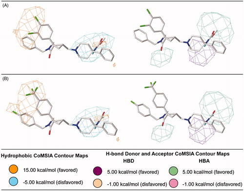
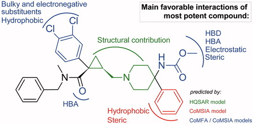
Figure 9. Structure–activity relationship obtained from all QSAR models.