Figures & data
Table 1. Fitted time series regression models with the COPD incidence series as the response series and concurrent influenza activity as the explanatory series
Figure 1. COPD admissions (upper panel) and influenza admissions (lower panel) by month from January 1998 to July 2010. In the upper panel, prior to 2009, the red series represents the fitted values based on the time series model with concurrent influenza activity as an explanatory variable. After 2009, the dotted red series represents forecasts of COPD admissions with influenza; the dotted blue series represents forecasts of COPD admissions without influenza.
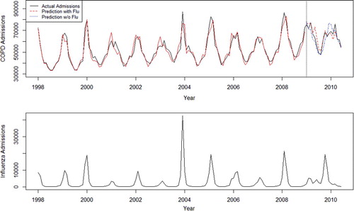
Figure 2. Time series forecast for the COPD admissions during July 2009 through June 2010. In the upper panel, the black series represents the actual COPD series; the dotted red series represents forecasts of COPD admissions with influenza and the dotted blue series represents forecasts of COPD admissions without influenza. The corresponding influenza series is shown in the lower panel. Importantly, the last 6 months of 2009 include the second wave of the 2009 influenza pandemic. Note: The right vertical axis represents monthly COPD admissions in terms of the percentage of peak monthly COPD admissions during the forecasting period. Thus, the peak month corresponds to 100%. For example, in December 2009, the forecasting error with influenza is roughly 1%, and the error without influenza is approximately 15% (where the percentage is relative to peak admissions during the forecasting period).
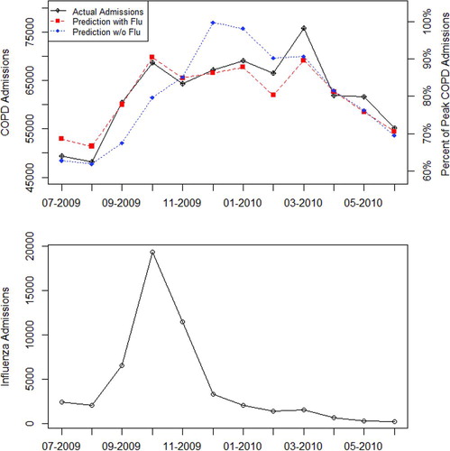
Figure 3. Time series forecast for AECOPD admissions during July 2009 through June 2010. In the upper panel, the black series represents the actual AECOPD series; the dotted red series represents forecasts of AECOPD admissions with influenza and the dotted blue series represents forecasts of AECOPD admissions without influenza. The corresponding influenza series is shown in the lower panel. Importantly, the last 6 months of 2009 include the second wave of the 2009 influenza pandemic. Note: The right vertical axis represents monthly AECOPD admissions in terms of the percentage of peak monthly AECOPD admissions during the forecasting period. Thus, the peak month corresponds to 100%. For example, in December 2009, the forecasting error with influenza is roughly 2–3%, and the error without influenza is approximately 15% (where the percentage is relative to peak admissions during the forecasting period).
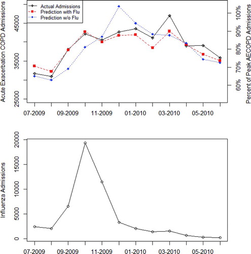
Table 2. Attributable risk measures by age group for the four COPD series