Figures & data
Table 1. Demographic data of the transplant group of patients and the first matched group of patients who did not undergo lung transplantation
Figure 1. ROC curve calculated using gas transfer measurements (TLCO and KCO % predicted) for predicting patients who received lung transplantation.
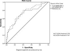
Figure 2. ROC curve calculated using data from the SGRQ (all 3 individual domains and the total score) for predicting patients who received lung transplantation.
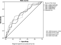
Table 2. Pre- and post-transplant health status scores measured using the St George's Respiratory Questionnaire
Table 3. Pre- and post-transplant lung physiology
Figure 3. Kaplan–Meier survival curve for patients with A1ATD who underwent lung transplantation. The vertical cross-lines represent censored data.
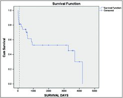
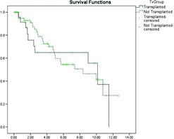
Figure 4. Kaplan–Meier survival curve for the transplanted (excluding those who died in the post-operative period) and a cohort matched for FEV1 and FEV1/FVC ratio. The vertical cross-lines represent censored data.
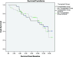
Table 4. A summary of the demographic data for the transplant group and the second group of patients matched at the time point closest to transplant
Figure 5. Kaplan–Meier survival curve for the transplanted (excluding those who died in the post-operative period) and a cohort matched for age, spirometry and gas transfer at the time of transplant. The vertical cross-lines represent censored data.
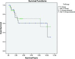
Table 5. A summary of the demographic data for the transplant group and the third group of patients matched including HRQoL at the time point closest to transplant
Figure 6. Kaplan–Meier survival curve for the transplanted (excluding those who died in the post-operative period) and a cohort matched for age, spirometry and gas transfer and HRQoL at the time of transplant. The vertical cross-lines represent censored data.